Collection collage settings
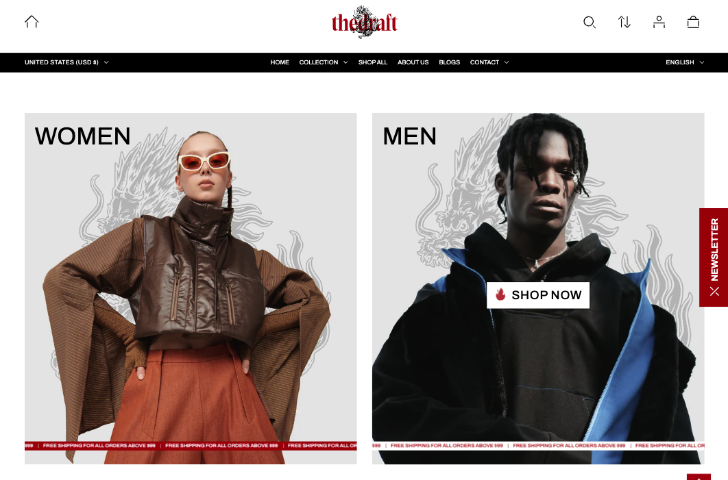
This guide describes the Collection Collage section. Use this section to display a series of collections as collection cards. Each collection card can include the collection title, a button for quick navigation to the collection, and a scrolling text strip at the bottom of each collection card.
Demo Example
How to access the Collection Collage section
Access this section through the theme customizer:
- Navigate to Online Store > Themes
- Select “Customize” on your active theme
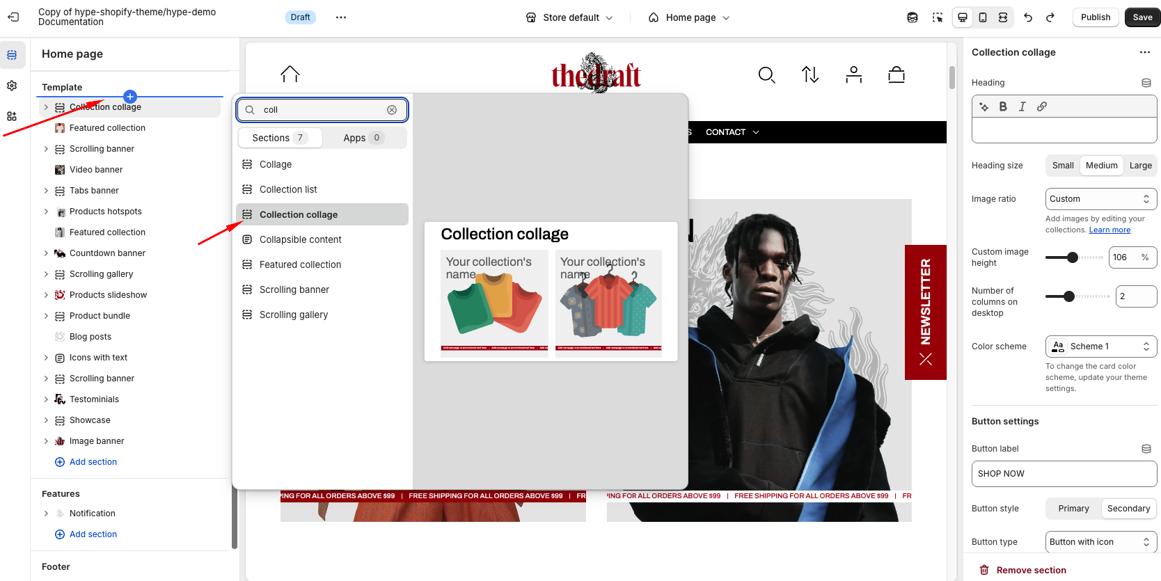
- On any theme template, click “Add section”
- Search and select “Collection Collage”
To insert a new section between existing ones, follow the steps in the article "Sections and blocks" and locate the section titled “How to add a section”.
How to configure the Collection Collage section
Basic Components
The “Collection Collage ” section consists of two primary components:
- General settings – These control the overall settings of the section.
- Block – Each block has its own individual settings.
General settings
| Setting | Description |
| Heading | To add a main section heading, simply enter the text in the provided field. In the top menu of the field, you can find options to customize the heading, such as making it bold, italic, or adding a hyperlink. |
| Heading size | The heading size setting offers three options to control the size of your section heading:
|
| Image ratio | The “Image ratio” setting allows you to control how images are displayed on your website based on their width-to-height ratio. You have several options to adjust the collection image's appearance near its products:
|
| Custom image height | Adjust the image height to fit your preferences simply by using the slider. |
| Number of columns on desktop | The “Number of columns on desktop” setting allows you to select the number of columns in which your content will be displayed on larger screens and on tablets. You can select from 1 to 4. |
| Color scheme | Select a color scheme from the list and customize it with appropriate colors for text, headings, buttons, and background. Applying a color scheme to the entire collection list section (excluding the collection columns) automatically updates all related colors based on the settings defined in the theme's color schemes. |
Button settings
| Button label | Decide whether the section includes a button:
|
| Button style | In Shopify, Button style can be customized by using the primary and secondary button color sets, which are defined in the theme settings. These color sets allow you to style buttons consistently across your store. |
|
Button type
|
Button type: Choose how the button will be displayed:
|
| Icon | Select an icon from the dropdown list; it will be displayed in the button before the text. |
Mobile layout
| Setting | Description |
| Number of columns on mobile | Choose the view of the column on mobile:
|
Section paddings
| Setting | Description |
| Top padding | The 'Top padding' setting allows you to adjust the amount of space at the top of the section using a slider. |
| Bottom padding | The 'Bottom padding' setting functions similarly to the “Section top padding” setting, but controls the space at the bottom of the section. |
| Top padding mobile | The 'Top padding mobile' setting allows you to adjust the amount of space at the top of the section specifically for mobile devices, using a slider. |
| Bottom padding mobile | The 'Bottom padding mobile' setting works similarly to the 'Top padding mobile' setting but controls the space at the bottom of the section for mobile devices. |