Showcase settings
Showcase section is a section that includes text content, a button, and a set of images that smoothly move in a circular loop.
The unique feature of this section is the unique shape to the images, which additionally draws users’ attention.
Demo Example:

How to access the Showcase section
Access this section through the theme customizer:
- Navigate to Online Store > Themes
- Select “Customize” on your active theme
- On any theme template, click “Add section”
- Search and select “Showcase”
To insert a new section between existing ones, follow the steps in the article "Sections and blocks" and locate the section titled “How to add a section”.
How to configure the Showcase section
Basic Components
The “Showcase” section consists of wo primary components:
- General settings – These control the overall settings of the section.
- Item block – Each slide has its own individual settings.
To insert a new block between existing ones or to add a block when none have been added yet, refer to the article "Sections and blocks" and locate the section titled “How to add a block”.
General settings
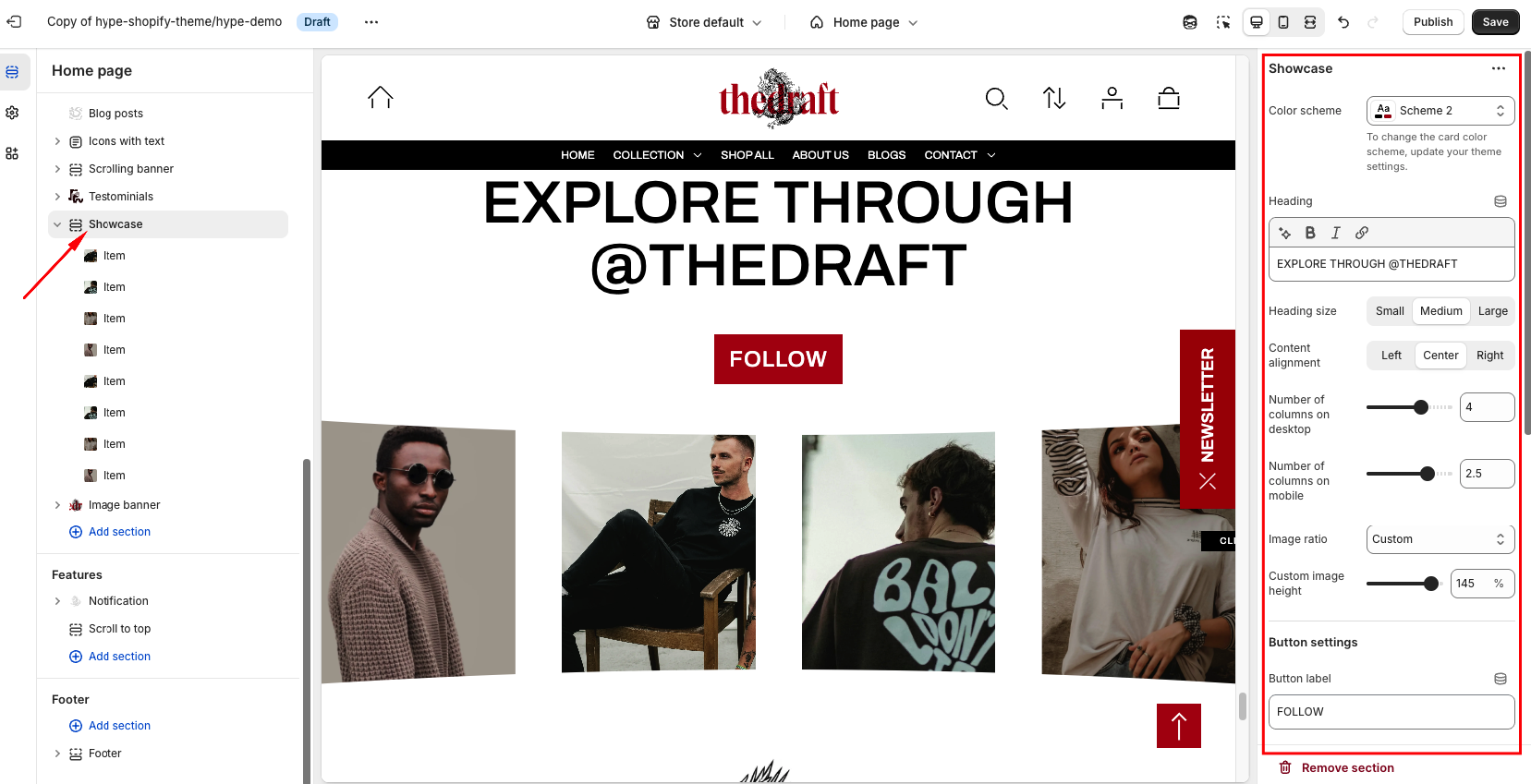
| Setting | Description |
| Color scheme | Apply Color Schemes:
|
| Heading | To add a main section heading, simply enter the text in the provided field. In the top menu of the field, you can find options to customize the heading such as making it bold, italic, or adding a hyperlink. |
| Heading size | The heading size setting offers three options to control the size of your section heading:
|
| Content alignment | The option allows you to choose the horizontal alignment of the heading and button. Simply select one of the three options:
|
| Number of columns on desktop | Specifies the number of columns to display in the section when viewed on a desktop. Adjust this setting to control how many items are shown side by side on larger screens. |
| Number of columns on mobile | Specifies the number of columns to display on mobile devices. Typically, you may choose to reduce the number of columns for better layout optimization on smaller screens. |
| Image ratio | Image Ratio controls how your images look based on their shape. Here are the options:
|
| Custom image height | Set a custom image ratio and adjust its height using a convenient slider. |