Icon with text settings
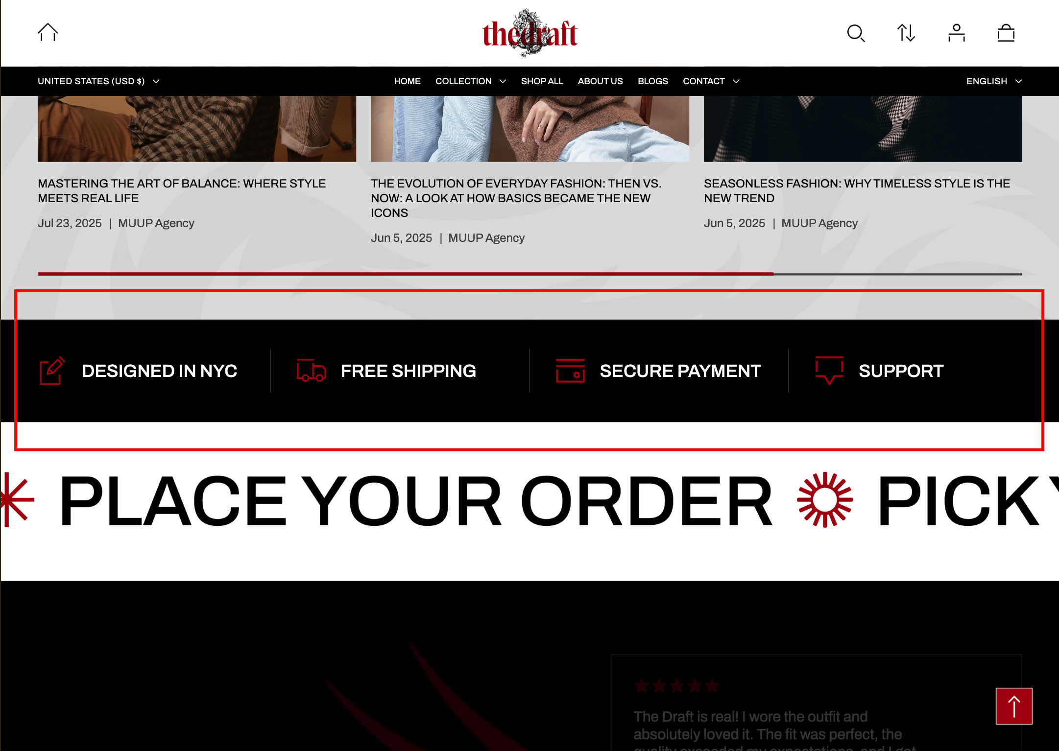
This guide describes the Icon with text section — a layout block that pairs icons with short text descriptions.
Use the section to highlight key features, benefits, or steps. Each icon visually represents the content next to it, making information easy to scan and understand.
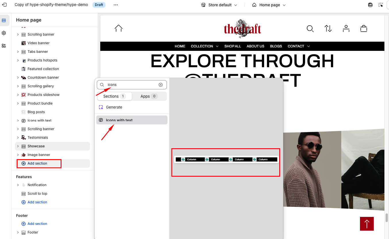
How to access Icon with text section
Access this section through the theme customizer:
- Navigate to Online Store > Themes
- Select “Customize” on your active theme
- On any theme template, click “Add section”
- Search and select “Icon with Text”
To insert a new section between existing ones, follow the steps in the article "Sections and blocks" and locate the section titled “How to add a section”.
How to configure the Icon with text section
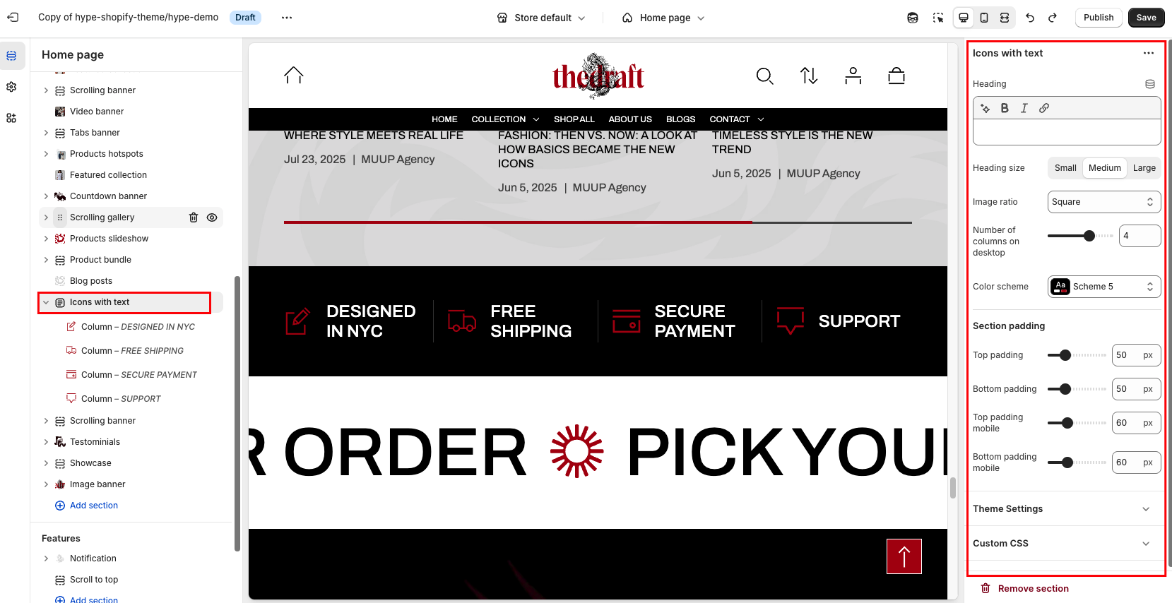
Basic Components
The “Icon with text” section consists of two primary components:
- General settings – These control the overall settings of the section.
- Block – Each block has its own individual settings.
General settings
| Settings | Description |
| Heading | This field is for adding a heading to the section. In the top menu of the field, you can find options to customize the heading. Furthermore, you can click the dynamic source button to insert a dynamic source as the heading of the section. |
| Heading size | The heading size setting offers three options to control the size of your section heading:
|
| Image ratio | Use Adapt to Image for flexibility when the source images vary in shape. Choose Portrait for elegant vertical layouts, such as a profile or photo gallery. Opt for Square to maintain consistency in design grids or when images need uniform sizing. |
| Number of columns on desktop | The “Number of columns on desktop” setting allows you to select the number of columns in which your content will be displayed on larger screens, and on tablets. You can select from 2 to 5. |
| Color scheme | Apply color scheme for section:
|
Section padding
| Setting | Description |
| Top padding | The 'Top padding' setting allows you to adjust the amount of space at the top of the section using a slider. |
| Bottom padding | The 'Bottom padding' setting functions similarly to the “Section top padding” setting, but controls the space at the bottom of the section. |
| Top padding mobile | The 'Top padding mobile' setting allows you to adjust the amount of space at the top of the section specifically for mobile devices, using a slider. |
| Bottom padding mobile | The 'Bottom padding mobile' setting works similarly to the 'Top padding mobile' setting but controls the space at the bottom of the section for mobile devices. |