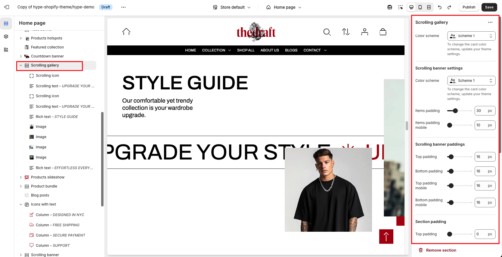
Scrolling gallery settings
This section combines three key components:
- Scrolling text with icons – a dynamic way to present promotional offers, discounts, product features, or any other commercial information.
- Image blocks – attract users’ attention and help style the section effectively.
- Text block with a button – highlights specific information and guides customers toward a purchase or another destination via the button.
Unique feature: The section includes animation — the content scrolls from right to left as the user navigates down the page.
Mobile view: On mobile devices, the section has a static layout (without horizontal scrolling) to improve the user experience on smaller screens.
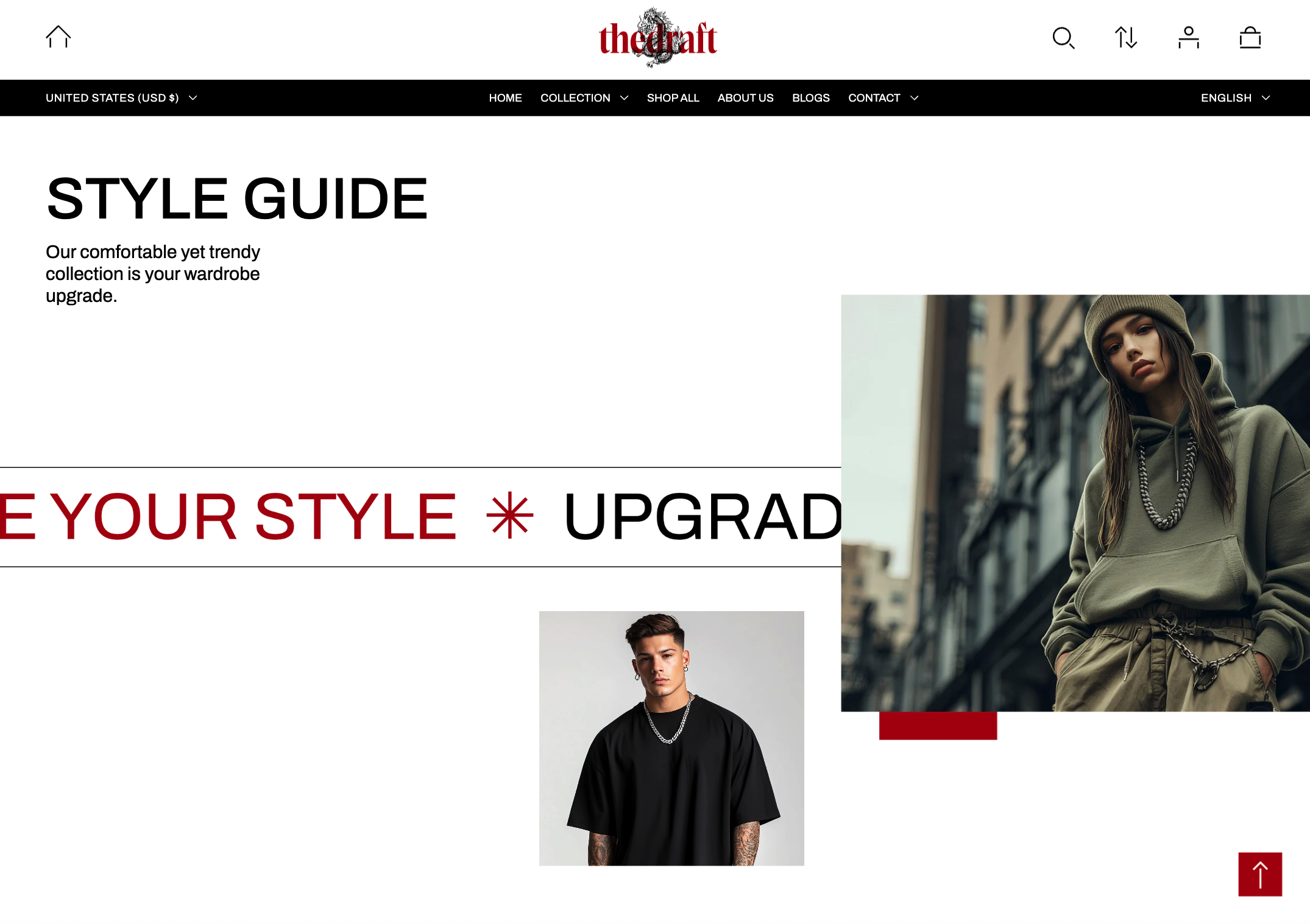
The first part of the section↓
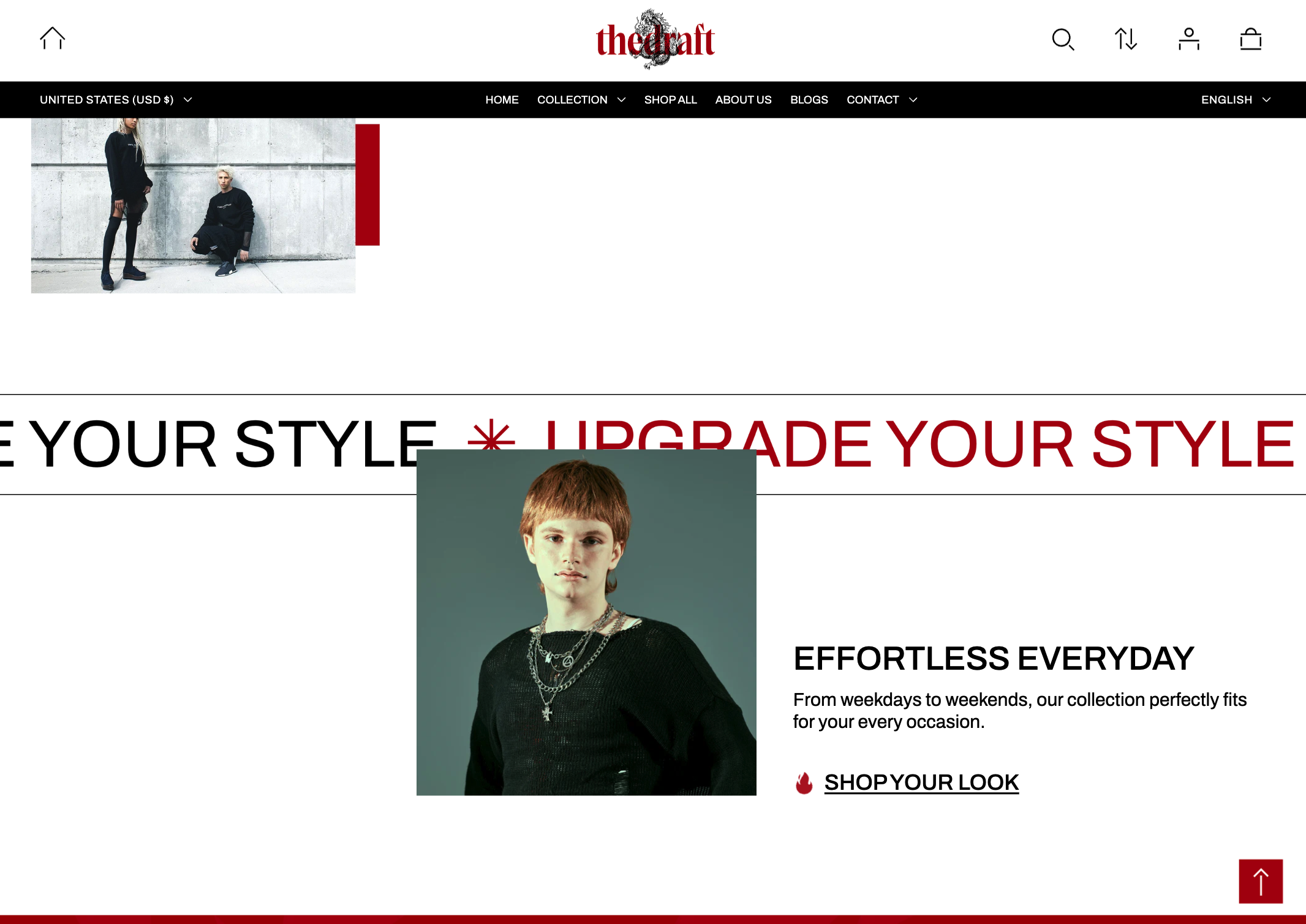
The second part of the section (becomes visible when scrolling down the page) ↓
How to access the Scrolling gallery section
Access this section through the theme customizer:
- Navigate to Online Store > Themes
- Select “Customize” on your active theme
- On any theme template, click “Add section”
- Search and select “Scrolling gallery”
To insert a new section between existing ones, follow the steps in the article "Sections and blocks" and locate the section titled “How to add a section”.
How to configure the Scrolling gallery section
Basic Components
The “Scrolling gallery” section consists of three primary components:
- General settings – These control the overall settings of the section.
- Scrolling icon - You can add an icon to the scrolling text and customize it.
- Scrolling text - Settings for adding and customizing the scrolling text.
- Rich text - This is a block that allows you to add text content and a button.
- Image - Settings for adding and positioning images.
To insert a new block between existing ones or to add a block when none have been added yet, refer to the article "Sections and blocks" and locate the section titled “How to add a block”.
General settings
|
Settings
|
Description
|
|
Color scheme
|
The option allows you to choose a color scheme for the section.
You can apply different color schemes to your store:
|
Scrolling banner settings
|
Settings
|
Description
|
|
Color scheme
|
The option allows you to choose a color scheme for the scrolling strip with text and icons.
You can apply different color schemes to your store:
|
|
Items padding
|
Adjust the gap between scrolling items, such as the space at the end of scrolling text when it starts again, to a different scrolling text block or the spacing between scrolling text and an icon. |
|
Items padding mobile
|
Adjust the gap between scrolling items on mobile, such as the space at the end of scrolling text when it starts again, to a different scrolling text block or the spacing between scrolling text and an icon. |
Scrolling banner paddings
|
Setting
|
Description
|
|
Top padding
|
The 'Top padding' setting allows you to adjust the amount of space at the top of the scrolling strip with text and icons using a slider.
|
|
Bottom padding
|
The 'Bottom padding' setting functions similarly to the 'Top padding' setting but controls the space at the bottom of the scrolling strip with text and icons.
|
|
Top padding mobile
|
The 'Top padding mobile' setting allows you to adjust the amount of space at the top of the scrolling strip with text and icons specifically for mobile devices using a slider.
|
|
Bottom padding mobile
|
The 'Bottom padding mobile' setting works similarly to the 'Top padding mobile' setting but controls the space at the bottom of the scrolling strip with text and icons for mobile devices.
|
Section padding
|
Setting
|
Description
|
|
Top padding
|
The 'Top padding' setting allows you to adjust the amount of space at the top of the section using a slider.
|
|
Bottom padding
|
The 'Bottom padding' setting functions similarly to the 'Section top padding' setting but controls the space at the bottom of the section.
|
|
Top padding mobile
|
The 'Top padding mobile' setting allows you to adjust the amount of space at the top of the section specifically for mobile devices using a slider.
|
|
Bottom padding mobile
|
The 'Bottom padding mobile' setting works similarly to the 'Top padding mobile' setting but controls the space at the bottom of the section for mobile devices.
|
Desktop background image
| Setting | Description |
|
Image
|
Choose a background image for your Scrolling gallery. Click on “Select Image” to access your media library, upload a new image, or explore free images. Also, you can connect a dynamic source by clicking the source button. Once an image is added, you can use the “Change” button to remove, replace, or delete it. |
| Image fit | “Media fit” refers to how background images are sized and displayed within their respective containers on a web page. Two options for Media fit:
|