Rich text
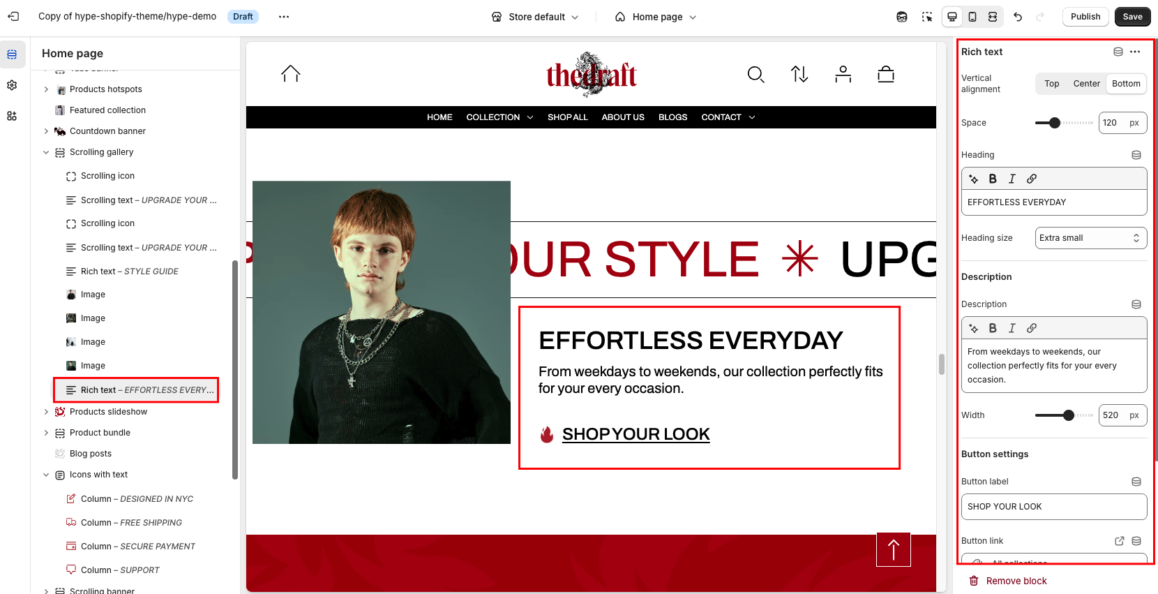
| Setting | Description |
| Vertical alignment | The option allows you to choose the vertical placement of the block relative to other blocks. Select one of the three available options:
|
| Space | Adjust the horizontal distance from this block to the next block. Simply use the slider to select your desired spacing. |
| Heading | This field is for adding a heading to the block. The heading will be displayed on the left side of the image. In the top menu of the field, you can find options to customize the heading. Furthermore, you can click the dynamic source button to insert a dynamic source as the heading of the section. |
| Heading size | The heading size setting offers three options to control the size of your block heading:
|
Description settings
| Setting | Description |
| Description | To add a description to the block, simply enter the text in the provided field. In the top menu of the field, you can find options to customize text, such as making its font bold or light, italic, or adding a hyperlink. Additionally, you can use the style of headings from H1 to H6 to the body text. Furthermore, you can click the dynamic source button to insert a dynamic source as the description of the section. |
| Width | The option allows you to control the width of the description. Select your desired width using the slider. |
Button settings
| Setting | Description |
| Button label | Decide whether the section includes a button:
|
| Button link (paste a link or search) | Input the URL you want the button to direct to, or select a page from the dropdown list of options that appears when you click on the field. Also, you can click the source button to add a dynamic source as a URL. |
| Button style | In Shopify, Button style can be customized by using the primary and secondary button color sets, which are defined in the theme settings. These color sets allow you to style buttons consistently across your store. |
|
Button type
|
Button type: Choose how the button will be displayed:
|
| Icon | Select an icon from the dropdown list; it will be displayed in the button before the text. |