Shipping information settings
| Setting | Description |
|
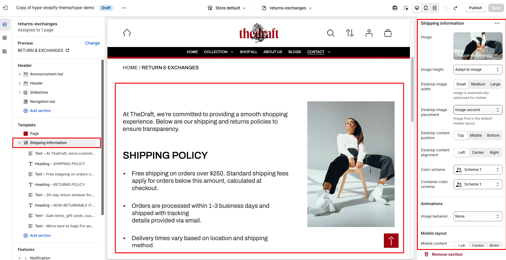
Image
|
Choose a image for your shipping information section. Click on “Select Image” to access your media library, upload a new image, or explore free images. Also, you can connect a dynamic source by clicking the source button. Once an image is added, you can use the “Change” button to remove, replace, or delete it. |
|
Image height
|
Use this option to adjust the image height:
|
| Desktop image width | Use this option to set how wide the image appears on desktop screens. You can choose from different width settings to control how much space the image takes within the layout:
*Note: Image is automatically optimized for mobile. |
| Desktop image placement | Adjust the placement of the image on the desktop view:
*Note: Image first is the default mobile layout. |
| Desktop content position | Select the vertical alignment of the content:
|
| Desktop content alignment | You have three alignment options to align content horizontally on desktop:
|
| Color scheme | This option allows you to select a color scheme for the entire section. You can apply different color schemes to your store:
|
| Container color scheme | Choose a color scheme to customize the colors for text blocks. To keep the entire section in a consistent color style, select the same color scheme for both the section and the container. |
Animations
| Setting | Description |
| Image behavior | Choose how the image behaves:
|
Mobile layout
| Setting | Description |
| Mobile content alignment | Choose the horizontal alignment of the content on mobile:
|
Section padding
| Setting | Description |
| Top padding | The 'Top padding' setting allows you to adjust the amount of space at the top of the section using a slider. |
| Bottom padding | The 'Bottom padding' setting functions similarly to the “Section top padding” setting, but controls the space at the bottom of the section. |
| Top padding mobile | The 'Top padding mobile' setting allows you to adjust the amount of space at the top of the section specifically for mobile devices, using a slider. |
| Bottom padding mobile | The 'Bottom padding mobile' setting works similarly to the 'Top padding mobile' setting but controls the space at the bottom of the section for mobile devices. |
Demo example: