Achievements settings
This guide describes the Achievements section.
The Achievements section is designed to highlight key accomplishments and performance metrics of your online store. It provides a clear and accessible way to present statistics, milestones, or other important information that helps demonstrate the success and growth of your business.
How to access the Achievements section
Access this section through the theme customizer:
- Navigate to Online Store > Themes
- Select “Customize” on your active theme
- On any theme template, click “Add section”
- Search and select “Achievements”
To insert a new section between existing ones, follow the steps in the article "Sections and blocks" and locate the section titled “How to add a section”.
How to configure the Achievements section
Basic Components
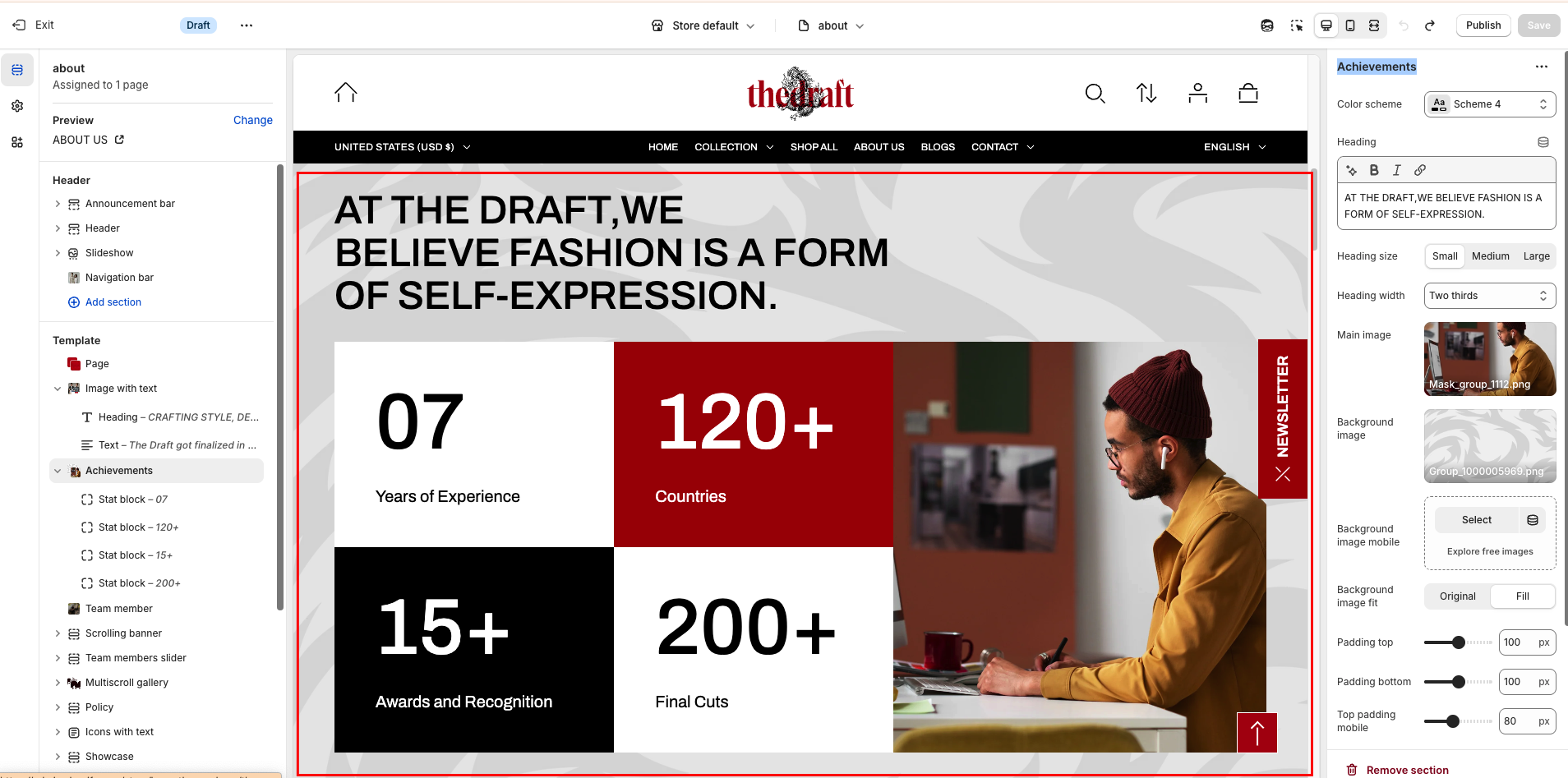
The “Achievements” section consists of two primary components:
- General settings – These control the overall settings of the section.
- Stat block – Each block has its own individual settings.
To insert a new block between existing ones or to add a block when none have been added yet, refer to the article "Sections and blocks" and locate the section titled “How to add a block”.
General settings
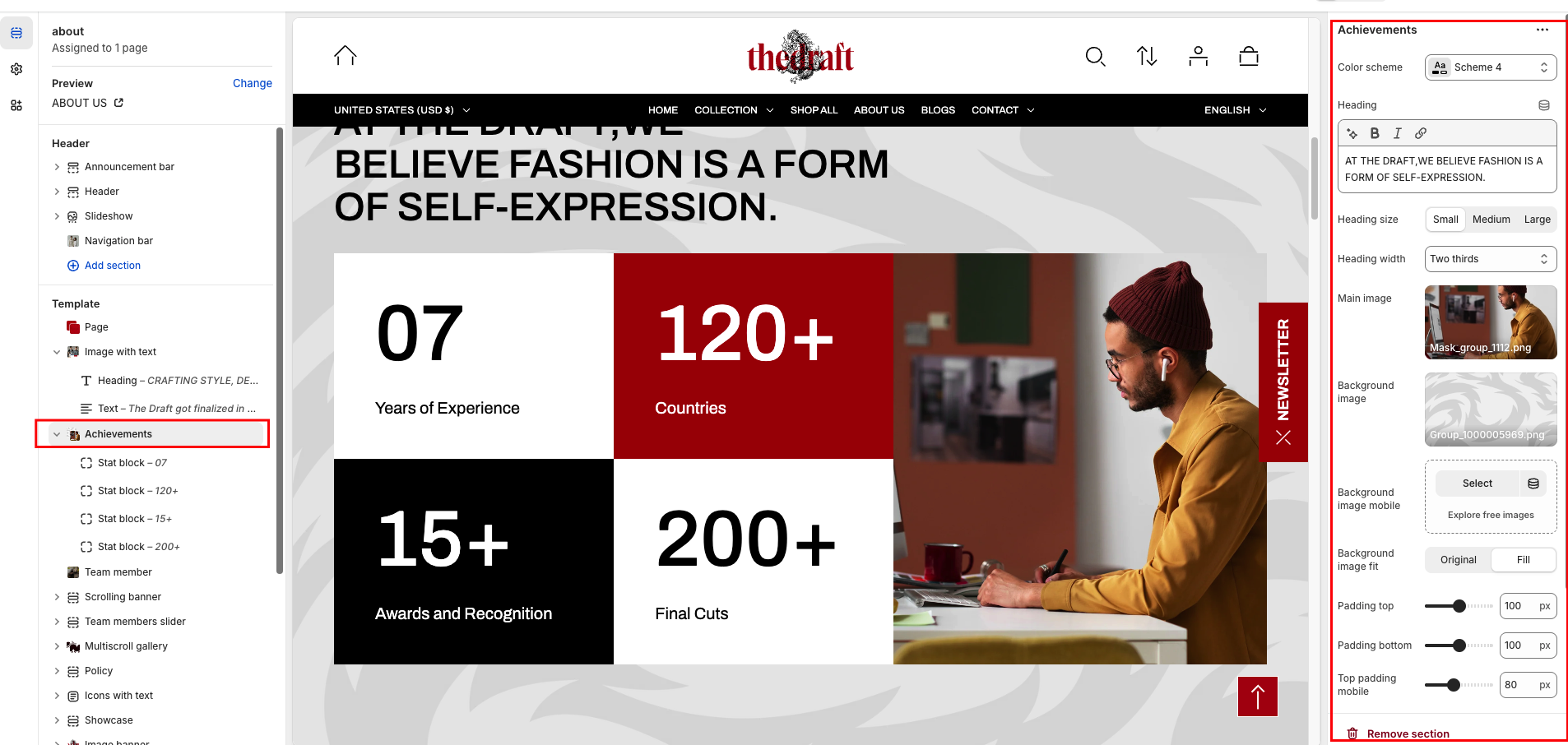
| Settings | Description |
| Color scheme | Select a color scheme from the list and customize it with appropriate colors for text, headings, buttons, and background. Applying a color scheme to the entire collection list section (excluding the collection columns) automatically updates all related colors based on the settings defined in the theme's color schemes. |
| Heading | To add a main section heading, simply enter the text in the provided field. In the top menu of the field, you can find options to customize the heading, such as making it bold, italic, or adding a hyperlink. |
| Heading size | The heading size setting offers three options to control the size of your section heading:
|
| Heading width | This option allows you to define how wide the section heading will appear on the page. You can choose from three layouts:
|
| Main image | Choose an image to display next to the blocks. Click on “Select Image” to access your media library, upload a new image, or explore free images. Also, you can connect a dynamic source by clicking the source button. Once an image is added, you can use the “Change” button to remove or replace it. |
| Background image | This option allows you to upload an image that will be displayed as the background for the whole section. |
|
Background image mobile
|
You can use a landscape image for desktop and a square or portrait image for mobile. This allows you to add an image with the appropriate ratio for each device, ensuring optimal display. |
| Background image fit | “Media fit” refers to how background images are sized and displayed within their respective containers on a web page. Two options for Media fit:
|
| Top padding | The 'Top padding' setting allows you to adjust the amount of space at the top of the section using a slider. |
| Bottom padding | The 'Bottom padding' setting functions similarly to the “Section top padding” setting, but controls the space at the bottom of the section. |
| Top padding mobile | The 'Top padding mobile' setting allows you to adjust the amount of space at the top of the section specifically for mobile devices, using a slider. |
| Bottom padding mobile | The 'Bottom padding mobile' setting works similarly to the 'Top padding mobile' setting but controls the space at the bottom of the section for mobile devices. |