Product card settings
| Setting | Description |
| Color scheme | Applying a color scheme from the available list to product cards automatically updates all associated colors—such as background, heading, price, and compare button—across all product cards on your site. |
| Card background |
Background
Background Secondary
|
| Card style |
|
| Media size |
Choose product image size:
|
| Custom media size | Set a specific custom size for the product image. |
| Heading size |
Choose the product heading size:
|
| Heading font |
In Theme Settings → Typography → Fonts, you can select a font family from the list and choose the font weight at the end of the list separately for Heading, Body, and Accent text. Based on these settings, each block allows you to select which font style is applied.
|
| Heading color |
Each color scheme includes Heading, Text, and Accent color settings. Use this dropdown to select which color to apply. The available options may vary depending on the selected block color scheme.
|
| Heading text style |
Choose a text style for the heading:
|
| Show vendor |
Click “Show vendor” to display the product vendor on product cards in this section. Note: The product vendor must first be added on the product page in the admin. |
| Show type |
Click “Show type” to display the product type on product cards in this section. Note: The product type must first be added on the product page in the admin. |
| Show price | Click “Show price” to display the product price. |
| Show variant picker |
Display color/size swatches on product cards. After enabling this option, all options below will be visible in settings. |
| Variant picker type |
|
| Show variant popup button | Enable this option to display a button that opens a variant selection popup. The button appears when hovering over a product card. In the demo store, this popup is used to display sizes, but it can show size, color, or another single variant option. |
| Variant popup option names | Enter variant option names separated by commas (for example, Size, Sizes). This allows different option names—such as shoe size, dress size, or pants size—to be displayed in the popup, depending on the product. |
| Variant popup title | Enter a custom title for the variant selection popup. |
| Show compare button | Enable this toggle to display a compare button. After clicking the button, customers can add products to the compare modal and view product details side by side in the compare popup. |
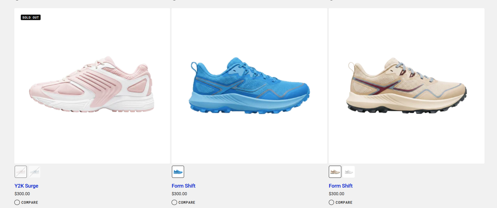
Demo store's product card
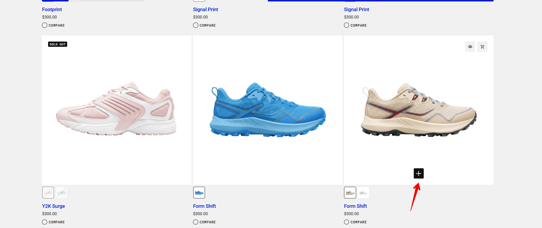
Product card on hover
Variant popup button
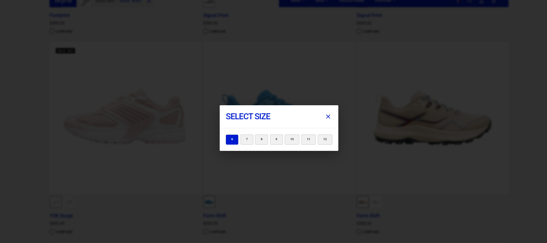
Variant popup
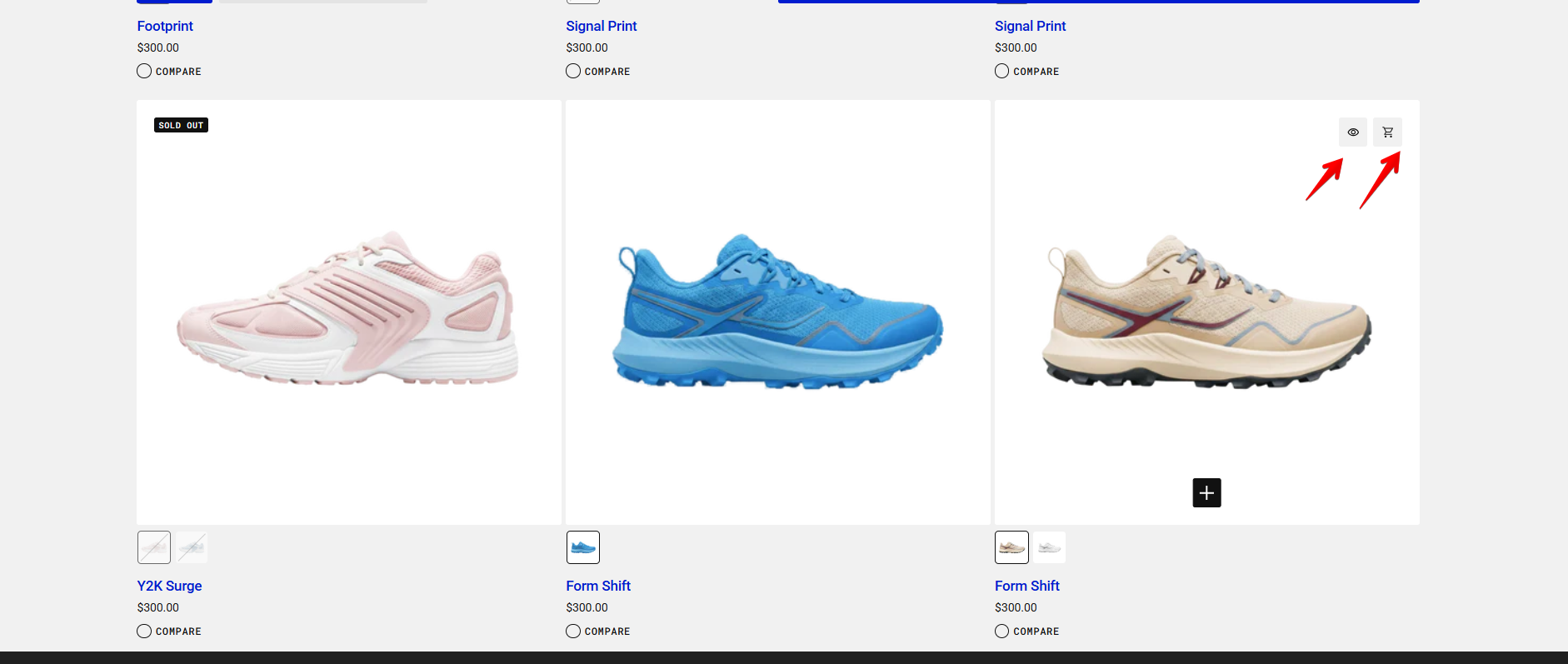
- First icon: Opens the Quick View popup with all product variants and product details.
- Second icon (Cart): Adds the selected product or product variant to the cart when clicked.
How to Add a Product Variant to the Cart
For a product with color and size options, you can add a variant to the cart in two ways:
Method 1: Using the Variant Popup
- Click on the desired color from the swatches below the product image.
- Hover over the product image and click the variant popup button.
- Select the size in the popup and close it.
- Click the cart icon to add this specific variant to the cart.
Method 2: Using Quick View
- Hover over the product image and click the quick view icon.
- Choose the desired variant in the quick view popup.
- Click Add to Cart to add it to the cart, or Buy It Now to proceed directly to the checkout page.