Collection block
| Setting | Description |
| Collection | Select the collection you want to showcase in the collection list. |
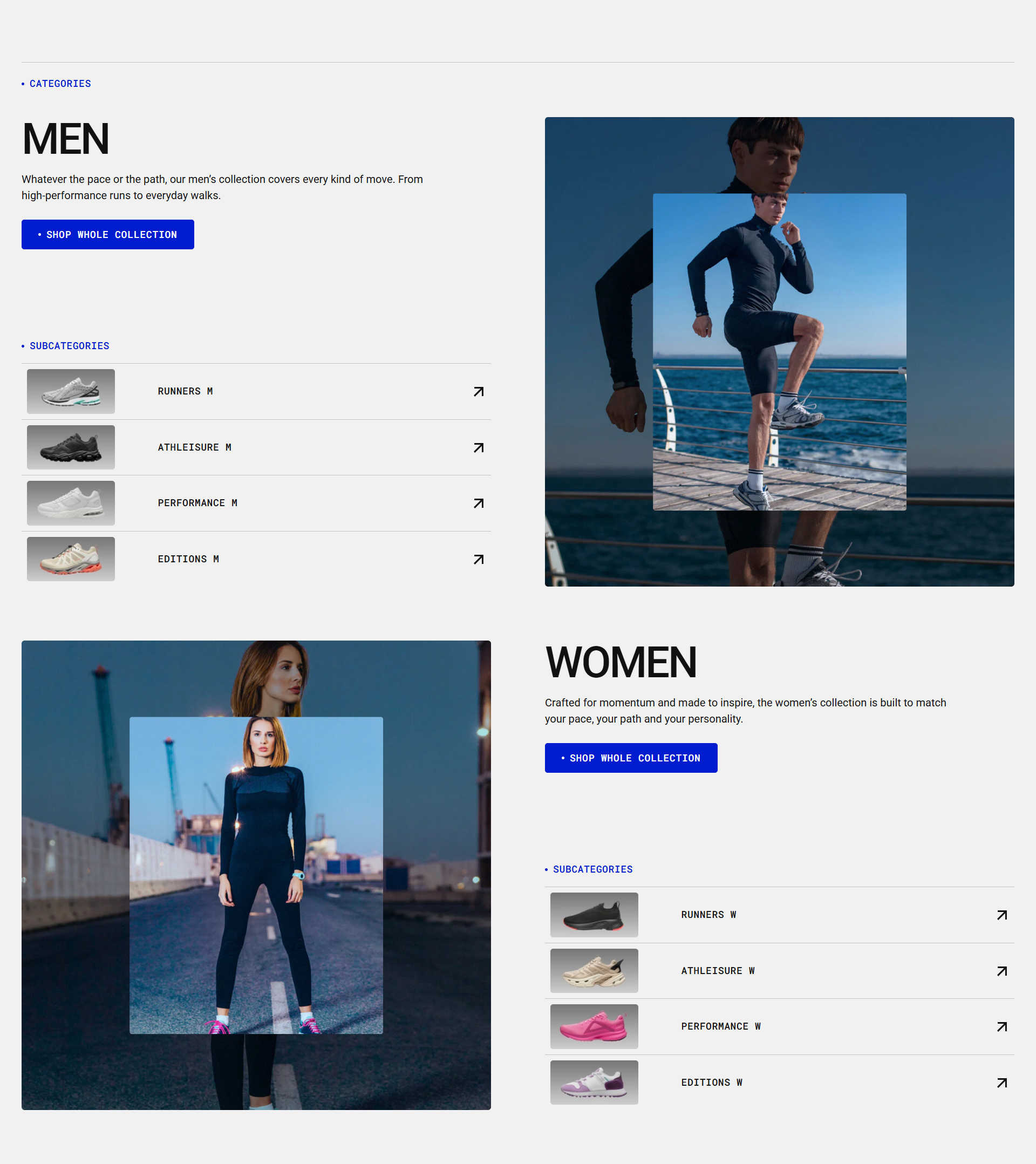
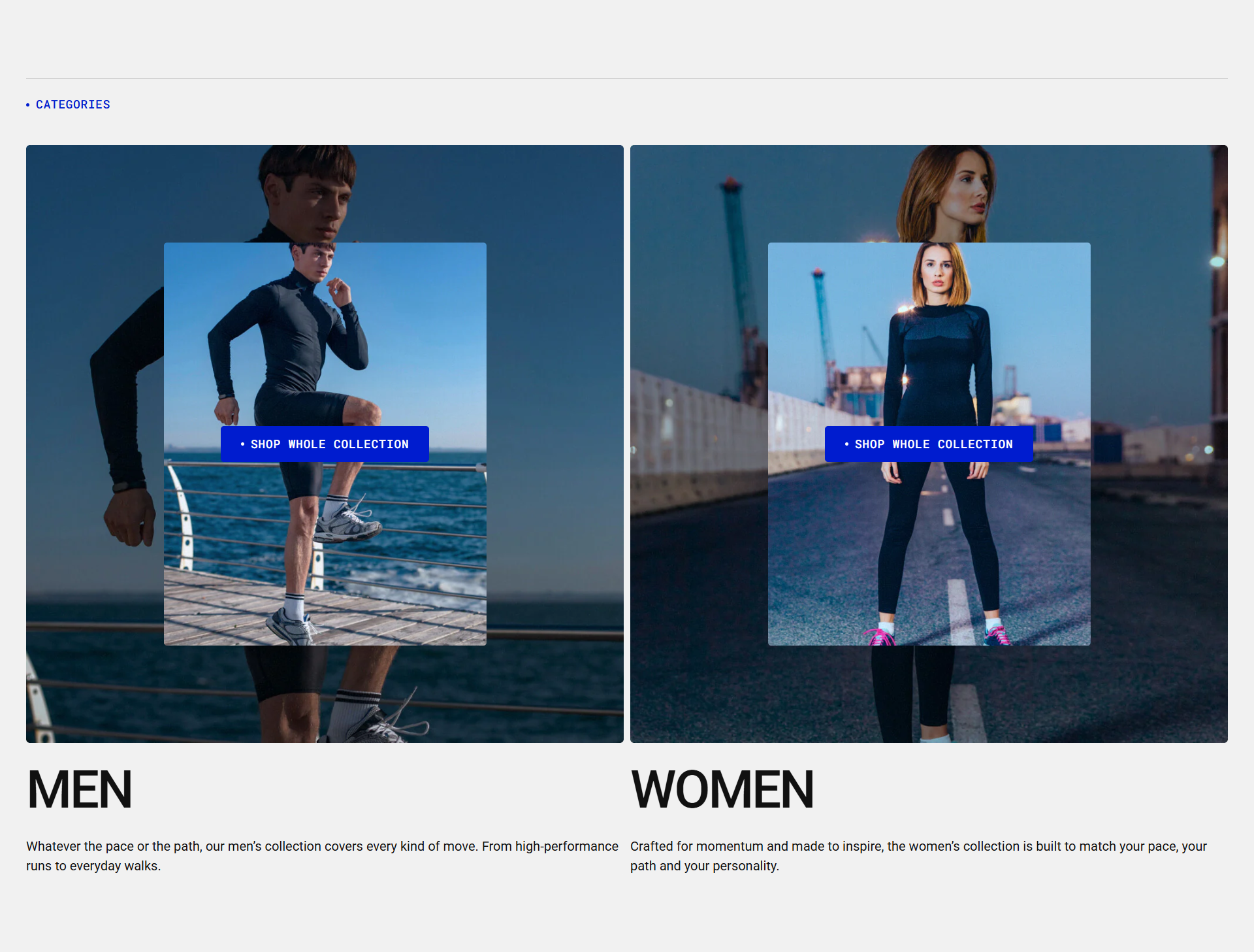
| Custom image |
Choose the main image for the collection. By default, the image set on the collection page in the admin panel will be shown. If no image is set there, the first product image from the collection will be used. You can upload a custom image to better match your section design. |
| Overlay image | Add a smaller image that will be displayed on top of the main collection image to create a more visually appealing layout. |
| Overlay image ratio |
You can adjust the ratio of a small custom image placed on top of the main collection image. Available options:
|
| Custom name |
Enable the Show collection name toggle in the collection list section settings to display the collection name from the admin page. You can then enter a custom name here to override the default collection name. |
| Custom description |
Enable the Show collection description toggle in the collection list section settings to display the collection description from the admin page. You can then enter a custom description here to override the default collection description. |
| Custom button label |
Enable the Show button toggle in the collection list template settings to display the button. Then add a button label to showcase button at the top of the images. |
| Custom button link | By default, the button links to the collection page. You can replace it with a custom link by entering an external URL or selecting a different internal page from the list. |
| Subcollections list |
You can add collections that include subcollections. Add them to this list, and when the desktop layout uses a single column per row, the subcollections will appear next to the collection. Please refer to the demo example. Each newly added collection is displayed in an alternating (checkerboard) layout:
|