Not found template
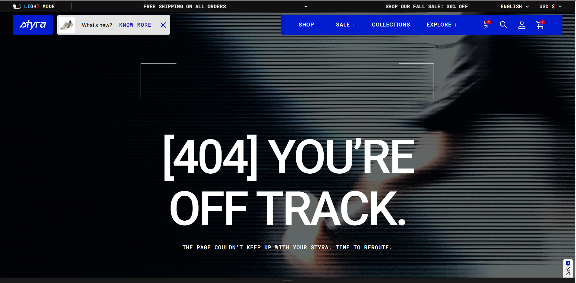
| Setting | Description |
| Color scheme |
Apply color scheme for the 404 (Not found) template from the available color schemes list. Read 'Color scheme' article to learn more about color schemes. |
| Show banner media | Enable this option to display banner media (image or video). If disabled, the background from the selected color scheme will be shown instead. |
| Media type |
Choose the type of media to display in the banner: Image: Displays a banner image Video: Displays a banner video. |
| Image | The Image option becomes available after selecting Image as the media type. Upload or select the image to display on the page. |
| Mobile image |
The Mobile image option becomes available after selecting Image as the media type. Upload a separate image optimized for mobile devices. |
| Video | The Video option becomes available after selecting Video as the media type. You can then choose a video using the Select option. |
| Media overlay opacity | Adjust the transparency level of the overlay applied to the media to improve the visibility of content displayed on top of it. |
Heading and description
Read the "Heading and description" article to view the full list of available options related to headings and descriptions.
| Setting | Description |
| Custom heading |
Enter a custom heading to replace the default heading. Leave this field blank to use the default heading. |
| Custom description |
Enter a custom description to display under the heading. Leave this field blank to use the default description. |
Button settings
| Setting | Description |
| Custom button label | The default label is “Back to Shopping.” You can enter a custom label to replace the default text. |
| Custom button link | By default, the “Back to Shopping” button links to the collection page displaying all products. You can change this link to redirect users to a different page. |
| Button style |
Choose the button’s appearance:
|
| Button icon |
This setting lets you add a small visual indicator to your button.
|
Padding
Padding is the space inside a section that separates the content from the section’s edges.
See this article to set paddings: Section padding