Collection list settings
This guide describes the Collection list section.
This section is used to display a group of collections on a website. It allows you to organize content in a clear layout, manage card and grid settings, customize desktop and mobile views, add and customize heading, subheading, description, and include button or custom image for each collection item.
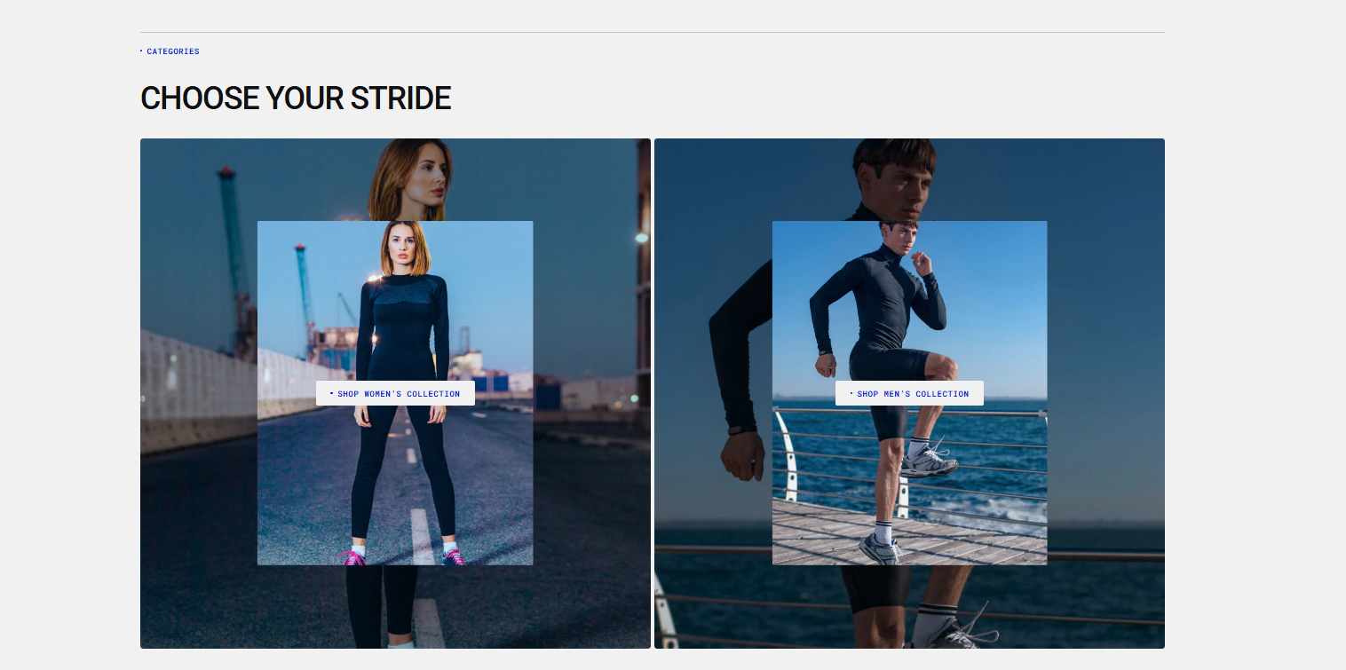
Collection list demo example
How to access the Collection list section
Access this section through the theme customizer:
- Navigate to Online Store > Themes
- Select “Customize” on your active theme
- On any theme template, click “Add section”
- Search and select “Collection List”
Note: Section cannot be added to the Password page.
To insert a new section between existing ones, follow the steps in the article "Sections and blocks" and locate the section titled “How to add a section”.
How to configure the Collection list section
Basic Components
The “Collection list” section consists of two primary components:
- General settings – These control the overall settings of the section.
- Block – Each block has its own individual settings.
Available block types include:
- Collection
General settings
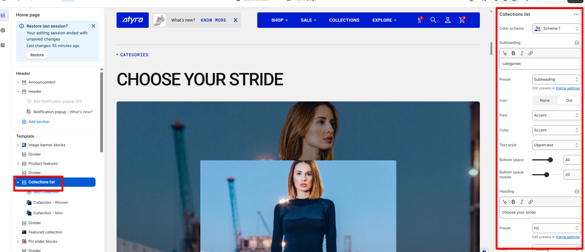
Color scheme
Apply color scheme to the section from the available list. Read Color scheme article to learn more about color schemes.
Subheading, heading, and description
Subheading, heading, and description settings are global settings that apply to the entire theme. They can be found in the Global settings category.
For more details, read this article: Subheading, heading, and description
Grid
| Setting | Description |
|
Desktop columns
|
You can display 1 to 5 collections per row. |
|
Mobile columns
|
You can display 1 or 2 collections per row. |
| Desktop horizontal spacing |
Set the space between collections in the same row. Note: The changes will be visible if there are 2 to 5 collections in a row. |
| Mobile horizontal spacing |
Set the space between collections in a row for mobile devices. Note: The changes will be visible if there are 2 collections in a row on mobile. |
| Desktop vertical spacing | Set the space between rows of collections on desktop. |
| Mobile vertical spacing | Set the space between rows of collections on mobile. |
Card settings
| Setting | Description |
| Card color scheme |
Choose color scheme from the list and apply to collection cards. It can match the section or be different, depending on the style you want:
|
| Card media color scheme | Choose a color scheme for the card media. It can apply a different background and text color for button placed on top of the image. |
| Image ratio |
You can adjust the main collection image (default or custom). Available options:
|
| Overlay image ratio |
You can adjust the ratio of a small custom image placed on top of the main collection image. Available options:
|
Collection name
| Show collection name | Enable this toggle to display the collection name below the collection image. When turned on, additional customization options for the collection name will appear. |
| Preset |
In Theme Settings → Typography → Fonts, you can set font settings for Heading, Subheading, Caption,Paragraph. Choose which style to apply in this block.
|
| Font |
In Theme Settings → Typography → Fonts, you can select a font family from the list and choose the font weight at the end of the list separately for Heading, Body, and Accent text. Based on these settings, each block allows you to choose which font style is applied.
|
| Color |
Each color scheme includes Heading, Text, and Accent color settings. Use this dropdown to select which color to apply. The available options may vary depending on the selected block color scheme.
|
| Text style |
Choose text style for preset:
|
| Name bottom space | The 'Name bottom space' option appears when you enable "Show description" toggle. It lets you adjust the space below the heading. |
| Name bottom space mobile | Adjust the space below the heading specifically for mobile devices. |
Description
| Show description | Enable this toggle to display the collection description below the collection name. When turned on, additional customization options for the collection name will appear. |
| Preset |
In Theme Settings → Typography → Fonts, you can set font settings for Heading, Subheading, Caption,Paragraph. Choose which style to apply in this block.
|
| Font |
In Theme Settings → Typography → Fonts, you can select a font family from the list and choose the font weight at the end of the list separately for Heading, Body, and Accent text. Based on these settings, each block allows you to choose which font style is applied.
|
| Color |
Each color scheme includes Heading, Text, and Accent color settings. Use this dropdown to select which color to apply. The available options may vary depending on the selected block color scheme.
|
| Text style |
Choose text style for preset:
|
Button
| Show button |
Enable this toggle to display a button that links to the collection page.
|
Padding
Padding is the space inside a section that separates the content from the section’s edges.
See this article to set paddings: Section padding