Before and after settings
Before & After Section Guide
This guide describes the Before & After section.
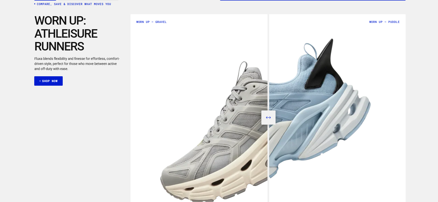
This section is ideal for comparing two products or two color variants of the same product. It can also be used to show a product in assembled and disassembled states, making internal details easier to see. The comparison is displayed using before-and-after images in a banner format.
You can add:
- A subheading, heading, and description at the top of the section. This content appears before the images and spans the full width of the section.
- Alternatively, you can keep the top area minimal (for example, only a subheading, as shown in the demo) and add the heading, description, and button inside the content blocks instead. In this case, the content will appear on the left side of the images.
- Two images to illustrate the before-and-after comparison.
Demo Example: The Before and After section displayed on the homepage, showcasing a comparison of two colors with before-and-after images.
How to access the Before and after section
Access this section through the theme customizer:
- Navigate to Online Store > Themes
- Select “Customize” on your active theme
- On any theme template, click “Add section”
- Search and select “Before and after”
Note: Section cannot be added to the Password page.
To insert a new section between existing ones, follow the steps in the article "Sections and blocks" and locate the section titled “How to add a section”.
How to configure the Before and after section
Basic Components
The “Before and after” section consists of two primary components:
- General settings – These control the overall settings of the section.
- Block – Each block has its own individual settings.
Available block types include:
By default:
- Heading, Spacer, Text, Button blocks
You can also add:
- Subheading and Divider blocks
General settings
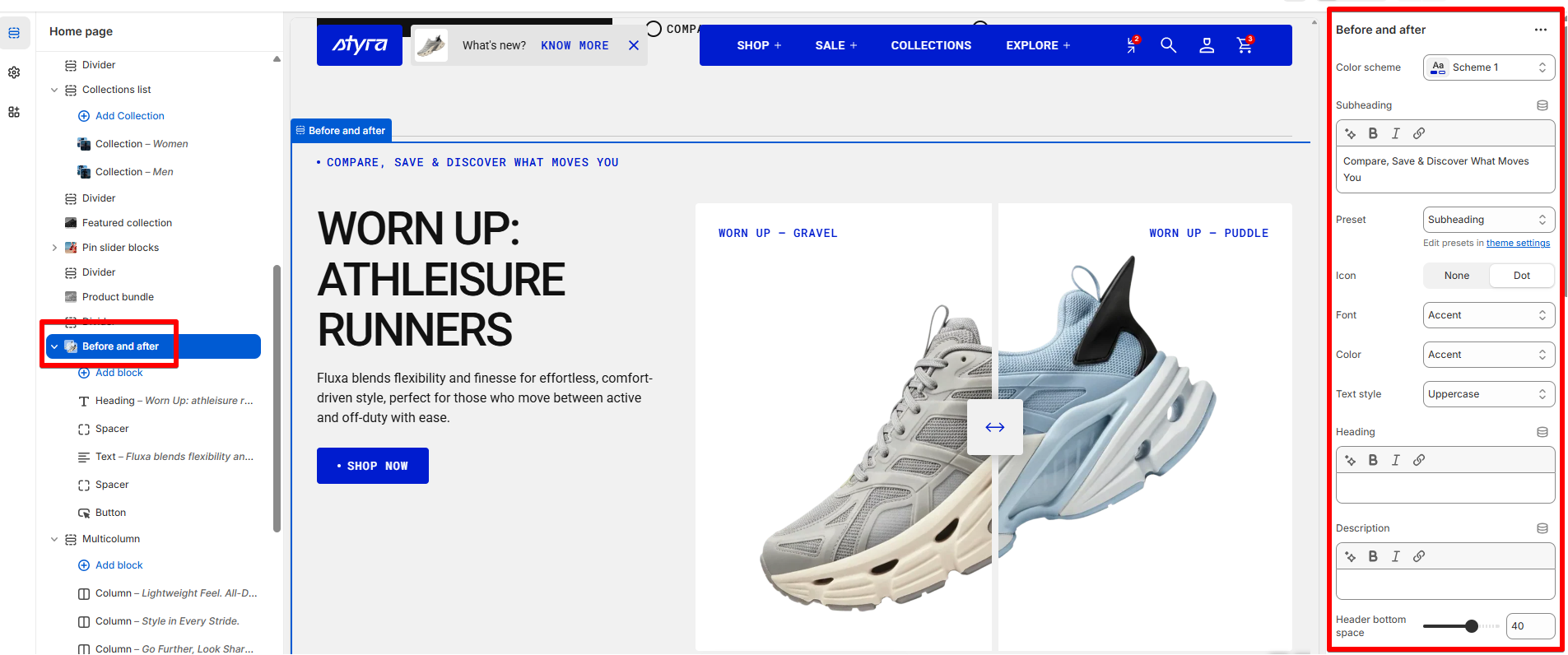
Color scheme
Read Color scheme article to learn more about color schemes.
Subheading, heading, and description in section settings
Subheading, heading, and description settings are global settings that apply to the entire theme. They can be found in the Global settings category.
For more details, read this article: Subheading, heading, and description
Before and After image settings
| Setting | Description |
| Color scheme | Add a color scheme for images to automatically apply appropriate colors to labels on the images and to the slider controls. If the images are with transparent background, the selected color will also be applied as the background for them. |
| Before image | Upload an image that will be showcased on the left side of the block (the “Before” image). |
| Before label | Add a title related to the before image. |
| After image | Upload an image that will be showcased on the right side of the block (the “After” image). |
| After label | Add a title related to the after image. |
Text customization for Before and After labels
| Setting | Description |
| Preset (Heading, Caption, and Paragraph) |
In Theme Settings → Typography → Fonts, you can set font settings for Heading, Caption, and Paragraph. Choose which style to apply in this block.
|
| Preset (Subheading) |
In Theme Settings → Typography → Fonts, you can set font settings for Subheading. Subheading: This style is used for text that appears below a main heading, typically smaller or less prominent than the heading, but still visually distinct from body text. |
| Icon (Subheading preset) |
Choose the subheading appearance in this block:
|
| Font |
In Theme Settings → Typography → Fonts, you can select a font family from the list and choose the font weight at the end of the list separately for Heading, Body, and Accent text. Based on these settings, each block allows you to choose which font style is applied.
|
| Color |
Each color scheme includes Heading, Text, and Accent color settings. Use this dropdown to select which color to apply. The available options may vary depending on the selected block color scheme.
|
| Text style |
Choose text style for preset:
|
Padding
Padding is the space inside a section that separates the content from the section’s edges.
See this article to set paddings: Section padding