Featured blog settings
This guide describes the section with blog posts.
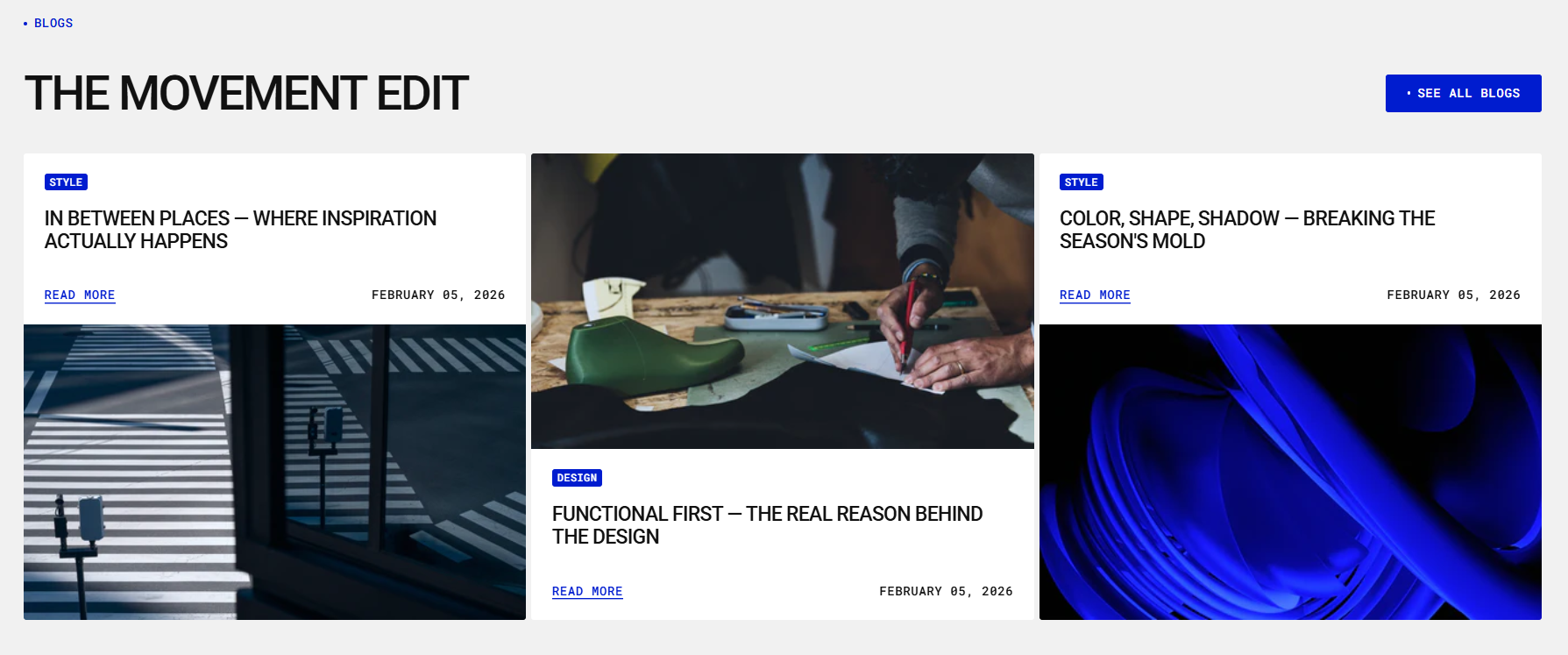
The Featured blog section allows you to feature selected blog articles on your store’s pages. It helps you engage your audience with relevant content, improve SEO, and drive traffic to your blog.
Key Features:
Content Settings
- Add and customize section subheading, heading and description to introduce your blog content.
- Choose to display posts from a specific blog category.
Layout Options
- Select the number of blog posts to display.
- Choose Layout style: Grid or Carousel and number of columns to show on desktop and mobile.
- Customize article card: image and content
- Choose whether to show featured image, date, author, and excerpt.
Design Customization
- Modify padding, and color scheme to match your brand.
Demo Example:
The Blog Posts section is displayed on the homepage, showcasing selected articles to engage visitors and drive traffic to the blog.
How to access the Blog posts section
Access this section through the theme customizer:
- Navigate to Online Store > Themes
- Select “Customize” on your active theme
- On any theme template, click “Add section”
- Search and select “Blog posts”
Note: Section cannot be added to the Password page.
To insert a new section between existing ones, follow the steps in the article "Sections and blocks" and locate the section titled “How to add a section”.
Once the blog posts section is added, you can customize its appearance and functionality using the available settings.
How to configure the Blog posts section
Basic Components
The “Blog posts” section consists of general settings.
To start customizing your blog posts, click on the “Blog posts” section to access its settings.
General settings
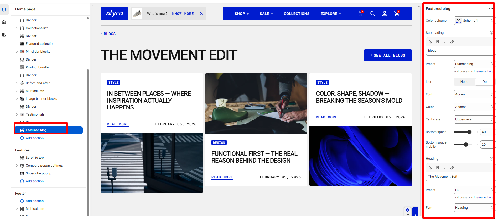
Color scheme
Read Color scheme article to learn more about color schemes.
Subheading, heading, and description
The Subheading, Heading, and Description settings are used across multiple sections, blocks, and templates. To avoid repeating this information, the article is provided in the Global settings category.
For more details, read this article: "Subheading, heading, and description"
Blog, and layout
| Setting | Description |
|
Blog
|
Select blog with blog posts to be displayed on the page, or create a new blog.
|
|
Article count
|
Choose the desired number of articles that you want to display in this section. This option allows you to control the quantity of blog posts visible to your visitors.
|
| Layout style |
The Layout Style setting lets you choose how products are displayed in the section.
|
Grid style
| Setting | Description |
|
Desktop columns
|
You can display 1 to 5 articles per row. |
|
Mobile columns
|
You can display 1 or 2 articles per row. |
| Desktop horizontal spacing | Set the space between articles in the same row. |
| Mobile horizontal spacing | Set the space between articles in a row for mobile devices. |
| Desktop vertical spacing | Set the space between rows of articles on desktop. |
| Mobile vertical spacing | Set the space between rows of articles on mobile. |
Carousel style
| Setting | Description |
|
Desktop columns
|
Choose how many articles to show per row on desktop. You can display between 1 and 5 articles. |
|
Mobile columns
|
Choose how many articles to show per row on mobile devices. You can display 1 or 2 articles. |
| Desktop horizontal spacing | Set the horizontal space between blog cards on desktop. |
| Mobile horizontal spacing | Set the horizontal space between blog cards on mobile devices. |
Button, arrows and scrollbar
| Settings | Description |
| Show view all | Display a “View All” button that allows users to navigate to the full blog listing page. |
|
View all button style
|
Choose the button’s appearance:
|
| Button icon |
This setting lets you add a small visual indicator to your button.
|
| Show arrows | Display navigation arrows for the blog post carousel when the number of articles exceeds the configured visible column count on desktop. |
| Show arrows on mobile | Display navigation arrows for the blog post carousel when the number of articles exceeds the configured visible column count on mobile devices. |
| Show scrollbar |
Display a horizontal scroll progress bar below the blog post list to indicate scroll position and allow manual scrolling. The progress bar reflects how far the user has scrolled through the blog list. |
Article card
Article card settings are global settings that apply to the entire theme. They can be found in the Global settings category.
For more details, read this article: Article card settings
Padding
Padding is the space inside a section that separates the content from the section’s edges.
See this article to set paddings: Section padding