Product bundle settings
This guide describes the Product Bundle section. The banner can use either an image or a video as its background.
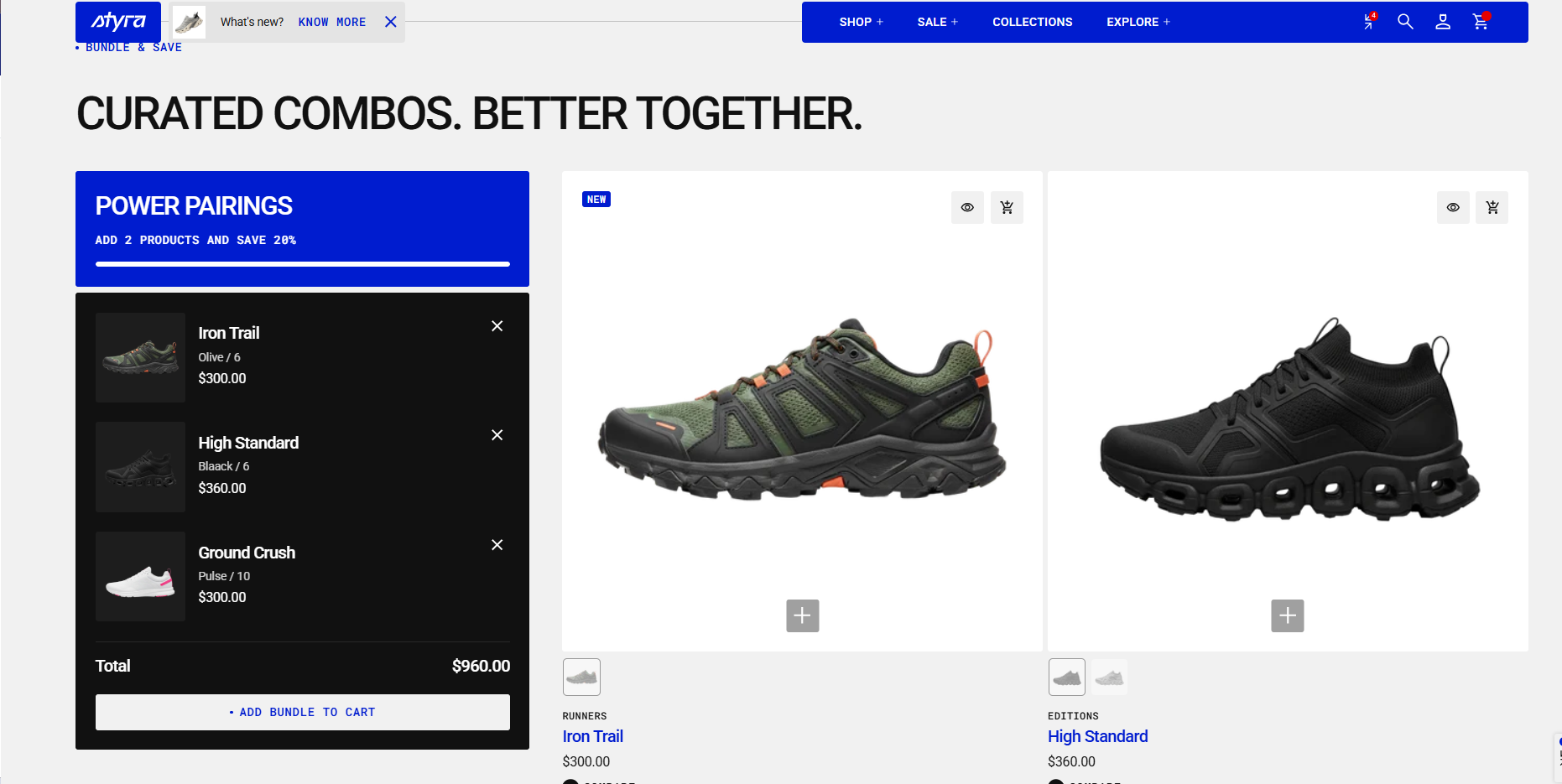
The Product Bundle section allows customers to create their own bundle by selecting multiple products from a predefined collection or from a manually created product list. The section displays available products, enables customers to add items to their bundle, and automatically updates the bundle summary, including selected products and the total price.
Customers can add products up to the defined limit, track their progress through a visual indicator, and complete the bundle using the provided action button. This section is designed to simplify product discovery while encouraging higher purchase value through customizable bundled selections.
Demo example:
How to access the Product bundle section
Access this section through the theme customizer:
- Navigate to Online Store > Themes
- Select “Customize” on your active theme
- On any theme template, click “Add section”
- Search and select “Product bundle”
Note: Section cannot be added to the Password page.
To insert a new section between existing ones, follow the steps in the article "Sections and blocks" and locate the section titled “How to add a section”.
How to configure the Product bundle section
Basic Components
The “Product bundle” section consists of general settings.
General settings – These control the overall settings of the section.
To start customizing your collection, click on the “Product bundle” section to access its settings.
General settings
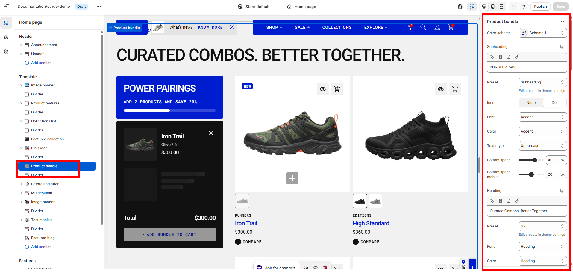
Color scheme
Read Color scheme article to learn more about color schemes.
Subheading, heading, and description
Subheading, heading, and description settings are global settings that apply to the entire theme. They can be found in the Global settings category.
For more details, read this article: Subheading, heading, and description
Bundle settings
| Setting | Description |
| Minimum items to require | You can set the minimum number of products customers need to add to the bundle, ranging from 2 to 4 items. This determines the smallest group of products that can be added to the cart. |
| Maximum items to allow | Set the maximum number of products a customer can add to the bundle, ranging from 2 to 6 items. Once the customer reaches the selected limit, the “Add to Bundle” button becomes inactive for all remaining available products. |
| Bundle header color scheme |
Apply a color scheme to the bundle header, where the heading, text, and progress bar (showing how many products have been added) are displayed. Read 'Color scheme' article to learn more about color schemes. |
| Bundle content color scheme |
Apply a color scheme to the bundle content block, including the added products, total price, and action button, using one of the available color schemes from the list. Read 'Color scheme' article to learn more about color schemes. |
| Bundle heading | The bundle heading is the main title. It helps users quickly understand what the bundle is about. |
Heading, subheading, caption, and paragraph style
| Setting | Description |
| Preset |
In Theme Settings → Typography → Fonts, you can set font settings for Heading, Caption, and Paragraph. Choose which style to apply in this block.
|
| Font |
In Theme Settings → Typography → Fonts, you can select a font family from the list and choose the font weight at the end of the list separately for Heading, Body, and Accent text. Based on these settings, each block allows you to choose which font style is applied.
|
| Color |
Each color scheme includes Heading, Text, and Accent color settings. Use this dropdown to select which color to apply. The available options may vary depending on the selected block color scheme.
|
| Text style |
Choose text style for preset:
|
| Setting | Description |
| Bundle text | The bundle text provides additional details or context about the bundle. Use it to describe features, benefits, or important information that supports the heading. |
| Button label | Add a label to your button to make it visible. This text shows the button’s purpose or the action it performs. Without a label, the button will be hidden from users. |
| Button style |
Choose the button’s appearance:
|
| Button icon |
This setting lets you add a small visual indicator to your button.
|
Layout
| Setting | Description |
| Collection | Select the collection of products you want to showcase in this section. |
| Product count | Choose how many products to display (1–16). |
| Product list | Manually choose specific products to display. If you add products here after selecting a collection, the section will show these products instead of the collection’s full set. |
|
Desktop columns
|
You can display 1 to 3 products per row. |
|
Mobile columns
|
You can display 1 or 2 products per row. |
| Desktop horizontal spacing | Set the space between products in the same row. |
| Mobile horizontal spacing | Set the space between products in a row for mobile devices. |
| Desktop vertical spacing | Set the space between rows of products on desktop. |
| Mobile vertical spacing | Set the space between rows of products on mobile. |
Product card settings
Product card settings are global settings that apply to the entire theme. They can be found in the Global settings category.
For more details, read this article: Product card settings
Padding
Padding is the space inside a section that separates the content from the section’s edges.
Padding settings are repeated across sections, which is why they are included in the Global Settings category. See this article to set paddings: Section padding