Content blocks settings
This section includes a wide range of blocks for customization. In our theme, it is used across different layouts and adapted to various design ideas.
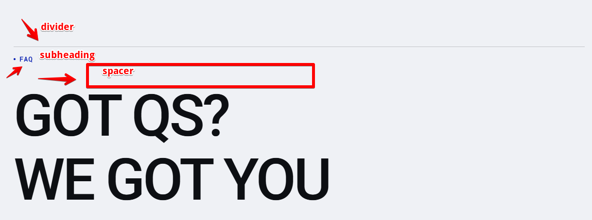
Content Blocks Sections: In most layouts, the sections typically begin with a divider line, a subheading, and a spacer. These elements are added before other blocks to create visual separation, hierarchy, and proper spacing across the layout.
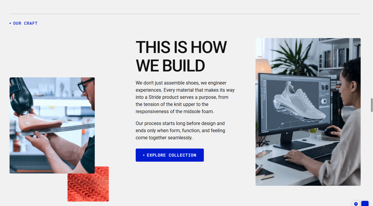
Example 1: A short story about a product and its creation process. This layout features multiple blocks, with the main structure Row block divided into three columns.
- First Column: Contains a spacer (making the image appear lower than other blocks) and a Team Member block with an image.
- Second Column: Includes a heading, text, and button, with spacer blocks between elements to adjust spacing.
- Third Column: Another Team Member block displaying a second image.
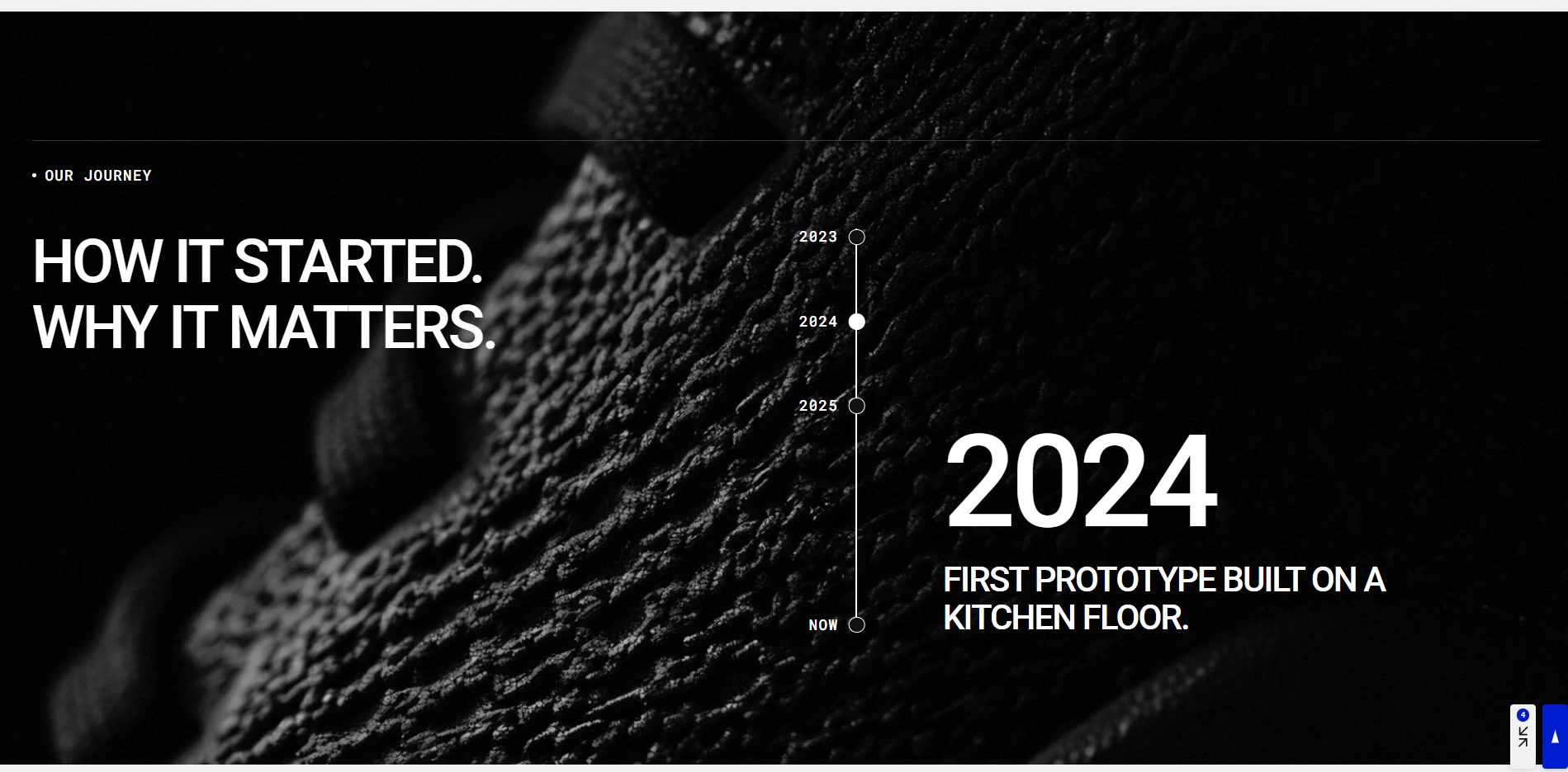
Example 2: Company Timeline — This layout presents a timeline illustrating how the company’s journey began and evolved over time. The content blocks are organized within a main Row block containing two columns:
- First Column: Contains a main heading.
- Second Column: Includes a Timeline Group block that visually displays the company’s milestones.
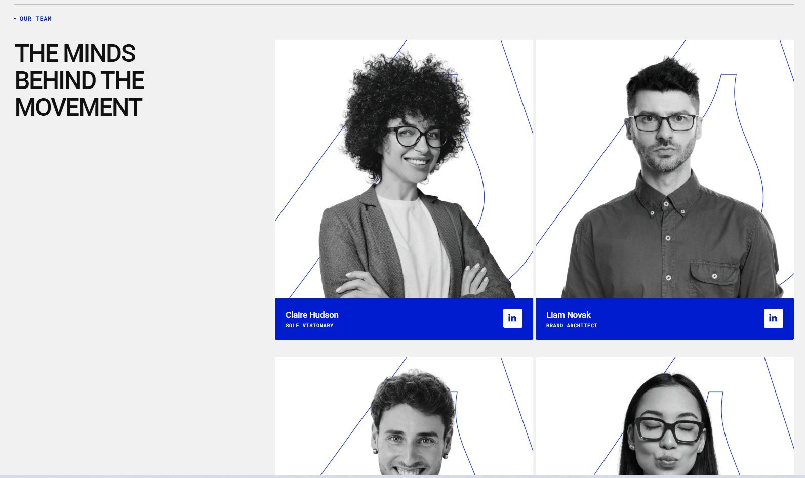
Example 3: Team Members Layout — This layout is designed to showcase team members, including their name, position, and a link to their LinkedIn profile.
The main structure is a Row block with three columns:
- First Column: Contains a heading.
- Second Column: Includes three Team Member blocks, with spacer blocks between them to adjust spacing.
- Third Column: Mirrors the second column, with additional Team Member blocks and spacers between each element.
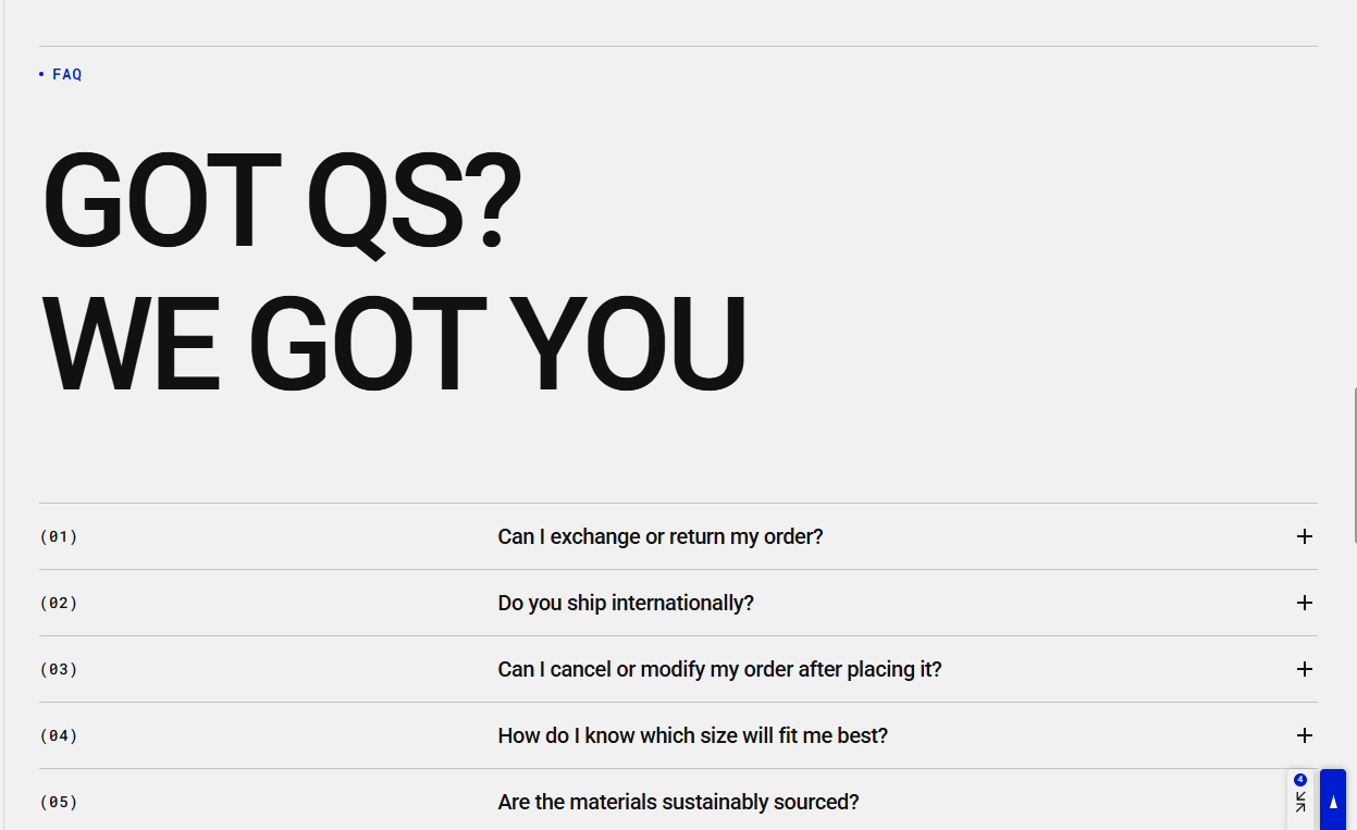
Example 4: FAQ Layout — This layout is designed for displaying frequently asked questions and answers. It includes:
- A main Heading block within the Content Blocks section.
- A spacer for proper spacing.
- A divider added five times, once before each collapsible content block, for clear visual separation.
- Five collapsible content blocks, each containing a question and answer, allowing users to expand or collapse content as needed.
Example 5: Two headings blocks — The first heading is on the left with default alignment, while the second heading uses custom right alignment. Both headings use the Hero style, creating a visually striking effect. The left and right headings appear at the top of a background image, which is added through the General Content Blocks section settings.
Example 6: Reading Text Block — In the demo store, the text scrolls inside a container, and the progress is visually indicated as you read. Initially, the text appears grey; as you scroll and read through the content, it gradually changes to white to highlight the portion that has been read.
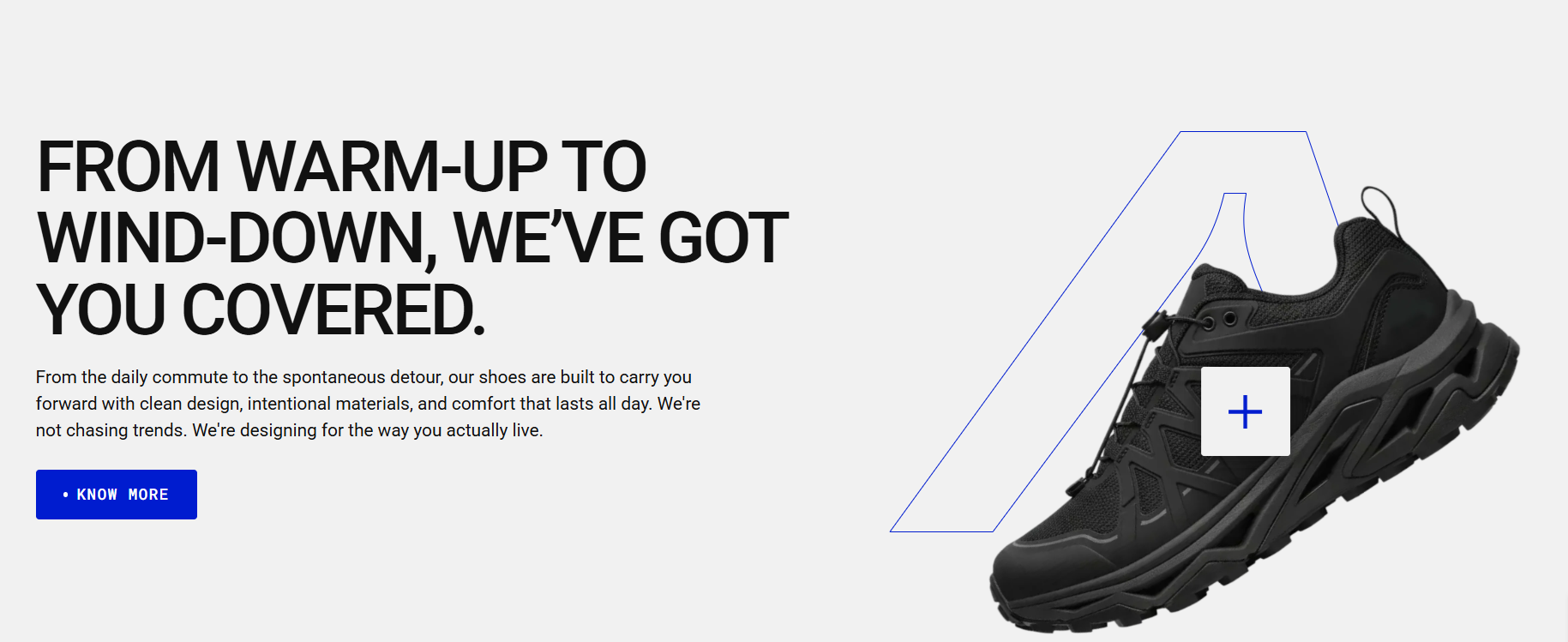
Example 7: This layout features two columns. The left column includes heading, text, and button blocks, while the right column contains a Product Card Hotspot block. A product background image and product image are added, allowing users to review the product by clicking the hotspot. Depending on the settings, the product opens either in a quick-view popup or on the product detail page.
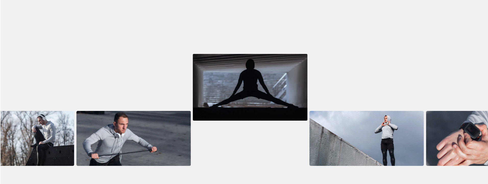
Example 8: Scrolling gallery block with autoplay and continuous scroll
How to access the Content blocks section
Access this section through the theme customizer:
- Navigate to Online Store > Themes
- Select “Customize” on your active theme
- On any theme template, click “Add section”
- Search and select “Content blocks”
Note: Section cannot be added to the Password page.
To insert a new section between existing ones, follow the steps in the article "Sections and blocks" and locate the section titled “How to add a section”.
How to configure the Content blocks section
Basic Components
The “Content blocks” section consists of two primary components:
- General settings – These control the overall settings of the section.
- Block – Each block has its own individual settings.
Available block types include:
- Subheading, heading and text
- Button
- Collapsible content
- Reading text
- Scrolling gallery
- Divider block
- Spacer block
- Timeline group
- Product card hotspot
- Team member
- Row row block is a container that can include the following sub-blocks: Subheading, Heading, Text, Button, Divider, Spacer, and Column.
- Column block exists inside a Row block and it can also contain its own sub-blocks: Subheading, Heading, Text, Divider, Spacer, Timeline group, Details with icon, Details with text, Product card hotspot, and Team member.
General settings
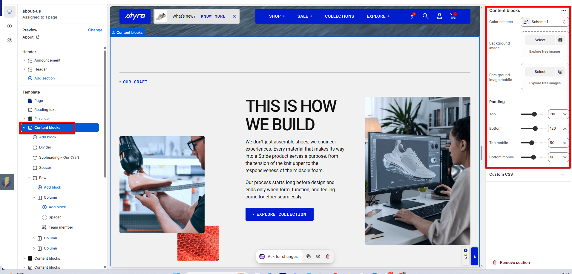
| Setting | Description |
| Color scheme |
Apply color scheme for the content blocks section from the available color schemes list. Read 'Color scheme' article to learn more about color schemes. |
| Background image | Add a background image for desktop and tablet devices. |
| Background image mobile | Add a separate background image for mobile devices. |
| Background style |
Choose how the background image fits within the content blocks section:
|
| Background style mobile |
Choose how the background image appears on mobile devices:
|
Padding
Padding is the space inside a section that separates the content from the section’s edges.
Padding settings are repeated across sections, which is why they are included in the Global settings category. See this article to set paddings: Section padding.