Featured collection settings
The Featured Collection section highlights a selected group of products on the homepage or any other store page. It helps draw attention to important items and makes product discovery easier for customers.
In the section settings, you can organize content with a clean layout, adjust card and grid options, and customize how the section appears on both desktop and mobile devices. You can also add and edit a heading, subheading, and description to match your store’s messaging.
Store owners can choose an existing collection to feature or manually select specific products to display in a custom product list.
This section is ideal for promoting new arrivals, bestsellers, seasonal selections, or special promotional collections.
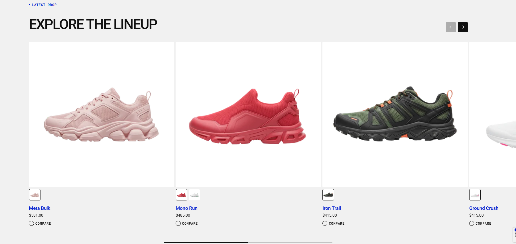
Demo example
How to access the Featured collection section
Access this section through the theme customizer:
- Navigate to Online Store > Themes
- Select “Customize” on your active theme
- On any theme template, click “Add section”
- Search and select “Featured collection”
Note: Section cannot be added to the Password page.
To insert a new section between existing ones, follow the steps in the article "Sections and blocks" and locate the section titled “How to add a section”.
How to configure the Featured collection section
Basic Components
The “Featured collection” section consists of general settings.
To start customizing your collection, click on the “Featured collection” section to access its settings.
General settings
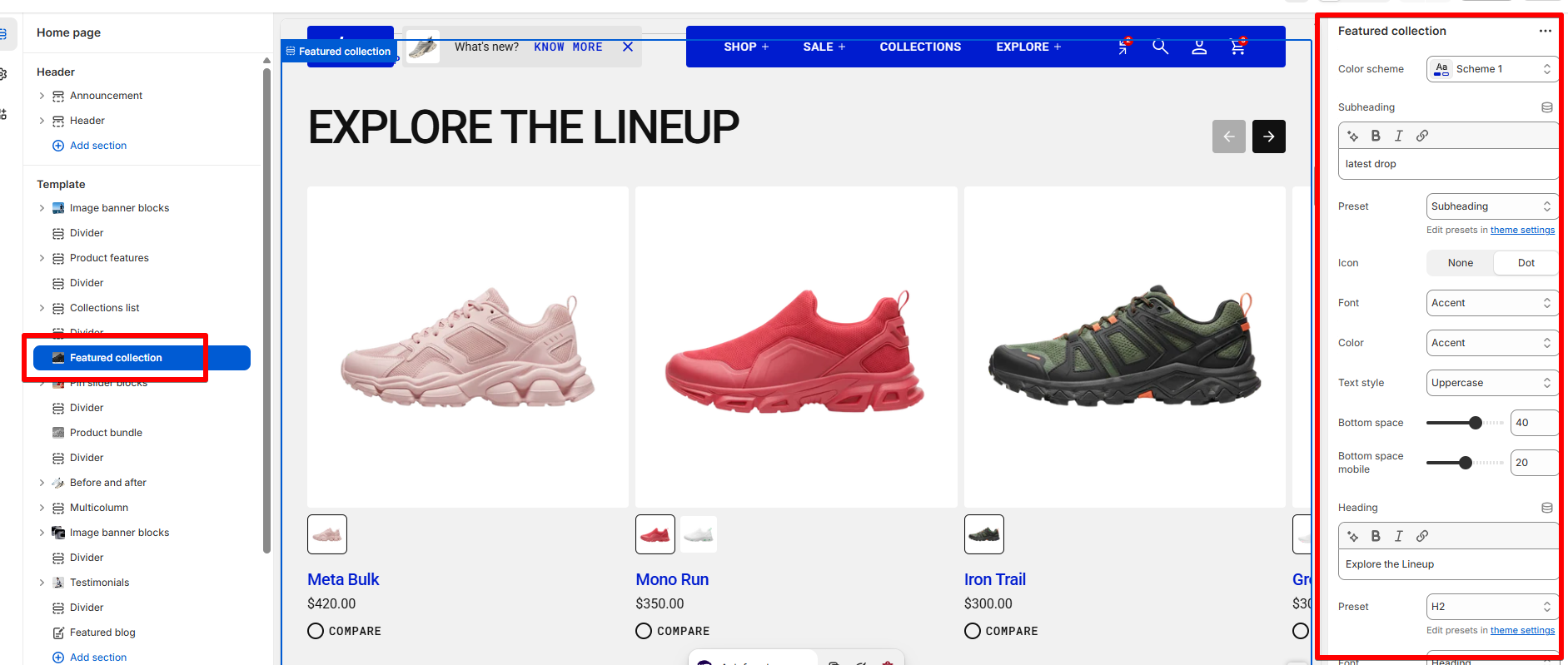
Color scheme
Read Color scheme article to learn more about color schemes.
Subheading, heading, and description
Subheading, heading, and description settings are global settings that apply to the entire theme. They can be found in the Global settings category.
For more details, read this article: Subheading, heading, and description
Collection, product list, and layout settings
| Setting | Description |
| Collection | Select the collection of products you want to showcase in this section. |
| Product list | Manually choose specific products to display. If you add products here after selecting a collection, the section will show these products instead of the collection’s full set. |
| Product count | Choose how many products to display (1–16). |
| Layout style |
The Layout Style setting lets you choose how products are displayed in the section.
|
Grid style
| Setting | Description |
|
Desktop columns
|
You can display 1 to 5 products per row. |
|
Mobile columns
|
You can display 1 or 2 products per row. |
| Desktop horizontal spacing | Set the space between products in the same row. |
| Mobile horizontal spacing | Set the space between products in a row for mobile devices. |
| Desktop vertical spacing | Set the space between rows of products on desktop. |
| Mobile vertical spacing | Set the space between rows of products on mobile. |
Carousel style
| Setting | Description |
|
Desktop columns
|
Choose how many products to show per row on desktop. You can display between 1 and 5 products. |
|
Mobile columns
|
Choose how many products to show per row on mobile devices. You can display 1 or 2 products. |
| Desktop horizontal spacing | Set the horizontal space between product cards on desktop. |
| Mobile horizontal spacing | Set the horizontal space between product cards on mobile devices. |
Product card settings
Product card settings are global settings that apply to the entire theme. They can be found in the Global settings category.
For more details, read this article: Product card settings
Padding
Padding is the space inside a section that separates the content from the section’s edges.
See this article to set paddings: Section padding