Blog posts template
Breadcrumbs settings
| Setting | Description |
| Show breadcrumbs | Enable this option to display breadcrumbs above the banner. This allows users to easily navigate back to the homepage, enhancing the overall user experience. |
| Breadcrumbs color scheme | Choose an appropriate color scheme for the breadcrumbs from the schemes list. The color scheme includes different colors for the background and text. |
| Use custom active breadcrumb color | Enable this option to set a custom color for the active breadcrumb. |
| Custom color for active breadcrumb | Choose your desired color from the color palette. |
Banner settings
| Setting | Description |
| Banner color scheme |
Choose an appropriate color scheme for the banner from the schemes list. The color scheme includes different colors for the background, heading, and other elements in the banner. *Applying a color scheme automatically updates all associated colors set in the theme settings according to the created color schemes. You can edit colors in this block, but it will impact the other sections and blocks in which the same color scheme is used. Learn more about color schemes. |
| Background image | Add an image as the background for your banner to enhance its visual appeal and match your overall design. |
| Banner height |
Select the height of the banner:
|
| Custom title |
Using this field, you can create a custom page title that differs from the one assigned when the page was originally created. The field's top menu offers options to customize the text, including bold, italic, or adding a hyperlink. You can also click the dynamic source button to insert a dynamic source for displaying the page title. Note: Custom title replaces the main title. If you leave the field empty, the title assigned during creation in the admin panel will be displayed. |
| Heading size |
The heading size setting offers three options to control the size of the heading:
With these options, you can easily customize the heading sizes to best match your website's style and create a visually appealing and cohesive design throughout your site. |
| Font weight |
Font weight defines the thickness or boldness of text on your store. Available options for heading:
|
| Text | To add a text after the main section heading, simply enter the text in the provided field. In the top menu of the field, you can find options to customize text. Furthermore, you can click the dynamic source button to insert a dynamic source for the featured collection description. |
| Top padding | The “Top padding” setting allows you to adjust the amount of space at the top of the banner using a slider. |
| Bottom padding | The “Bottom padding” setting functions similarly to the “Top padding” setting, but controls the space at the bottom of the banner. |
| Top padding mobile | The “Top padding mobile” setting allows you to adjust the amount of space at the top of the banner for mobile devices using a slider. |
| Bottom padding mobile | The “Bottom padding mobile” setting functions similarly to the “Top padding mobile” setting, but controls the space at the bottom of the banner for mobile devices. |
Tags
| Setting | Description |
| Tags style |
This option allows you to choose the style of tag elements. Two styles are available:
|
| Tags color scheme | Choose an appropriate color scheme for the tags from the schemes list. The color scheme includes different colors for the background and text. |
| Active tag color scheme | This option allows you to choose a color scheme for the active tag to make it stand out from the others, helping the user clearly understand which tab is currently active. |
|
Tags font weight
|
Font weight defines the thickness or boldness of text on your store. Available options for heading:
|
Blog post card
| Setting | Description |
| Posts to show |
Use the slider to set the number of blog posts you wish to display on the page. Note: If there are more blog posts than the selected number, pagination will appear on the page to allow users to navigate through the posts. |
| Desktop layout |
This setting allows you to choose how your blog posts are displayed on desktop screens.
Note: On mobile devices, the posts are stacked. |
| Enable custom first article style | Enable this option to style the first blog card differently from the rest. |
| First article color scheme | This option allows you to choose a color scheme for the article card. |
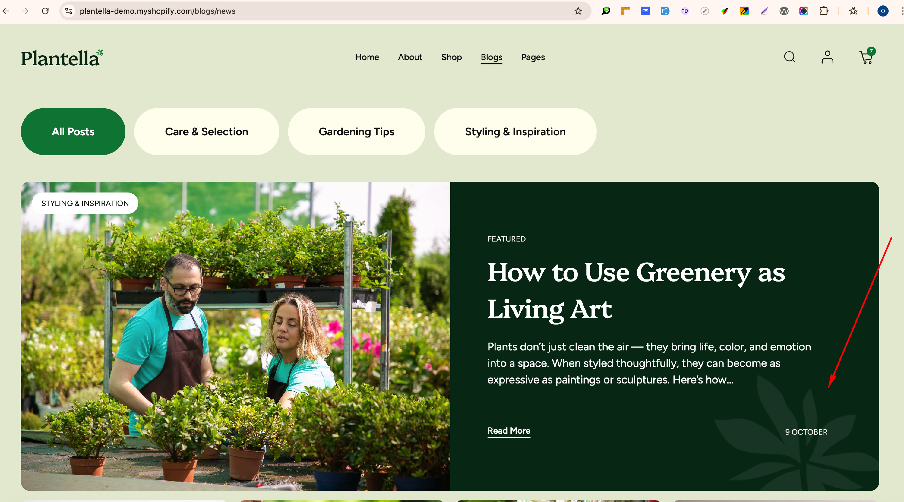
| First article background image (desktop) |
This option allows you to set an image as the background of the first article card. Simply upload your desired image. *See below for an example from the demo store. |
| First article background image (mobile) |
This option allows you to upload a separate image for mobile devices. Upload an image with a more suitable ratio for mobile display for best results. |
| Show featured image | Enable the setting to showcase the featured image from the blog post page in admin panel on the blog post archive page. If left unchecked, categories, heading, description, and comment count will be visible without an image. Also, we can add a date and an author to show them on the page. |
| Featured image height |
Adjust the image height according to your preferences. Four options to try:
For best results, use an image with a 3:2 aspect ratio. Learn more |
| Show description |
This setting controls the display of blog post excerpts. From the dropdown menu, choose one of the following three options:
Choose the option that best suits your store’s layout and content presentation. |
| Show date | Enable this option to display the publication date of the blog post. |
| Show author | Enable this option to display the author's name of the blog post. |
| Show comments | Enable this option to display the number of comments on the blog post. |
| Label for post link | Enter the label for link to blog detail page (post). However, if you remove the text, the button won't be visible under each blog post. |
Demo example: Background Image for First Article ↓
Pagination
| Setting | Description |
| Font weight |
Font weight defines the thickness or boldness of text on your store. Available options for heading:
|
| Pagination button color | This option allows you to choose a color style for pagination buttons. Two variants are available — General and Secondary. Colors are based on the applied color scheme. |
Content settings
| Setting | Description |
| Top padding | The "Top padding" setting allows you to adjust the amount of space at the top of the content section using a slider. |
| Bottom padding | The "Bottom padding" setting functions similarly to the “Top padding” setting, but controls the space at the bottom of the content section using a slider. |
| Top padding mobile | The "Top padding mobile" setting allows you to adjust the amount of space at the top of the content section for mobile devices using a slider. |
| Bottom padding mobile | The "Bottom padding mobile" setting functions similarly to the “Top padding mobile” setting, but controls the space at the bottom of the content section for mobile devices using a slider. |