
Badges
| Setting | Description |
|---|---|
| Product sale badge style |
When a product has two prices — a compare-at price (the original, higher price) and a price (the discounted, lower price) — a Sale badge will be shown. These settings allow you to choose the style in which the badge appears on product cards. • Sale text badge • Sale text scrolling • Sale percentage badge • Sale percentage scrolling • Sale text and percentage badges • Sale text and percentage scrolling • Sale percentage with scrolling text • Sale text with scrolling percentage (Default) |
| Sale/sold text badge corner radius | Controls how rounded the corners of the plain text "Sale"/"Sold out" badge are, in pixels (0–20px). Default: 2px. |
| Sale percentage badge corner radius | Controls how rounded the corners of the percentage-style badge (e.g. "-33%") are, in pixels (0–20px). Default: 20px. |
| Use custom badge text colors | Overrides the badge's color-scheme-based colors with manually picked colors. Disabled by default. |
| Badge text color | The text color of the sale/sold badge. Only shown when Use custom badge text colors is enabled. Default: #F6F2EE. |
| Badge background color | The background color of the sale/sold badge. Only shown when Use custom badge text colors is enabled. Default: #B72840. |
| Use custom badge text colors for dark mode | Lets you set separate badge colors for dark mode. Only shown when dark mode is enabled and Use custom badge text colors is on. Disabled by default. |
| Badge text color for dark mode | The badge text color used in dark mode. Default: #F6F2EE. |
| Badge background color for dark mode | The badge background color used in dark mode. Default: #B72840. |
| Use custom scrolling sale colors | Overrides the color-scheme-based colors of the scrolling sale badge. Only shown when Product sale badge style is set to a scrolling variant. Disabled by default. |
| Scrolling sale text color | The text color of the scrolling sale badge. Default: #F6F2EE. |
| Scrolling sale background color | The background color of the scrolling sale badge. Default: #B72840. |
| Use custom scrolling sale colors for dark mode | Lets you set separate scrolling badge colors for dark mode. Disabled by default. |
| Scrolling sale text color for dark mode | The scrolling badge text color used in dark mode. Default: #F6F2EE. |
| Scrolling sale background color for dark mode | The scrolling badge background color used in dark mode. Default: #B72840. |
| Custom badge |
The Custom badge is an additional badge that can appear alongside the Sale badge. You can assign a unique name to a badge per product — for example: Hot, Best Seller, Exclusive, etc. To display the Custom badge in the Scrolling text style, create a product metafield and enter the desired badge name into the metafield input for each product. Add Badge (product metafield name) in the field above to activate this feature. |
| Product custom badge style |
• Custom badge — shown as a static badge. • Scrolling custom badge (Default) — shown as scrolling text at the bottom of the product image. Only shown when Custom badge is filled in. |
| Product custom badge corner radius | Corner rounding of the static custom badge (0–20px). Only shown when Custom badge is filled in and style is Custom badge. Default: 2px. |
| Product custom badge color type | Color picker (manual colors) or Color scheme (Default). Only shown when Custom badge is filled in. |
| Custom badge color scheme | Choose a color scheme for the custom badge. Only shown when color type is Color scheme. |
| Custom badge text color | The text color of the custom badge. Only shown when color type is Color picker. Default: #F6F2EE. |
| Custom badge background color | The background color of the custom badge. Only shown when color type is Color picker. Default: #B72840. |
| Use custom badge text colors for dark mode | Lets you set separate custom badge colors for dark mode. Only shown when dark mode is enabled and color type is Color picker. Disabled by default. |
| Custom badge text color for dark mode | Custom badge text color in dark mode. Default: #F6F2EE. |
| Custom badge background color for dark mode | Custom badge background color in dark mode. Default: #B72840. |
| Rotate scrolling badge strip | Tilts the scrolling badge strip at a slight angle instead of keeping it perfectly horizontal. Enabled by default. |
Steps to set the Sale badge as scrolling text on product cards
- Navigate to the product page.
- If the product has no variants: Locate the Price and Compare-at price fields.
- If the product has variants: Select the first variant that will be displayed on the product card, then locate the Price and Compare-at price fields.
- In Price, enter a lower price.
- In Compare-at price, enter the original (higher) price.
- Go to Theme settings → Badges tab and ensure Product badges style is set to Scrolling text.
- After a few seconds, the product card will display a scrolling text badge along with a percentage discount icon.


Steps to set a Custom Badge on product cards
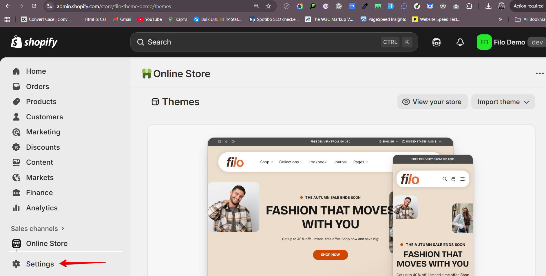
- Navigate to Settings in your Shopify admin panel.
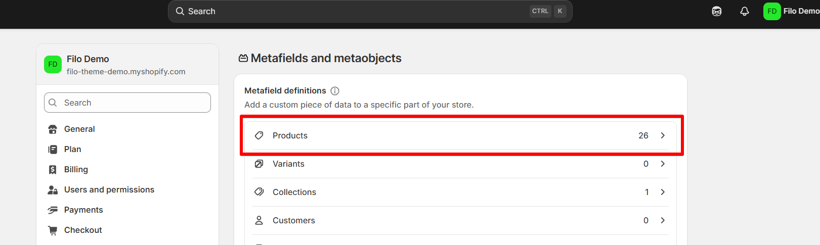
- Click on Metafields and metaobjects, then select Products.
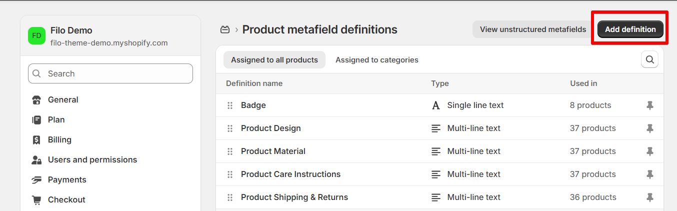
- Click the Add definition button.
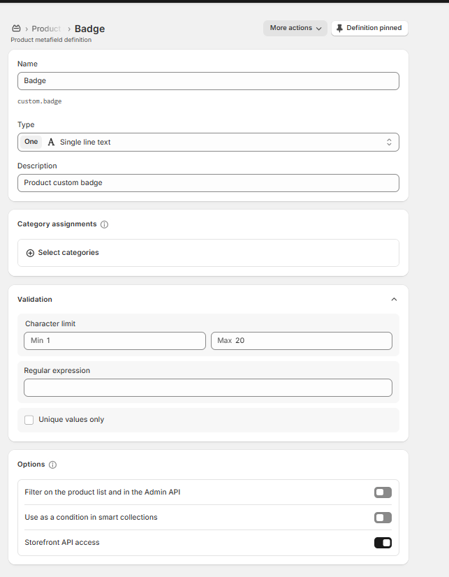
- Fill in the required information as shown in the example screenshot.
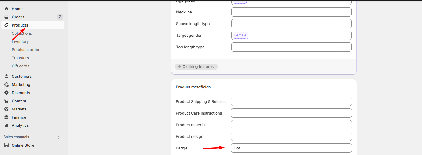
- Go to the product page in your admin and scroll down to the Product metafields section.
- Enter your custom badge name into the metafield input and click Save.
- In your theme settings, under the Badges tab, make sure the Custom Badge option includes the correct metafield name.
- Settings
- Metafields and metaobjects

- Products
- Add definition button
- Definition card
- Product metafields section and badge field


Article badges
| Setting | Description |
|---|---|
| Color scheme | Sets the color scheme applied to badges shown on blog article cards. |
| Corner radius | Controls how rounded the corners of article badges are, in pixels (0–20px). Default: 2px. |
Collection badges
| Setting | Description |
|---|---|
| Collection custom badge | The name of a collection metafield to pull a custom badge label from, shown on collection cards (e.g. "New", "Popular"). Placeholder example: "Badge". |
| Color scheme | Sets the color scheme applied to badges shown on collection cards. |
| Corner radius | Controls how rounded the corners of collection badges are, in pixels (0–20px). Default: 2px. |