Megamenu with collections
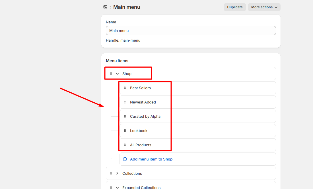
In the header, start by creating the main menu that serves as the primary navigation for your store. Once the main menu is established, you can add a mega menu with various layouts and designs to specific items within the main menu. This allows you to organize and display detailed submenus, enhancing navigation and user experience. Follow to the header settings article to check screenshot of main menu.
| Setting | Description |
|---|---|
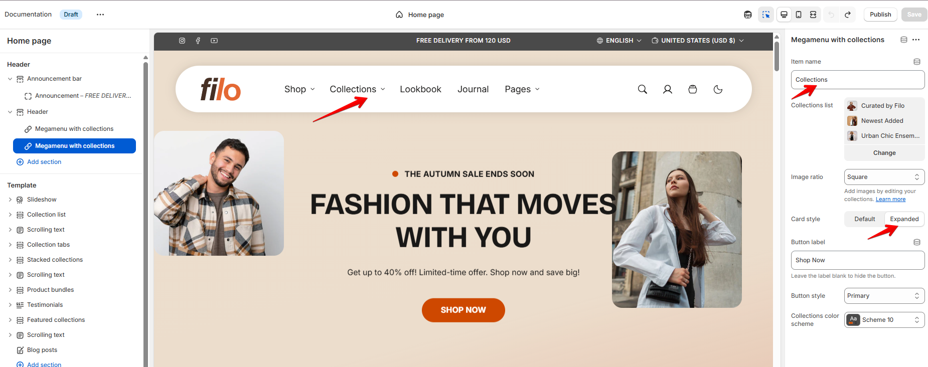
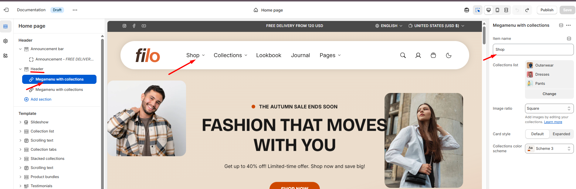
| Item name | Specify the name of the navigation menu you want to connect to the collection's menu view. Refer to the screenshot below for guidance. |
| Collections color scheme |
Choose color scheme for collections. A color scheme consists of a predefined set of colors you can apply to this section for consistent styling. These schemes are created in the Theme Settings and are available across all sections, making customization faster and ensuring a cohesive color system throughout your store. Learn more about color schemes. |
| Collections list |
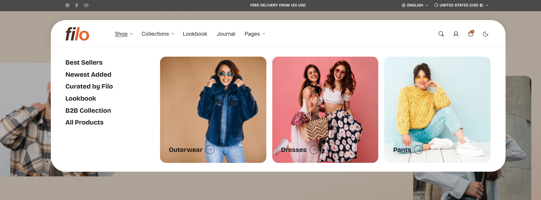
Select collections to display in the mega menu from the collection list. You can add a maximum of 6 collections to the mega menu. Collections are displayed in a grid format with 3 columns per row on desktop. |
| Image ratio |
• Portrait – displays images in a vertical orientation. • Square – displays images as squares. • Landscape – displays images in a horizontal orientation. |
| Card style |
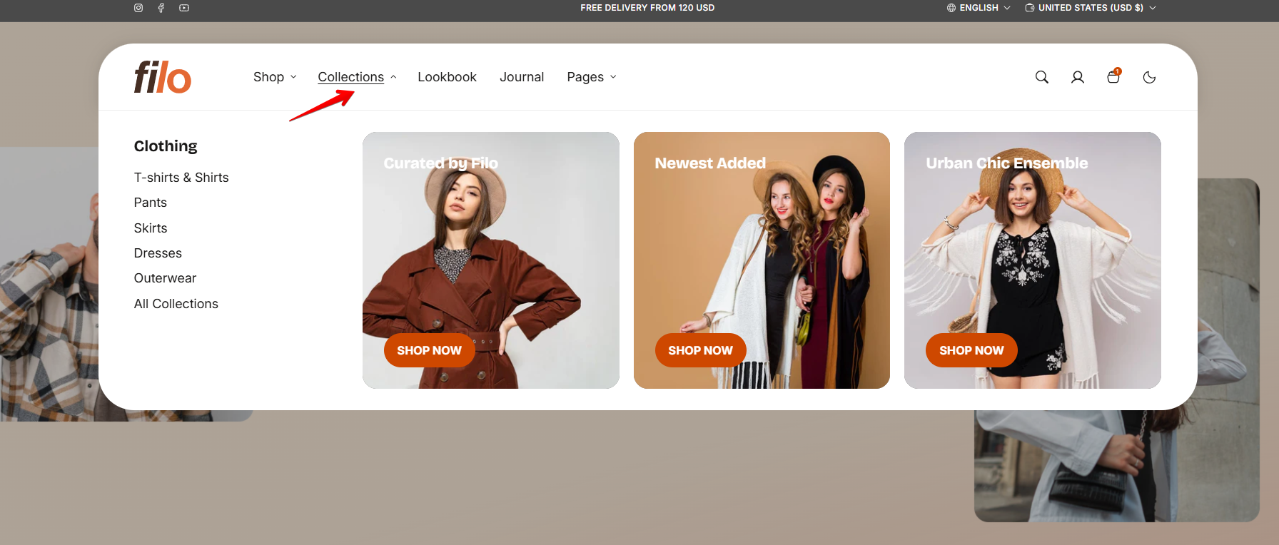
Choose collection style: • Default – collection name with an arrow is displayed on the image. • Expanded – collection title is displayed at the top of the image, with a call-to-action button at the bottom. • Modern – reveals the Title style setting instead of a button, letting you style the collection title as a button-like label. |
| Button label |
Decide whether the menu includes a button: To display the button, enter text into the field as the label. To hide the button, leave the text field empty. Only shown when Card style is set to Expanded. |
| Button style |
Choose the button's appearance: • Primary: Uses the primary button color defined in color scheme. • Secondary: Uses the secondary button color defined in each color scheme. • Outline: A button with a border and no fill. • Link: A minimal button style aligned with the text. • Link with dot: A minimal text-only link with a small dot marker next to it. Only shown when Card style is set to Expanded. |
| Title style | Sets the visual style of the collection title, using the same options as Button style: Primary, Secondary, Outline, Link, Link with dot. Only shown when Card style is set to Modern. |
- Default
To set up the Default Collections view as in this example:
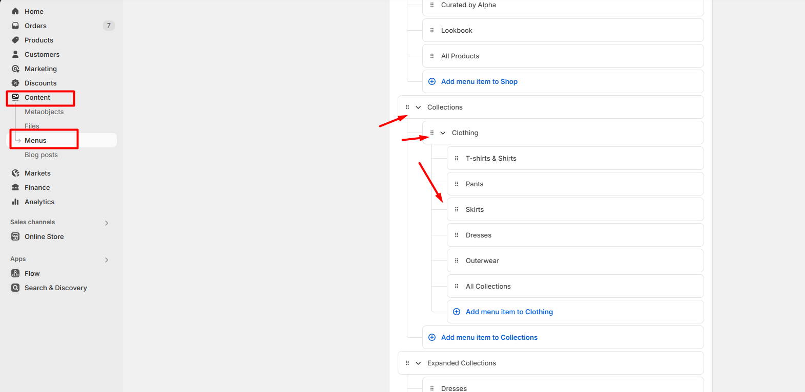
- Create menu structure
- Navigate to Online Store > Navigation in your Shopify admin.
- Open the Main menu.
- Create a main menu item – this will serve as the title for the mega menu in the header.
- Under this item, add the collections you want to display in the shop (these will appear in the mega menu block).
-
Save the menu.
Add the Default collections block
- Navigate to the theme customizer.
- Add the “Megamenu with collections” block and type the main menu item name (Shop) in its settings.
- Choose the “Default” card style.
- Save changes.
- Expanded
Create menu structure
- Navigate to Online Store > Navigation in your Shopify admin.
- Open the Main menu.
- Create a main menu item – this will serve as the title for the mega menu in the header.
- Under this item, add the main collection that will include subcollections.
- Save the menu.
Add the Expanded collections block
- Navigate to the theme customizer.
- Add the “Megamenu with collections” block and type the main menu item name (Collections) in its settings.
- Choose the “Expanded” card style.
- Save changes.