Collection list settings
This guide describes the Collection list section.
The Collection List section helps you efficiently organize and showcase collections in a flexible, visually engaging layout. Designed with enterprise needs in mind, it supports multiple layouts, including grid view on desktop, column view on mobile, and carousel/slideshow formats on both.
Key Features:
🧩 Content Settings
- Customize the section heading.
- Add an optional “View All” button linking to the main collection page.
🖼️ Layout Customization
- Choose the number of columns for grid layout.
- Enable swipe mode as an alternative to the standard grid layout.
- Configure autoplay settings for carousels.
🌟 Featured Item
- Add an image or video as the main visual element to enhance the section’s appeal.
📦 Collection Cards
- Adjust the image ratio for all collection cards.
- Optionally display collection descriptions.
- Select the appropriate collection for each block.
Demo Example: A carousel-style collection list section displayed on the homepage, showcasing multiple collection cards, each with an image, title, and optional description. A featured video is displayed on the left side of the section, drawing attention and enhancing visual engagement.
Collection list demo example

How to access the Collection list section
Access this section through the theme customizer:
- Navigate to Online Store > Themes
- Select “Customize” on your active theme
- On any theme template, click “Add section”
- Search and select “Collection List”
Note: Section cannot be added to the Password page.
To insert a new section between existing ones, follow the steps in the article "Sections and blocks" and locate the section titled “How to add a section”.

How to configure the Collection list section
Basic Components
The “Collection list” section consists of two primary components:
- General settings – These control the overall settings of the section.
- Block – Each block has its own individual settings.
Available block types include:
- Featured item. To learn about all available block settings, see the related article "Featured item"
- Collection. To learn about all available block settings, see the related article "Collection"
To insert a new block between existing ones or to add a block when none have been added yet, refer to the article "Sections and blocks" and locate the section titled “How to add a block”.
General settings
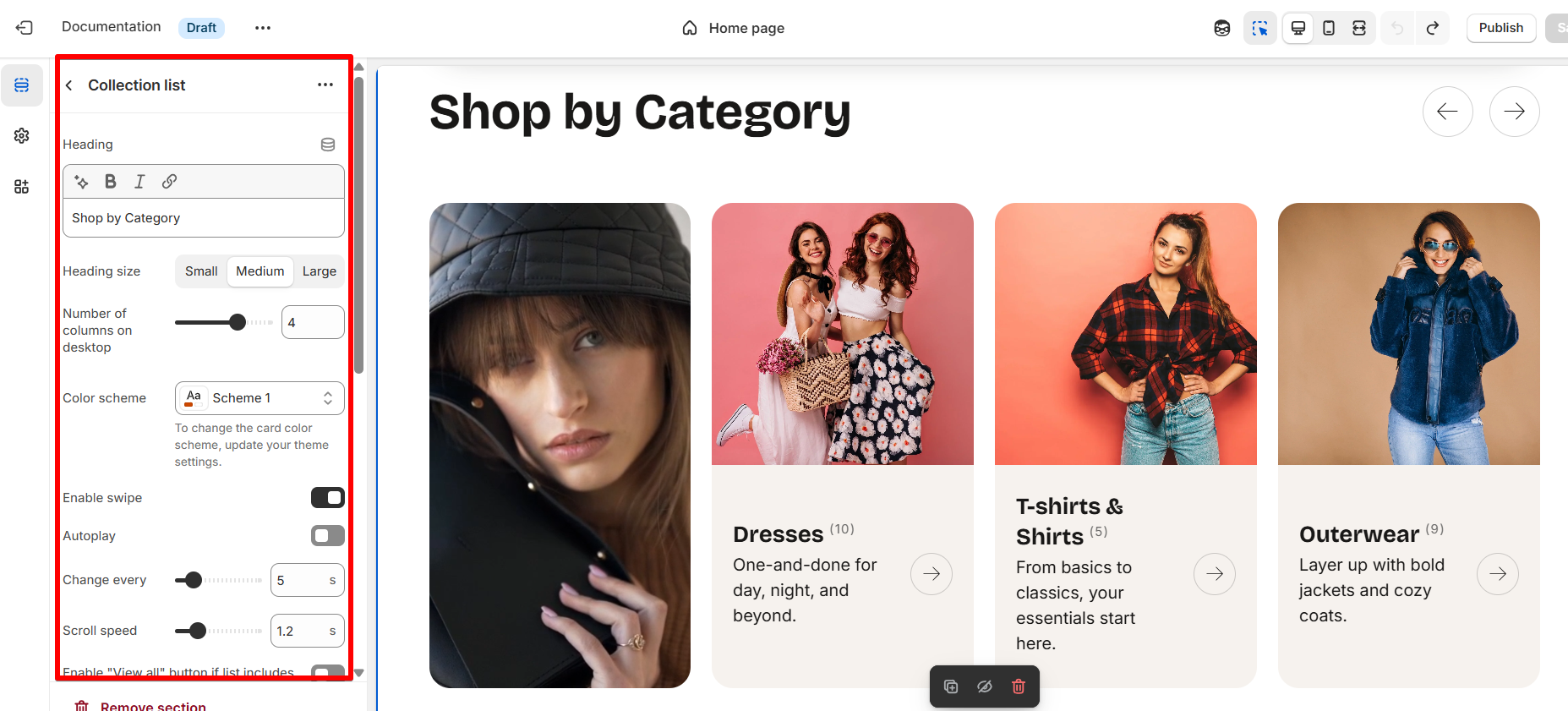
Select a setting described in the following table:
| Setting | Description |
| Heading | To add a heading to the section, simply enter the text in the provided field. In the top menu of the field, you can find options to customize the heading such as making it bold, italic, or adding a hyperlink. Furthermore, you can click the dynamic source button to insert a dynamic source as the title of the section. |
| Heading size |
The heading size setting offers three options to control the size of the section heading:
|
| Number of columns on desktop | The “Number of columns on desktop” setting allows you to select the number of columns in which your content will be displayed on larger screens, and on tablets. You can select from 2 to 5. |
| Color scheme |
Select a color scheme from the list and customize it with appropriate colors for text, headings, buttons, and background. Applying a color scheme to the entire collection list section (excluding the collection columns) automatically updates all related colors based on the settings defined in the theme's color schemes. |
| Enable swipe | Allows users to swipe through collection cards using touch gestures (finger) or by clicking slider navigation buttons. |
| Autoplay | Automatically scrolls through the collection carousel without user interaction. Enhances visibility of all items over time. |
| Change every |
Sets the interval duration (in seconds) for how often the carousel should automatically move to the next slide when autoplay is enabled. Example: |
| Scroll speed | Controls how fast the slide transition animation occurs during autoplay or manual scroll. |
| Enable “View all” button if the list includes more collections than shown. | The “View More” button redirects to a page displaying all collections. This button is visible only when a main heading is added to the section. |
| Button style |
When you enable the View all button, the Button style setting becomes available. Choose the button’s appearance:
|
Card settings
| Setting | Description |
| Image ratio |
The Image ratio setting allows you to control how collection images are displayed based on their width-to-height proportion. This helps ensure a consistent and visually appealing layout across devices. You can choose from the following options:
|
| Show description | Swipe the button to the right to show collection description added on collection page (Shopify admin). |
Section paddings
| Setting | Description |
| Top padding | The 'Top padding' setting allows you to adjust the amount of space at the top of the section using a slider. |
| Bottom padding | The 'Bottom padding' setting functions similarly to the “Section top padding” setting, but controls the space at the bottom of the section. |
| Top padding mobile | The 'Top padding mobile' setting allows you to adjust the amount of space at the top of the section specifically for mobile devices, using a slider. |
| Bottom padding mobile | The 'Bottom padding mobile' setting works similarly to the 'Top padding mobile' setting but controls the space at the bottom of the section for mobile devices. |