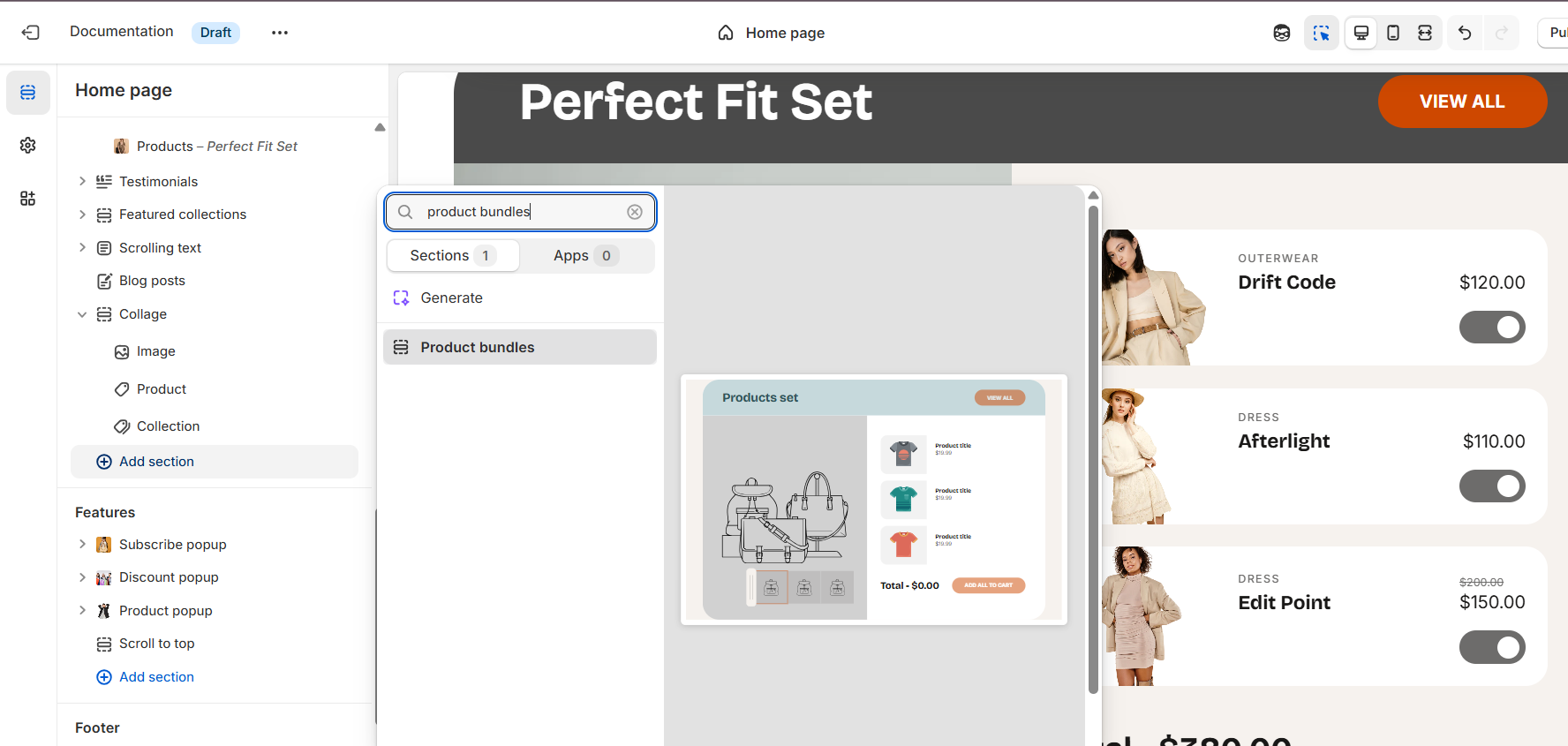
Product bundles
This guide describes the Product Bundles section.
The Product Bundles section lets you showcase a group of related products together on the homepage or product page. Customers can:
- View all items in the bundle and check product details by clicking the Quick view icon on hover.
- Add all products at once using the Add all to cart option.
- Customize their selection by turning off the toggle beside items they don’t want to include.
In addition, multiple product blocks can be added, each with a main image and its related products. Customers can switch between these blocks in the preview by clicking on the thumbnails.
The View all button can be linked to a collection that contains all product sets.
On each main image, you can also add hotspots, with fully adjustable positions. When hovering over a hotspot, the corresponding product in the set is highlighted.
Demo Example:
A Product Bundle section displayed on the homepage. The layout features a main image on the left with thumbnails below, and a related products set on the right. Customers can add the entire set to their cart at once by clicking “Add all to cart.”

How to access the Product bundles section
Access this section through the theme customizer:
- Navigate to Online Store > Themes
- Select “Customize” on your active theme
- On any theme template, click “Add section”
- Search and select “Product bundles”
Note: Section cannot be added to the Password page.
To insert a new section between existing ones, follow the steps in the article "Sections and blocks" and locate the section titled “How to add a section”.
How to configure the Product bundles section
Basic Components
The “Product bundles” section consists of two primary components:
- General settings – These control the overall settings of the section.
- Block – Each block has its own individual settings.
Available block type include:
- Products. To learn about all available block settings, see the related article "Products"
To insert a new block between existing ones or to add a block when none have been added yet, refer to the article "Sections and blocks" and locate the section titled “How to add a block”.
General settings

Select a setting described in the following table:
| Setting | Description |
| Heading |
Display main heading of the product bundle section. In the top menu of the field, you can find options to customize it, such as making it bold or italic. Furthermore, you can click the dynamic source button to insert a dynamic source as the title of the section. |
| Heading size |
Select heading size:
|
| Description | Add an optional text below the main heading to provide more details. |
| Description size |
Select description size:
|
| Heading alignment |
Align the heading, heading with description, according to your design preferences:
|
| Color scheme |
Select a color scheme from the list for the entire section and customize it with appropriate colors. Applying a color scheme automatically updates all related colors based on the settings defined in the theme's color schemes. |
| Switch background |
Within each color scheme, you can define a secondary background in addition to the main background. When you enable Switch background, the main background of the product block changes to the secondary background. This allows you to create contrast and highlight specific product sets. |
| Bundle header color scheme | Use this setting to select a color scheme for the bundle header. The chosen scheme is applied to the header area of the product set, helping to highlight the bundle title and make it stand out from the rest of the content. |
Product card
| Setting | Description |
| Image ratio |
The “Image ratio” setting allows you to control how images are displayed on your website based on their width-to-height ratio. You have several options to choose from:
|
| Show gallery preview | Enable this option to display a preview of the product’s image gallery on hover. This feature works only if the product has more than one image, and will display a maximum of three images. |
| Show type |
Click “Show type” to display the product type on product cards in this section. Note: The product type must first be added on the product page in the admin. |
| Show vendor |
Click “Show vendor” to display the product vendor on product cards in this section. Note: The product vendor must first be added on the product page in the admin. |
| Show product rating | Displays the average product rating in stars with the number of reviews in parenthesis, for example: ★★★★★ (8). Also requires a product review app such as Shopify Product Reviews, and Metafield definitions for reviews.rating_count and reviews.rating. |
| Quick add |
If you activate the Quick add option, then your customers can add an item to their cart from the product card. Choose from the following options:
|
| Color scheme |
Select a color scheme from the list and customize it with appropriate colors for the whole section. Applying a color scheme automatically updates all related colors based on the settings defined in the theme's color schemes. |
| Switch toggle color |
This option allows you to choose the toggle color. Available options:
|
Section padding
| Setting | Description |
| Top padding | The 'Top padding' setting allows you to adjust the amount of space at the top of the section using a slider. |
| Bottom padding | The 'Bottom padding' setting functions similarly to the “Section top padding” setting, but controls the space at the bottom of the section. |
| Top padding mobile | The 'Top padding mobile' setting allows you to adjust the amount of space at the top of the section specifically for mobile devices, using a slider. |
| Bottom padding mobile | The 'Bottom padding mobile' setting works similarly to the 'Top padding mobile' setting but controls the space at the bottom of the section for mobile devices. |