404 page template
The 404 template is a crucial component of your online store that helps manage user experience when visitors encounter broken or missing pages. It’s designed to:
- Maintain professional brand presence even when errors occur
- Guide visitors back to working pages
- Reduce bounce rates from broken links
- Enhance user experience during navigation errors
- Support SEO best practices for error handling
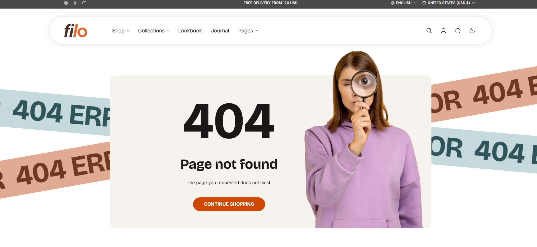
Full page 404 template
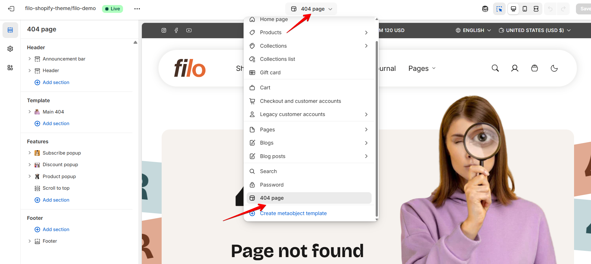
How to Access 404 Template
Access the 404 template from the top center bar in your Admin Dashboard. Once selected, you can customize its appearance and functionality through the available settings.
How To Configure 404 Template
To begin customizing, navigate to the 404-page settings in your theme editor.
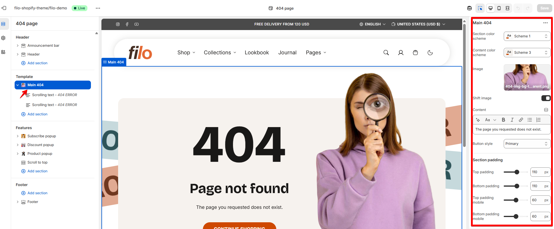
General settings
| Setting | Description |
| Section color scheme | Applying a chosen color scheme to 404 template from a suggested list of color schemes automatically updates all associated colors for a cohesive look across your website. |
| Content color scheme | You can apply a different color scheme to the content block than the default template scheme, allowing for greater design flexibility. |
| Image |
|
| Shift image | When enabled, the image is slightly shifted outside the content block. This option works best with images without background, creating a more dynamic visual effect. |
| Content | In this field, you can write a custom message that will be displayed when a user tries to access a page that doesn't exist or has been moved. This content is meant to guide users back to relevant areas of the site and help them navigate to the correct information. You can provide links to the homepage, product pages, or other helpful sections like FAQs or search, ensuring a smooth user experience even when encountering an error. |
| Button style |
Choose the button’s appearance:
|
Section padding
| Setting | Description |
| Top padding | The 'Top padding' setting allows you to adjust the amount of space at the top of the section using a slider. |
| Bottom padding | The 'Bottom padding' setting functions similarly to the “Section top padding” setting, but controls the space at the bottom of the section. |
| Top padding mobile | The 'Top padding mobile' setting allows you to adjust the amount of space at the top of the section specifically for mobile devices, using a slider. |
| Bottom padding mobile | The 'Bottom padding mobile' setting works similarly to the'Top padding mobile' setting but controls the space at the bottom of the section for mobile devices. |