Split slideshow
This guide describes the Split Slideshow section.
The Split Slideshow section allows you to display a series of slides with flexible layout and design options. You can enable automatic slide rotation, choose the layout, set the slide height, and adjust the pagination position.
Each slide can include the following elements:
- Main background
- Two images split into left and right blocks.
- Content container
- Can be shown or hidden depending on your design needs
You can customize both images and content settings for each slide to achieve the desired visual style and layout.
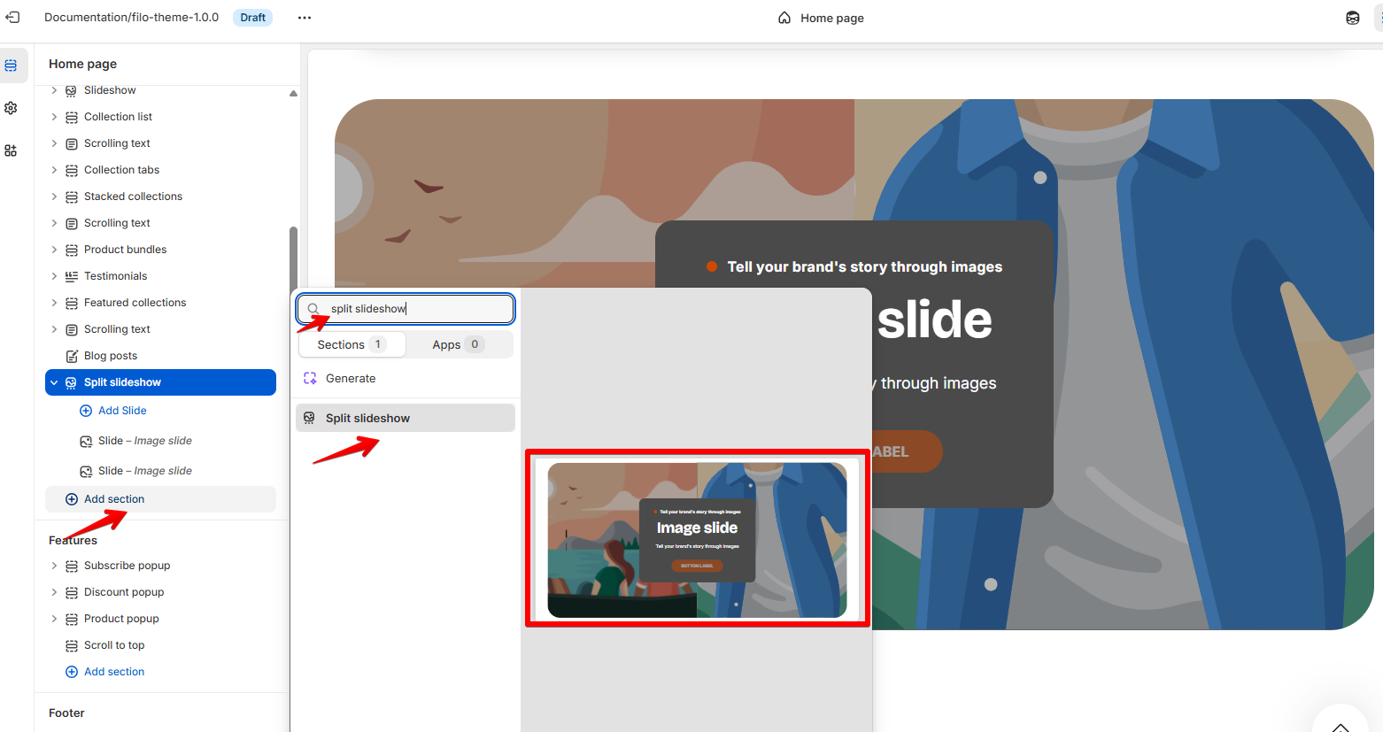
How to access the Split Slideshow section
Access this section through the theme customizer:
- Navigate to Online Store > Themes
- Select “Customize” on your active theme
- On any theme template, click “Add section”
- Search and select “Split Slideshow”
Note: Section cannot be added to the Password page.
To insert a new section between existing ones, follow the steps in the article "Sections and blocks" and locate the section titled “How to add a section”.
How to configure the Split Slideshow section
Basic Components
The “Split Slideshow” section consists of two primary components:
- General settings – These control the overall settings of the section.
- Block – Each block has its own individual settings.
Available block types include:
- Slide. To learn about all available block settings, see the related article "Slide"
To insert a new block between existing ones or to add a block when none have been added yet, refer to the article "Sections and blocks" and locate the section titled “How to add a block”.
General settings
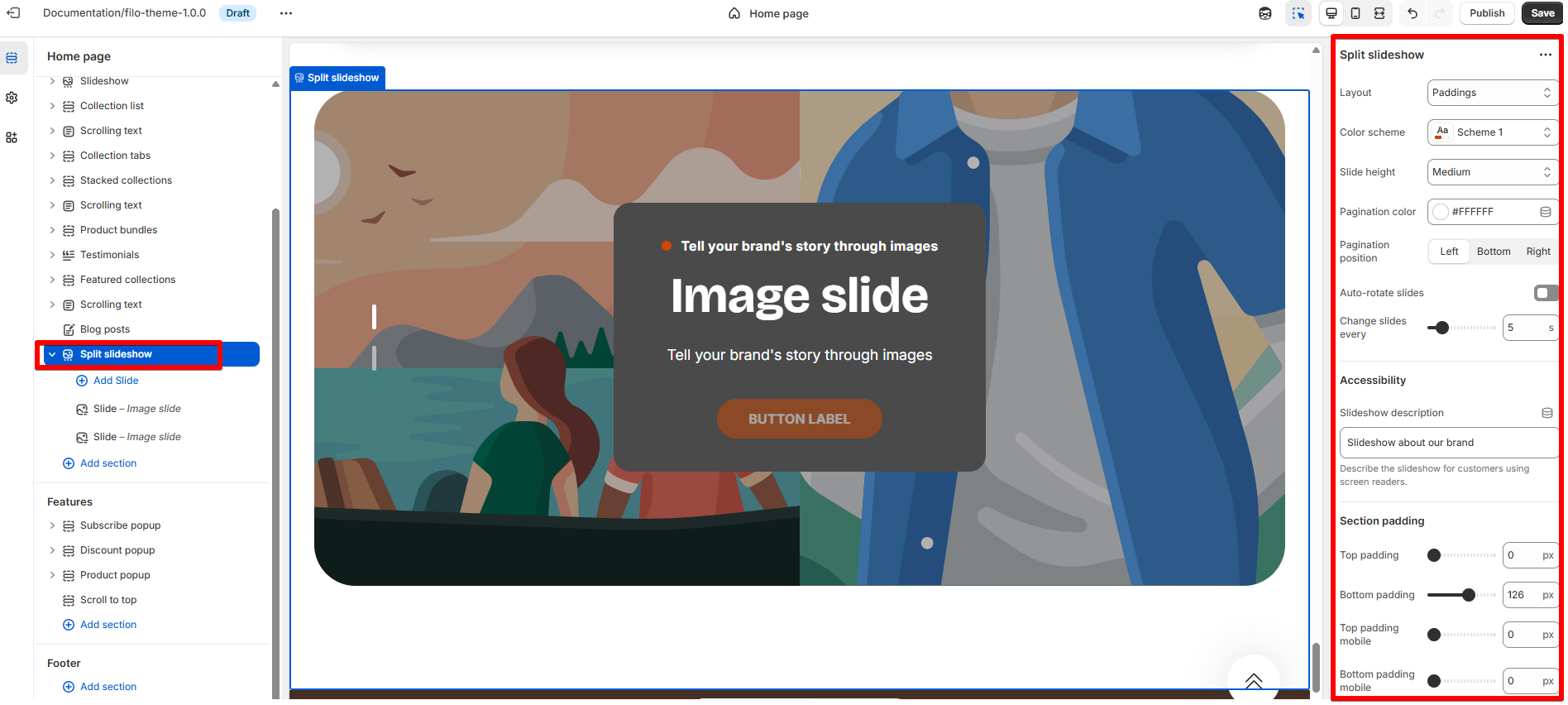
Select a setting described in the following table:
| Settings | Description |
| Layout |
|
| Color scheme |
Apply Color Schemes:
|
| Slide height |
Choose slide height from the dropdown list:
|
| Pagination color | Select the color of the pagination indicators. |
| Pagination position |
Choose where the pagination appears on desktop screens:
|
| Auto-rotate slides | Enable automatic slide rotation. |
| Change slides every | Set the interval (in seconds or milliseconds) between each slide when auto-rotate is enabled. |
Accessibility
| Setting | Description |
| Slideshow description | Enhance accessibility by providing a description for your slideshow, catering to visually impaired customers. |
Section padding
| Setting | Description |
| Top padding | The 'Top padding' setting allows you to adjust the amount of space at the top of the section using a slider. |
| Bottom padding | The 'Bottom padding' setting functions similarly to the “Section top padding” setting, but controls the space at the bottom of the section. |
| Top padding mobile | The 'Top padding mobile' setting allows you to adjust the amount of space at the top of the section specifically for mobile devices, using a slider. |
| Bottom padding mobile | The 'Bottom padding mobile' setting works similarly to the 'Top padding mobile' setting but controls the space at the bottom of the section for mobile devices. |