Product comparison settings
Product comparison Section Guide
This guide describes the Product comparison section.
Use this section to compare multiple products side by side in a clean, table-style layout. Each product entry can include an image, title, price, and product description, added through blocks.
Comparison fields can include:
- Variant options
- Product type
- SKU
- Vendor
These details are pulled automatically from the product’s detail page—provided the relevant information has been filled in.
For more flexibility, you can create metafields to display custom information. Additionally, manual input is supported, allowing you to add unique data or custom content directly into the comparison table.
You can add a button to each product column. This button can be customized with options such as:
- View Product: This will link to the product detail page for more information.
- Add to Cart: For products without variants, this button allows customers to add the product directly to the cart.
- Quick View: For products with variants, this button triggers a Quick View popup, allowing customers to select variants and add the product to the cart without leaving the page.
You can also enable the current product. When enabled, the current product will appear as a column in the table, allowing customers to compare it with the other added products. This column updates automatically based on the product page the customer is viewing.
You can also choose the label position — Aside or Column — depending on your preferred layout.
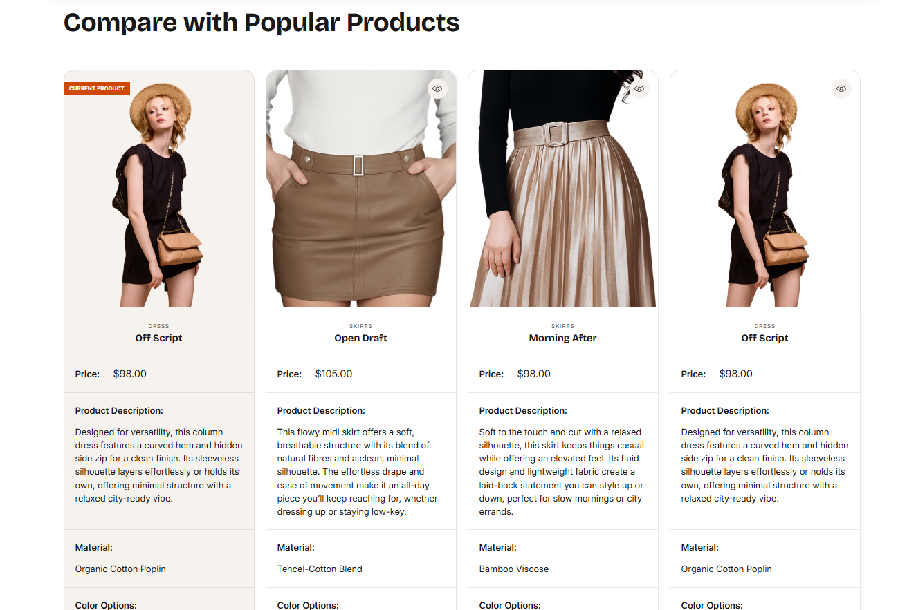
Demo Example:
The Product Comparison section displayed on the product detail page, featuring one current product and three other products added in settings. Each product is shown with its image, title, price, description, and key specification such as material, color.
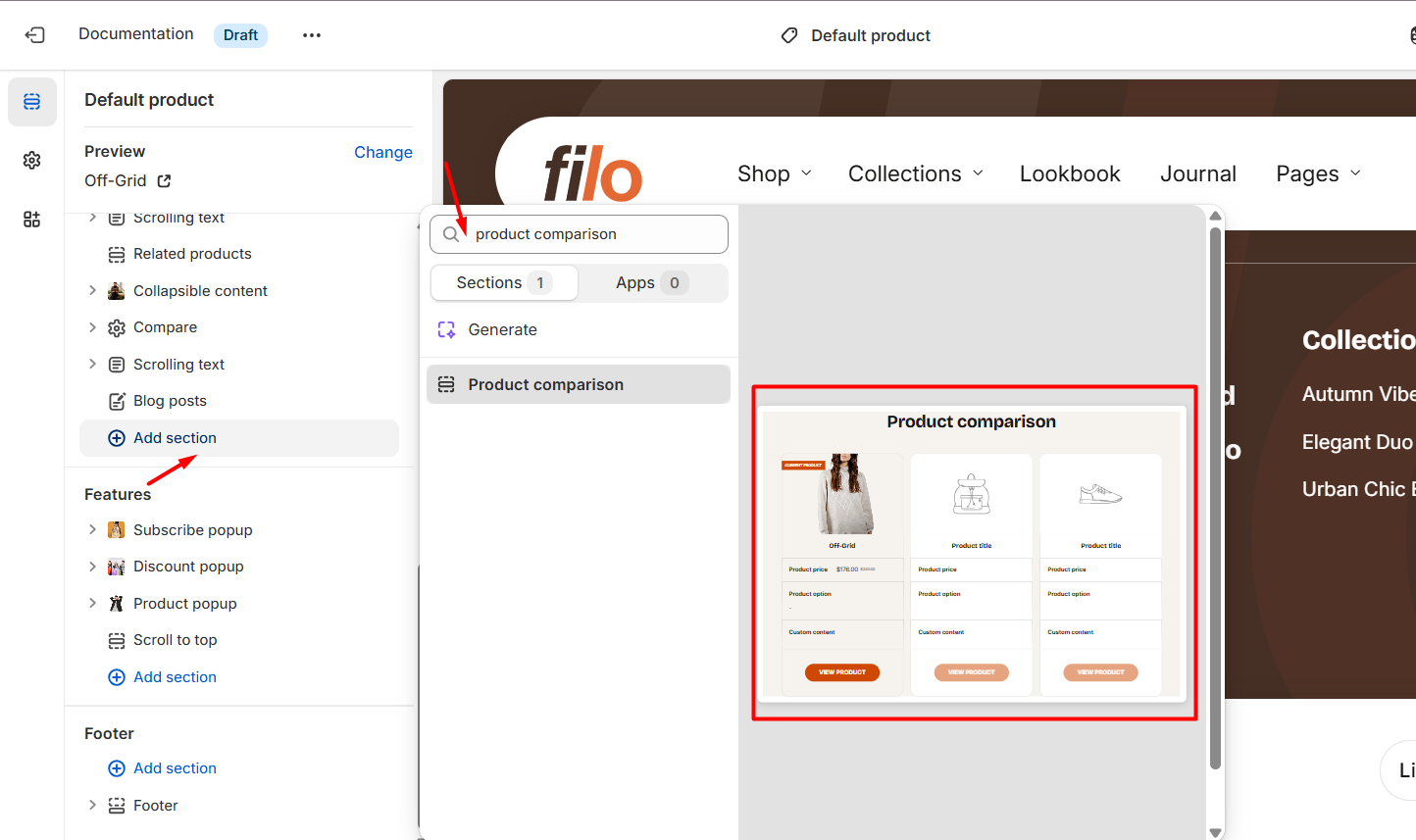
How to access the Product comparison section
Note: Section cannot be added to the Password page.
From any page, click on “Add Section” and choose “Product comparison” from the list.
To insert a new section between existing ones, follow the steps in the article "Add a section"
How to configure the Product comparison section
Basic Components
The “Product comparison” section consists of two primary components:
- General settings – These control the overall settings of the section.
- Block – Each block has its own individual settings.
Available block types include:
By default:
- Image (The related article "Image")
- Title (The related article "Title")
- Price (The related article "Price")
You can also add:
- Product type (The related article "Product type")
- Product description (The related article "Product description")
- Product SKU (The related article "Product SKU")
- Variant option (The related article "Variant option")
- Vendor (The related article "Vendor")
- Custom content (The related article "Custom content")
- Metafield (The related article "Metafield")
- Button (The related article "Button")
To insert a new block between existing ones or to add a block when none have been added yet, refer to the article "Add a block" and locate the section titled “How to add a block”.
General settings
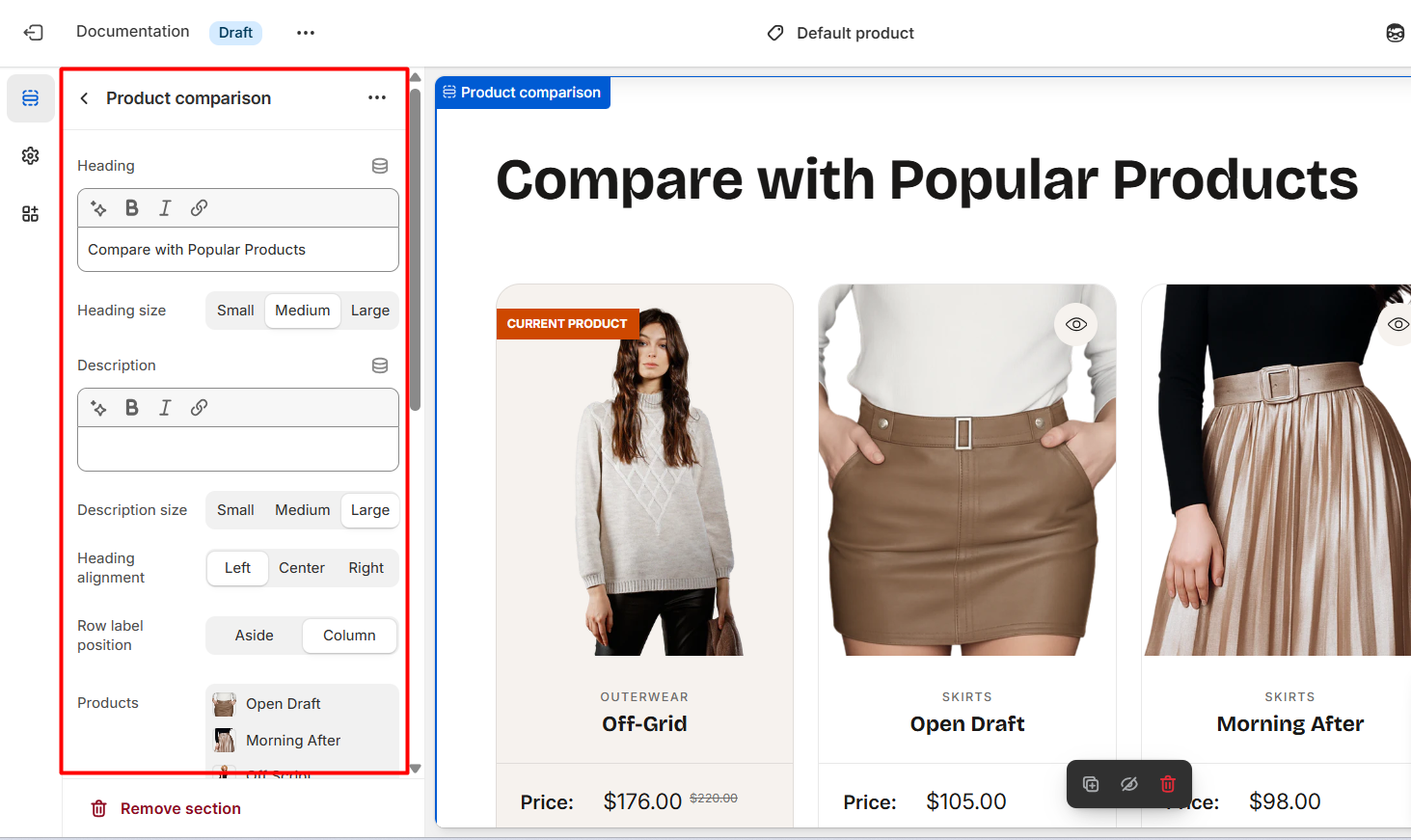
Select a setting described in the following table:
| Setting | Description |
| Heading |
To add a heading, simply enter the text in the provided field. In the top menu of the field, you can find options to customize the heading such as making it bold, italic, or adding a hyperlink. Furthermore, you can click the dynamic source button to insert a dynamic source for the featured collection description. |
| Heading size |
The heading size setting offers three options to control the size of the section heading:
|
| Description |
To add a description, simply enter the text in the provided field. In the top menu of the field, you can find options to customize text such as making it bold, italic, or adding a hyperlink. Furthermore, you can click the dynamic source button to insert a dynamic source for the featured collection description. |
| Description size |
Choose the font size for description:
|
| Heading alignment |
You have three options to align heading or heading with description:
|
| Row label position |
|
| Products | You may add a maximum of 4 products to the comparison table. |
|
Show current product Visible only on product page |
Turn this on to include the product you’re viewing in the comparison table with the other selected items. |
| Content color scheme |
Select a color scheme from the list and customize it with appropriate colors for text, headings, buttons, and background in columns. Applying a color scheme to columns automatically updates all associated colors set in the theme settings according to the created color schemes. You can edit colors in this block, but it will impact the other sections and blocks in which the same color scheme is used. Learn more about color schemes. |
| Color scheme | Apply a color scheme to this section. Editing the colors here will also affect any other sections or blocks that use the same scheme. Learn more about color schemes. |
| Switch background |
Within each color scheme, you can define a secondary background in addition to the main background. When you enable Switch background, the main background of the section changes to the secondary background. |
| Setting | Description |
| Heading |
To add a heading, simply enter the text in the provided field. In the top menu of the field, you can find options to customize the heading such as making it bold, italic, or adding a hyperlink. Furthermore, you can click the dynamic source button to insert a dynamic source for the featured collection description. |
| Heading size |
The heading size setting offers three options to control the size of the section heading:
|
| Description |
To add a description, simply enter the text in the provided field. In the top menu of the field, you can find options to customize text such as making it bold, italic, or adding a hyperlink. Furthermore, you can click the dynamic source button to insert a dynamic source for the featured collection description. |
| Description size |
Choose the font size for description:
|
| Heading alignment |
You have three options to align heading or heading with description:
|
| Row label position |
|
| Row label font weight |
Controls the thickness of the text used for row labels in the comparison table:
|
| Products | You may add a maximum of 4 products to the comparison table. |
|
Show current product Visible only on product page |
Turn this on to include the product you’re viewing in the comparison table with the other selected items. |
| Content color scheme |
Select a color scheme from the list and customize it with appropriate colors for text, headings, buttons, and background in columns. Applying a color scheme to columns automatically updates all associated colors set in the theme settings according to the created color schemes. You can edit colors in this block, but it will impact the other sections and blocks in which the same color scheme is used. Learn more about color schemes. |
| Color scheme | Apply a color scheme to this section. Editing the colors here will also affect any other sections or blocks that use the same scheme. Learn more about color schemes. |
| Switch background |
Within each color scheme, you can define a secondary background in addition to the main background. When you enable Switch background, the main background of the section changes to the secondary background. |
Section paddings
| Setting | Description |
| Top padding | The 'Top padding' setting allows you to adjust the amount of space at the top of the section using a slider. |
| Bottom padding | The 'Bottom padding' setting functions similarly to the “Section top padding” setting, but controls the space at the bottom of the section. |
| Top padding mobile | The 'Top padding mobile' setting allows you to adjust the amount of space at the top of the section specifically for mobile devices, using a slider. |
| Bottom padding mobile | The 'Bottom padding mobile' setting works similarly to the 'Top padding mobile' setting but controls the space at the bottom of the section for mobile devices. |