Hotspot product item settings
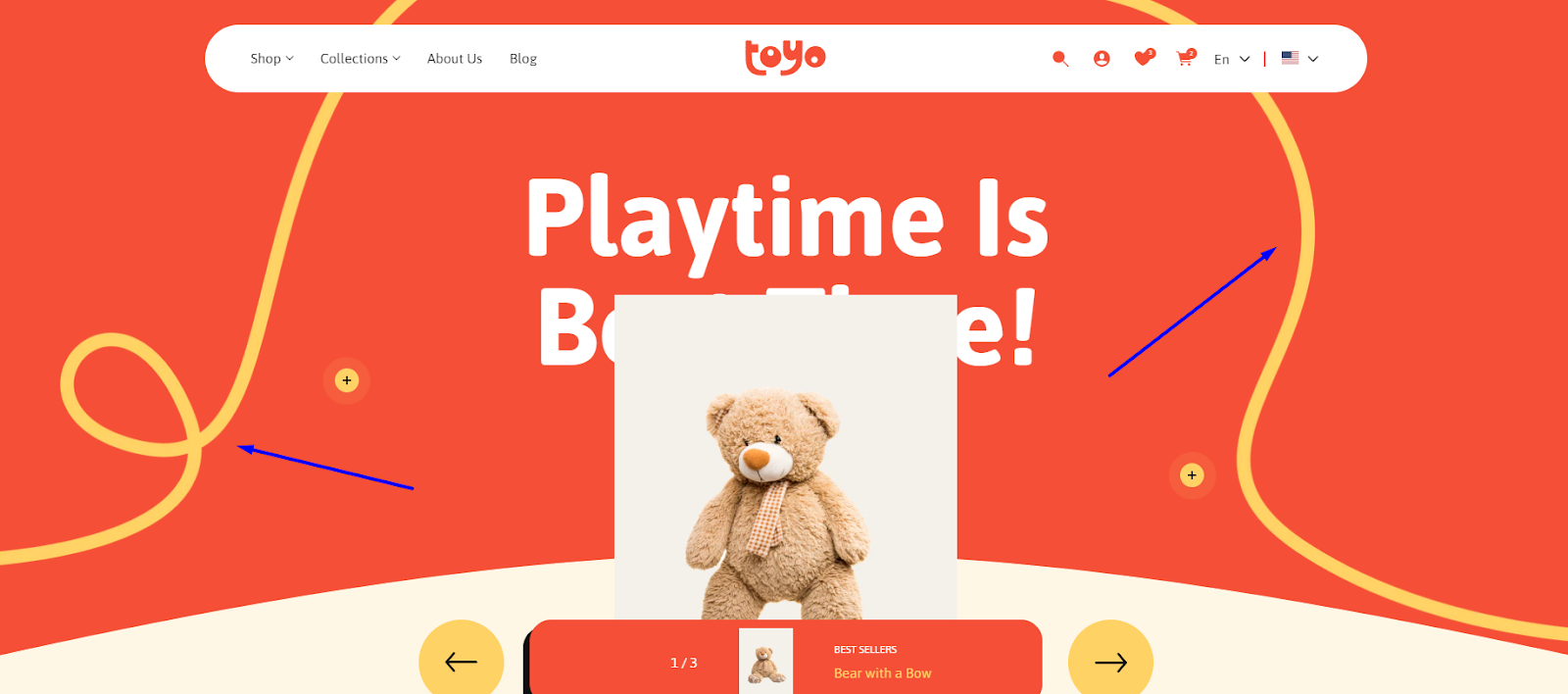
Hotspot product item
| Setting | Description |
| Select Product |
The “Select Product” option allows you to add a link to a specific product in your store. When you click on the “Select Product” button, you have two options:
|
| Banner title | To add a banner title, simply enter the text in the provided field. In the top menu of the field, you can find options to customize the heading such as making it bold, italic, or adding a hyperlink. |
| Heading size |
The heading size setting offers four options to control the size of your site's headings:
With these options, you can easily customize the heading sizes to best match your website's style and create a visually appealing and cohesive design throughout your site. |
| Heading color |
The “Heading color” setting offers four options to customize the color scheme of your heading:
It's important to note that the color scheme you choose for these four options will be consistent throughout your website. So, when you update the theme settings for these text colors, the same color scheme will be applied to other sections or blocks that use text elements. |
| Heading alignment |
You have three alignment options for the heading to choose from:
|
| Heading alignment mobile |
You have three alignment options for the heading to choose from on mobile devices:
|
| Banner description | Provide a description for the banner. This text will be displayed along with the heading and the banner image and can be used to convey additional information or context related to the banner's content. |
| Text size |
Choose a description size that complements heading and elements in the banner:
|
| Description color |
The “Description color” setting offers four options to customize the color scheme of your text:
|
| Banner background | Choose an image background for your banner. |
| Banner background mobile | Select a background image specifically for mobile devices. This feature is beneficial for banners containing lines, icons, or small elements, ensuring they maintain visual consistency and look optimal on mobile screens. |
| Background fit |
|
| Custom banner product image | You have the option to utilize a different product image here than the main image displayed on the product page, should it be necessary. |
| Custom container product image | This option enables you to customize the product image container. You can replace the product image and add a different one, such as a transparent image, to looks good on the container's background color. |
| Content box background color | Click on the color picker to add or change the background color of the banner. |
| Container background color | Click on the color picker to add or change the background color of the box container with the product information placed below the banner. |
| Counter color | Click on the color picker to add color to the counter. |
| Collection title color | Use a color picker to apply color to the collection title. |
| Product title color | Use a color picker to apply color to the product title. |
| Collection title weight | Choose the appropriate font weight for collection name placed inside box container. |
| Product title weight | Choose the appropriate font weight for product title placed inside box container. |
Example - Banner background
Cross sell products

| Setting | Description |
| Products | Choose one or two products for hotspot items that are complementary or related to the main product featured in the banner. These products should enhance the customer's experience or provide additional value when purchased together. When customers hover over the hotspot area on the banner, a pop-up should appear displaying information about the complementary product. The pop-up contains the product name, image, price, and either a “Choose Options” button for products with multiple options or an “Add to Cart” button for direct purchase. |
| Custom bullet icon | Add a custom icon to make your design more unique. |
| Background color | Instead of an icon, you can add a background color for the bullet. |
| Cross color | Add a color of cross placed inside the hotspot item. |
| Bullet size | Adjust size of bullet using a slider. |
| Open bubble on desktop | Enable the toggle if you want bubbles to be always open with all information instead of hovering on it. |
| Hide item on mobile | You can hide an item on mobile if it is better for your design vision. |
Top and bottom icons

Icon settings
Settings to highlight image block container using captivating icons.
| Setting | Description |
| Icon | You can add an icon to be visible at the top of the image block container. |
| Hide icon on mobile | If needed, you can hide the icon on mobile devices. |
| Image width | This setting allows you to adjust the image width of the icon. |
| Image vertical position | The setting enables you to control the vertical position of the icon at the top of the image block container. |
| Image horizontal position | This setting enables you to control the horizontal position of the icon at the top of the image block container. |
| Image width mobile | This setting lets you adjust icon width on mobile devices separately. It's important for optimizing the visual appearance and layout. |
| Image vertical position mobile | The setting enables you to control the vertical position of the icon at the top of the image block container on mobile. Adjustments like changing placement can improve mobile usability. |
| Image horizontal position mobile | This setting enables you to control the horizontal position of the icon at the top of the image block container. Adjustments like changing placement can improve mobile usability. |