Blog posts settings
This guide describes the Blog posts section.
The Blog Posts section allows you to feature selected blog articles on your store’s pages. It helps you engage your audience with relevant content, improve SEO, and drive traffic to your blog.
Key Features:
Content Settings
- Customize the section heading and description to introduce your blog content.
- Choose to display posts from a specific blog category.
Layout Options
- Select the number of blog posts to display.
- Adjust the number of columns for desktop view.
- Choose whether to show featured image, date, author, and excerpt.
Design Customization
- Modify text alignment, padding, and color scheme to match your brand.
Tag Bar Feature
- Display a tags bar above your blog posts.
- Add a custom label for the tags bar.
- All tags are shown in a single row and act as navigation links, directing users to pages filtered by the selected tag.
Demo Example:
The Blog Posts section is displayed on the homepage, showcasing selected articles to engage visitors and drive traffic to the blog.

Tag Bar view

How to access the Blog posts section
Access this section through the theme customizer:
- Navigate to Online Store > Themes
- Select “Customize” on your active theme
- On any theme template, click “Add section”
- Search and select “Blog posts”
Note: Section cannot be added to the Password page.
To insert a new section between existing ones, follow the steps in the article "Add a section"

Once the blog posts section is added, you can customize its appearance and functionality using the available settings.
How to configure the Blog posts section
Basic Components
The “Blog posts” section consists of general settings.
To start customizing your blog posts, click on the “Blog posts” section to access its settings.
General settings

Select a setting described in the following table:
|
Setting
|
Description
|
|
Heading
|
To add a heading to the section, simply enter the text in the provided field. In the top menu of the field, you can find options to customize the heading such as making it bold, italic, or adding a hyperlink.
Furthermore, you can click the dynamic source button to insert a dynamic source as the title of the section.
|
|
Heading size
|
The heading size setting offers three options to control the size of the section heading:
|
|
Description
|
This field is for adding a description to the section. In the top menu of the field, you can find options to customize the text.
Furthermore, you can click the dynamic source button to insert a dynamic source for the “Collapsible content” description.
|
|
Description size
|
There are three options to control the size of your description:
|
|
Enable “View more” button if blog includes more blog posts than shown
|
Swipe the button to the right to display a “View more” button if there are more blog posts than what is currently shown. This allows users to access additional blog posts easily.
|
|
“View all” style
|
Choose the button’s appearance:
|
|
Heading alignment
|
Align the heading, heading with description, or heading, description, and button according to your design preferences:
|
Blog settings
|
Setting
|
Description
|
|
Blog
|
Select blog with blog posts to be displayed on the page, or create a new blog.
|
|
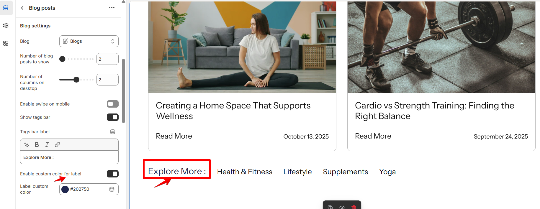
Number of blog posts to show
|
Choose the desired number of blog posts that you want to display in this section. This option allows you to control the quantity of blog posts visible to your visitors.
|
|
Number of columns on desktop
|
Use the slider to select the number of columns for desktop view. You can select a range from 1 column to a maximum of 4 columns.
|
|
Enable swipe on mobile
|
Turn on this setting to let users swipe through blog posts on mobile devices, making navigation smoother and more interactive.
|
|
Show tags bar
|
Swipe the button to the right to display the tags of blog posts in the row. Customers can navigate to all blog posts related to a specific tag.
|
|
Tags bar label
|
Add a label (e.g., “Explore More”) to provide a tip for customers about the tag's bar.
|
| Enable custom color for label | Turn on this toggle to apply a custom color to the tags bar label. |
| Label custom color | Select the desired color using the color picker. |
Card settings
|
Setting
|
Description
|
|
Show featured image (For best results, use an image with a 3:2 aspect ratio).
|
Swipe the button to the right to showcase the featured image from the blog post page to the homepage or other pages. If left unchecked, heading, description, and comment count will be visible without image. Also, we can add date and author to show them on a card.
|
|
Show excerpt
|
Display a portion of the blog post's content as a brief description.
|
|
Read more button
|
Enter a label to direct customers to the blog detail page.
|
|
Show date
|
Enable this option to display the publication date of the blog post.
|
|
Show author
|
Enable this option to display the author's name of the blog post.
|
|
Show comments
|
When this option is enabled, customers will see the number of comments left on a particular blog post displayed on the blog post card.
|
|
Color scheme
|
A color scheme consists of a predefined set of colors you can apply to this section for consistent styling. These schemes are created in the Theme Settings and are available across all sections, making customization faster and ensuring a cohesive color system throughout your store. Learn more about color schemes.
|
|
Setting
|
Description
|
|
Show featured image (For best results, use an image with a 3:2 aspect ratio).
|
Swipe the button to the right to showcase the featured image from the blog post page to the homepage or other pages. If left unchecked, heading, description, and comment count will be visible without image. Also, we can add date and author to show them on a card.
|
|
Show excerpt
|
Display a portion of the blog post's content as a brief description.
|
|
Read more button
|
Enter a label to direct customers to the blog detail page.
|
| Read more button style |
Sets the visual style of the Read More button on blog cards. Options: • Inline — displays as a plain text link. (Default) • Inline with arrow — displays as a text link with an arrow icon. |
|
Show author
|
Enable this option to display the author's name of the blog post.
|
|
Show comments
|
When this option is enabled, customers will see the number of comments left on a particular blog post displayed on the blog post card.
|
|
Color scheme
|
A color scheme consists of a predefined set of colors you can apply to this section for consistent styling. These schemes are created in the Theme Settings and are available across all sections, making customization faster and ensuring a cohesive color system throughout your store. Learn more about color schemes.
|
Section padding
|
Setting
|
Description
|
|
Top padding
|
The 'Top padding' setting allows you to adjust the amount of space at the top of the section using a slider.
|
|
Bottom padding
|
The 'Bottom padding' setting functions similarly to the “Section top padding” setting, but controls the space at the bottom of the section.
|
|
Top padding mobile
|
The 'Top padding (Mobile)' setting allows you to adjust the amount of space at the top of the section specifically for mobile devices, using a slider.
|
|
Bottom padding mobile
|
The 'Bottom padding mobile' setting works similarly to the 'Top padding mobile' setting but controls the space at the bottom of the section for mobile devices.
|