Collection list settings
This guide describes the Collection list section.
The Collection List section allows you to efficiently organize and showcase your product catalogs. Designed for enterprise use, it supports a grid layout on desktop, as well as grid and carousel layouts with pagination on mobile.
Key Features:
Content Settings
- Customize the section heading and description.
- Add a “View All” button that links to the main collection page.
Layout Customization
- Adjust heading alignment.
- Choose the number of columns for the desktop view.
- Choose the number of columns for the mobile view or enable swipe on mobile
Collection Cards
- Adjust image ratio for all collections.
- Optionally include a description on each collection card.
- Add multiple collections and display them in a grid format on desktop.
- Select the appropriate collection for each block.
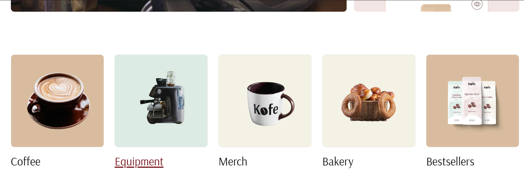
Section view example

How to access the Collection list section
Access this section through the theme customizer:
- Navigate to Online Store > Themes
- Select “Customize” on your active theme
- On any theme template, click “Add section”
- Search and select “Collection List”
Note: Section cannot be added to the Password page.
To insert a new section between existing ones, follow the steps in the article "Add a section"

How to configure the Collection list section
Basic Components
The “Collection list” section consists of two primary components:
- General settings – These control the overall settings of the section.
- Block – Each block has its own individual settings.
Available block types include:
- Collection. To learn about all available block settings, see the related article "Collection"
To insert a new block between existing ones or to add a block when none have been added yet, refer to the article "Add a block" and locate the section titled “How to add a block”.
General settings

Select a setting described in the following table:
| Setting | Description |
| Heading | To add a heading to the section, simply enter the text in the provided field. In the top menu of the field, you can find options to customize the heading such as making it bold, italic, or adding a hyperlink. Furthermore, you can click the dynamic source button to insert a dynamic source as the title of the section. |
| Heading size |
The heading size setting offers three options to control the size of the section heading:
|
| Description |
This field is for adding a description to the section. In the top menu of the field, you can find options to customize the text. Additionally, you can use the style of headings from H1 to H6 to the body text. Furthermore, you can click the dynamic source button to insert a dynamic source for the description. |
| Description size |
There are three options to control the size of your description:
|
| Enable “View all” button if the list includes more collections than shown. | The “View More” button redirects to a page displaying all collections. This button is visible only when a main heading is added to the section. |
| “View all” style |
Choose the button’s appearance:
|
| Heading alignment |
Align the heading, heading with description, or heading, description, and button according to your design preferences:
|
| Number of columns on desktop | The “Number of columns on desktop” setting allows you to select the number of columns in which your content will be displayed on larger screens, and on tablets. You can select from 2 to 5. |
| Color scheme |
Select a color scheme from the list and customize it with appropriate colors for text, headings, buttons, and background. Applying a color scheme to the entire collection list section (excluding the collection columns) automatically updates all related colors based on the settings defined in the theme's color schemes. |
Collection card
| Setting | Description |
| Image ratio |
The “Image ratio” setting allows you to control how images are displayed on your website based on their width-to-height ratio. You have several options to adjust collection image appearance near its products:
|
| Show excerpt | Swipe the button to the right to show collection description added on collection page (Shopify admin). |
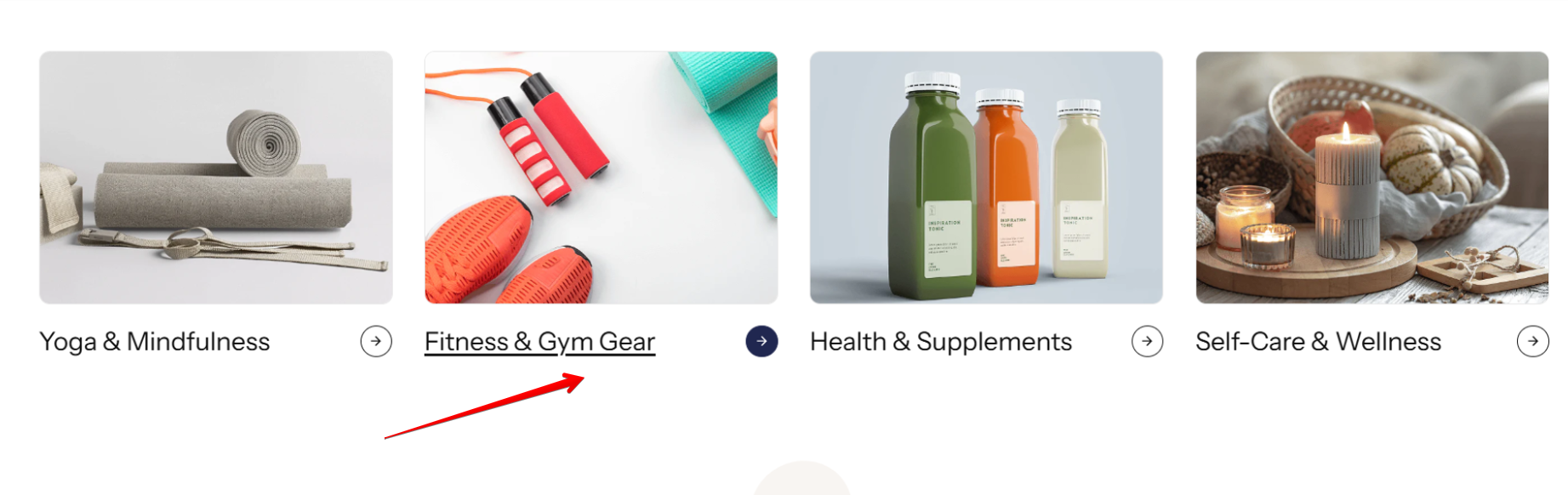
| Show arrow button | Enable this toggle to display an arrow button next to the collection heading. |
| Enable hover color on collection card links | Enable this toggle to apply a hover color to the collection heading. When disabled, the heading will simply be underlined on hover. |
When 'Show arrow button' toggle is disabled and 'Enable hover color on collection card links' is turned on.
When 'Show arrow button' toggle is enabled and 'Enable hover color on collection card links' is turned off.
Mobile layout
| Setting | Description |
| Number of columns on mobile |
Choose the view of the column on mobile:
|
| Enable swipe on mobile | Allow users to swipe columns in a slider using arrows or just scroll on mobile devices. |
Section paddings
| Setting | Description |
| Top padding | The 'Top padding' setting allows you to adjust the amount of space at the top of the section using a slider. |
| Bottom padding | The 'Bottom padding' setting functions similarly to the “Section top padding” setting, but controls the space at the bottom of the section. |
| Top padding mobile | The 'Top padding mobile' setting allows you to adjust the amount of space at the top of the section specifically for mobile devices, using a slider. |
| Bottom padding mobile | The 'Bottom padding mobile' setting works similarly to the 'Top padding mobile' setting but controls the space at the bottom of the section for mobile devices. |