Before and after settings
This guide describes the Before and after section.
This section is ideal for comparing two products by displaying before and after images in a banner format. You can add:
- A Main Heading and a button for additional information or calls to action.
- Two images to illustrate the before and after comparison.
- A product list with cards showcasing the products used in the comparison, as well as similar products. Customers can scroll product list by a slider feature.
Demo Example: The Before and After section displayed on the homepage, showcasing a product comparison with before-and-after images and a scrollable product list.

How to access the Before and after section
Note: Section cannot be added to the Password page.
From any page, click on “Add Section” and choose “Before and after” from the list.
To insert a new section between existing ones, follow the steps in the article Add a section

How to configure the Before and after section
Basic Components
The “Before and after” section consists of two primary components:
- General settings – These control the overall settings of the section.
- Block – Each block has its own individual settings.
Available block types include:
By default:
- Heading (Article "Heading block")
- Button (Article "Button block")
- Product list (Article "Product list")
You can also add:
- Caption (Article "Caption")
- Text block (Article "Text block")
To insert a new block between existing ones or to add a block when none have been added yet, refer to the article "Add a block" and locate the section titled “How to Add a Block”.
General settings

Select a setting described in the following table:
| Setting | Description |
| Left image | Upload an image that will be showcased on the left side of the block (the “Before” image). |
| Left label |
*If the image is not added, left label option is hidden. Add a product title related to the left image. |
| Right image | Upload an image that will be showcased on the right side of the block (the “After” image). |
| Right label |
*If the image is not added, right label option is hidden. Add a product title related to the right image. |
| Image height | You can use this slider to adjust the image height. |
| Desktop image width |
Choose the width of the image for desktop view:
|
| Desktop image placement |
Adjust the placement of the image on the desktop view:
|
| Desktop content position |
Select the vertical alignment of image
|
| Desktop content alignment |
Choose the horizontal alignment of the content:
|
| Color scheme | Add a color scheme to the entire section from the dropdown list. These schemes are created in the Theme Settings and are available across all sections, making customization faster and ensuring a cohesive color system throughout your store. Learn more about color schemes. |
| Media color scheme | Add a color scheme to the media. A color scheme consists of a predefined set of colors you can apply to media text and vertical scroll line. |
| Make section full width | Enable this option to extend the section to the full width of the page, making its background stretch across the entire screen, while the content remains confined within the container. |
Mobile layout
| Setting | Description |
| Mobile image placement |
Adjust the placement of the image on the desktop view:
|
| Mobile content alignment |
Choose the horizontal alignment of the content on mobile:
|
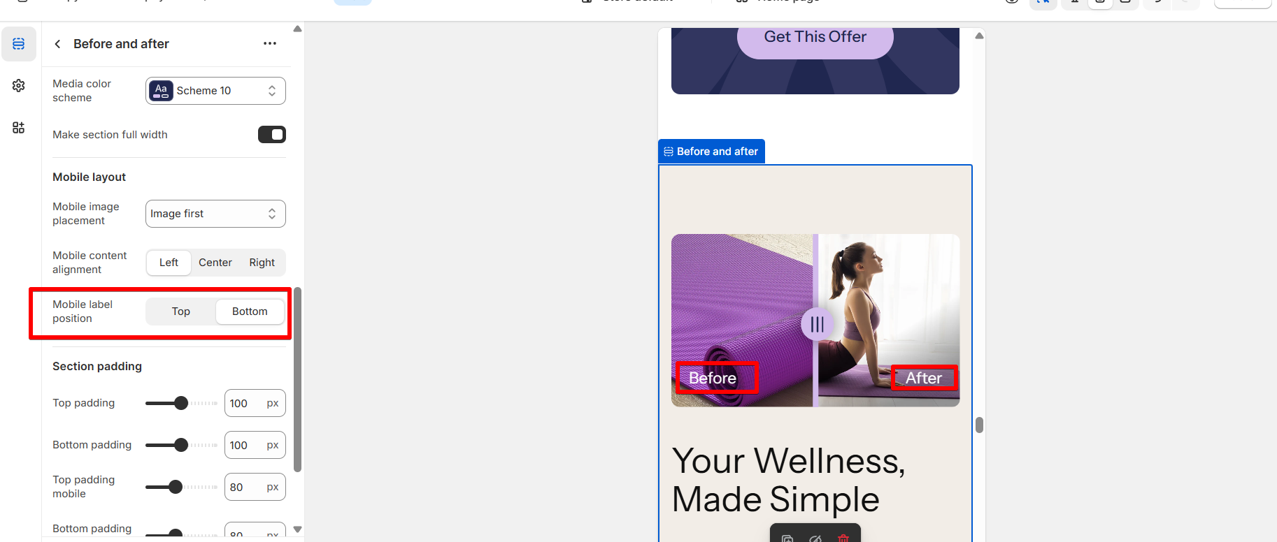
| Mobile label position | By default, labels are positioned at the top on mobile. However, you can change their position to the bottom. |
Label position on mobile
Section padding
| Setting | Description |
| Top padding | The 'Top padding' setting allows you to adjust the amount of space at the top of the section using a slider. |
| Bottom padding | The 'Bottom padding' setting functions similarly to the “Section top padding” setting, but controls the space at the bottom of the section. |
| Top padding mobile | The 'Top padding mobile' setting allows you to adjust the amount of space at the top of the section specifically for mobile devices, using a slider. |
| Bottom padding mobile | The 'Bottom padding mobile' setting works similarly to the 'Top padding mobile' setting but controls the space at the bottom of the section for mobile devices. |