Сollection list row settings
Collection list row section guide
This section is good to use if you want to have two collection list pages.
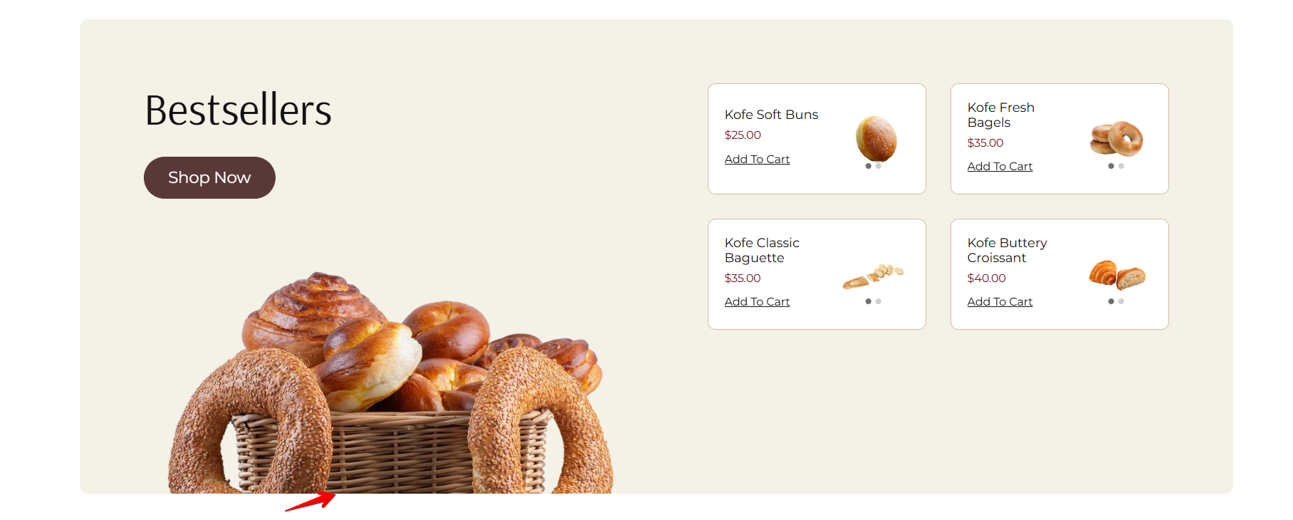
For example, on demo store, we have a main collection list page where all settings are available in collection list page template. On this page our main collections like Fresh Produce, Pantry, Dairy & Eggs, Bakery, and Meat & Seafood.
Demo example: Collection list page

We’ve also created a dedicated Offers page using a custom page template that includes banner and content settings, along with a Collection List Row section. This section highlights offer-based collections like Weekly Deals, Super Deals, and Loka Essentials. When customers click on a button within any of these collection blocks, they are navigated to the corresponding collection page with related products.
To know how to apply templates, read this article "Applying templates"


Demo Offers page

Collection list row section – key features:
This section offers flexible layout options for showcasing collections in different styles:
- Banner view:
Display one collection per row with a banner-style layout. This layout includes a heading and button on the left, and a list of 4 featured products from the selected collection displayed on the right.

- Grid view:
By selecting 2 to 5 columns, you can display collections in a grid layout, ideal for showing multiple collections in a compact, organized format.


- Image customization:
Adjust the image ratio to best fit your design and maintain visual consistency across the page.
- Custom collection block:
Add a specific collection and optionally upload a custom image to enhance the appearance and match your branding or content focus.
How to access the Collection list row section
From any page, click on “Add Section” and choose “Collection list row” from the list.
To insert a new section between existing ones, follow the steps in the article "Add a section"

How to configure the Collection list row section
Basic Components
The “Collection list row” section consists of two primary components:
- General settings – These control the overall settings of the section.
- Block – Each block has its own individual settings.
Available block types include:
- Custom collection (To learn about all available block settings, see the related article "Custom collection").
To insert a new block between existing ones or to add a block when none have been added yet, refer to the article "Add a block" and locate the section titled “How to add a block”.
General settings
Select a setting described in the following table:
| Setting | Description |
| Color scheme |
Choose appropriate color scheme for section — list with collections. *You can edit colors of color scheme in this block, but it will impact the other sections and blocks in which the same color scheme is used. Learn more about color schemes. |
| Image ratio |
The “Image ratio” setting allows you to control how images are displayed on your website based on their width-to-height ratio. You have several options to adjust collection image appearance near its products:
This option is useful when:
|
| Image remove bottom space |
You can remove the extra space below the image — especially useful for images with transparent backgrounds. This option only applies on desktop and when an image is set. |
| Show description |
Path:
|
| Number of columns on desktop | The “Number of columns on desktop” setting allows you to select the number of columns in which your content will be displayed on larger screens, and on tablets. You can select from 1 to 5. |
Image remove bottom space
Product card
| Setting | Description |
| Font family |
Choose which font family is applied to product card heading.
In Theme Settings, you set your global heading and body fonts. This option allows you to select which of those fonts will be used specifically for product card headings. |
Mobile layout
| Setting | Description |
| Number of columns on mobile | The setting allows you to choose the number of columns in which your collections will be displayed on mobile. You can select from the list: 1 column or 2 columns. |
Section padding
| Setting | Description |
| Top padding | The 'Top padding' setting allows you to adjust the amount of space at the top of the section using a slider. |
| Bottom padding | The 'Bottom padding' setting functions similarly to the “Section top padding” setting, but controls the space at the bottom of the section. |
| Top padding mobile | The 'Top padding mobile' setting allows you to adjust the amount of space at the top of the section specifically for mobile devices, using a slider. |
| Bottom padding mobile | The 'Bottom padding mobile' setting works similarly to the 'Top padding mobile' setting but controls the space at the bottom of the section for mobile devices. |