Column block
| Setting | Description |
| Color scheme | A color scheme consists of a predefined set of colors you can apply to this block for consistent styling. Learn more about color schemes. |
| Image | Upload or select an image file to be used as icon for the column. |
| Heading |
This field is for adding a heading to the column. In the top menu of the field, you can find options to customize the heading. Furthermore, you can click the dynamic source button to insert a dynamic source for heading. |
| Heading size |
There are six options to control heading size in the column:
|
| Heading font weight |
Controls the weight (thickness) of the column heading text. Options: • Default — uses the font weight defined in your theme's typography settings. (Default) • Bold — makes the heading heavier and more prominent. • Normal — applies a regular, lighter weight regardless of theme defaults. |
| Description |
This field is for adding a description to the column. In the top menu of the field, you can find options to customize the text. Additionally, you can use the style of headings from H1 to H6 to the body text. Furthermore, you can click the dynamic source button to insert a dynamic source for the description. |
| Text size |
There are five options to control text size in the column:
|
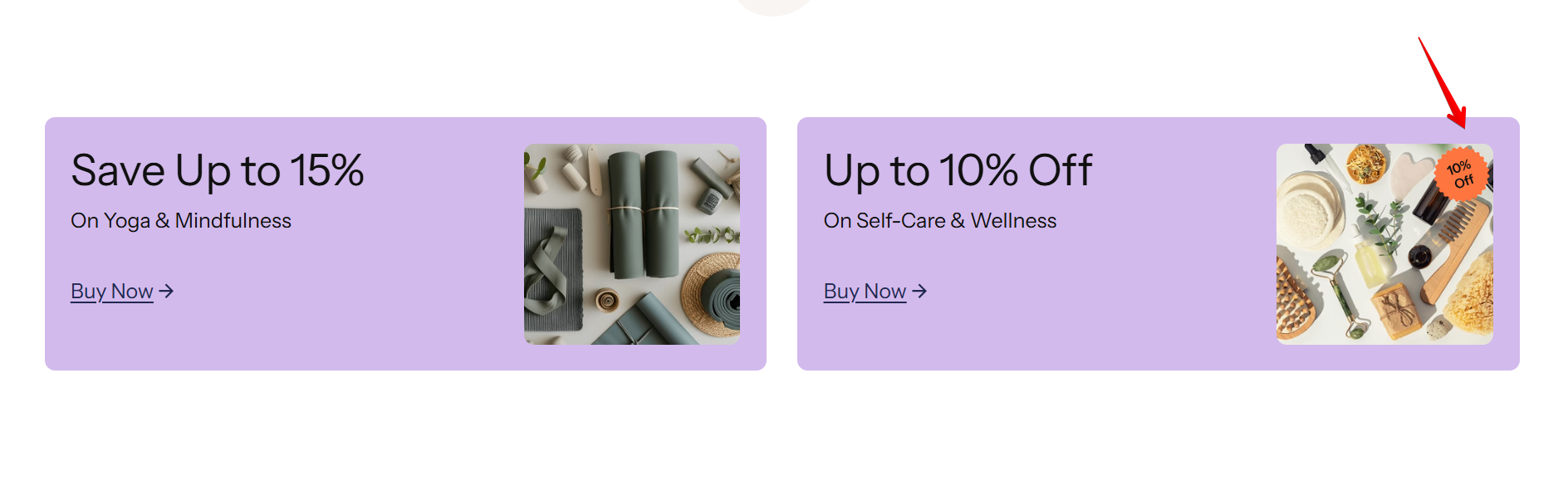
| Badge | You can add a badge to the image, such as a discount label or promotional marker. |
| Link label |
Decide whether the column includes a button:
|
| Link | Add a URL or page link for the button, directing customers to a specific destination. |
| Button style |
Sets the visual style of the button in the column block. Options: • Solid — filled button with a solid background. • Solid with arrow — filled button with an arrow icon. • Outline — button with a border and transparent background. • Outline with arrow — outlined button with an arrow icon. • Inline — displays as a plain text link. (Default) • Inline with arrow — displays as a text link with an arrow icon. |
Badge