Split slide product
| Setting | Description |
| Slide color scheme |
Choose the right color scheme from the list for image split slide product block. Applying a color scheme to the split slide product block automatically updates all associated colors set in the theme settings according to the created color schemes. |
Left slide
| Setting | Description |
| Left slide color scheme |
Choose the right color scheme from the list for the left slide. Applying a color scheme to the split slide product block automatically updates all associated colors set in the theme settings according to the created color schemes. |
| Background image | Choose a background image for your left slide. Click on “Select Image” to access your media library, upload a new image, or explore free images. Also, you can connect a dynamic source by clicking the source button. Once an image is added, you can use the “Change” button to remove, replace, or delete it. |
| Background video file |
Choose a background video for your left slide. Click on “Select Image” to access your media library and upload a video. Also, you can connect a dynamic source by clicking the source button. Once a video is added, you can use the “Change” button to remove, replace, or delete it. Note that the video replaces the image. |
| Overlay | The “Overlay” setting allows you to adjust the transparency of the overlay that is applied to an image or video on your website. Use the slider to make changes. |
| Label | Simply enter text in the label field to show it above the heading as a badge. In the top menu of the field, you can find options to customize the text, such as making it bold, italic, or adding a hyperlink. |
| Label icon |
This option allows you to style the label by adding an icon. Upload an icon to be displayed alongside the label. |
| Heading |
To add a heading to the image left slide, simply enter the text in the provided field. In the top menu of the field, you can find options to customize the heading such as making it bold, italic, or adding a hyperlink. Furthermore, you can click the dynamic source button to insert a dynamic source as the title of the left slide. It is also possible to animate part of the heading or the entire heading. Simply place the word you want to animate in square brackets []. Example: “Split [slide]”. After that, adjust the necessary settings in the two options below. *See the screenshots at the end of the section to view how the heading animation works ↓ |
| Replacement words |
A filled-in field with the text that will replace the part of the heading placed in square brackets. You can add multiple text options separated by commas. Each comma-separated value will sequentially replace the previous one. |
| Replacement words color |
This option allows you to choose a color for the part of the text that changes. Simply select the desired color from the palette. |
| Heading size |
The heading size setting offers three options to control the heading size of each slide:
|
| Subheading | Include a subheading for image left slide after heading and customize its appearance using the rich text field. |
| Button label |
Decide whether the left slide includes a button:
|
| Button link (paste a link or search) | Input the URL you want the button to direct to, or select a page from the dropdown list of options that appears when you click on the field. Also, you can click the source button to add a dynamic source as a URL. |
| Use outline button style | Enable this option to apply an outline style to buttons. This style features a border around the button with a transparent background. |
| Desktop content position |
Customize the position of content on desktop screens:
Note: Position is automatically optimized for mobile. |
| Desktop content alignment |
You have three alignment options to align content horizontally on desktop (heading, label, and button) :
|
| Mobile content alignment |
Choose the horizontal alignment of the content on mobile:
|
Right slide
| Setting | Description |
| Right slide color scheme |
Choose the right color scheme from the list for image right slide. Applying a color scheme to the slide block automatically updates all associated colors set in the theme settings according to the created color schemes. |
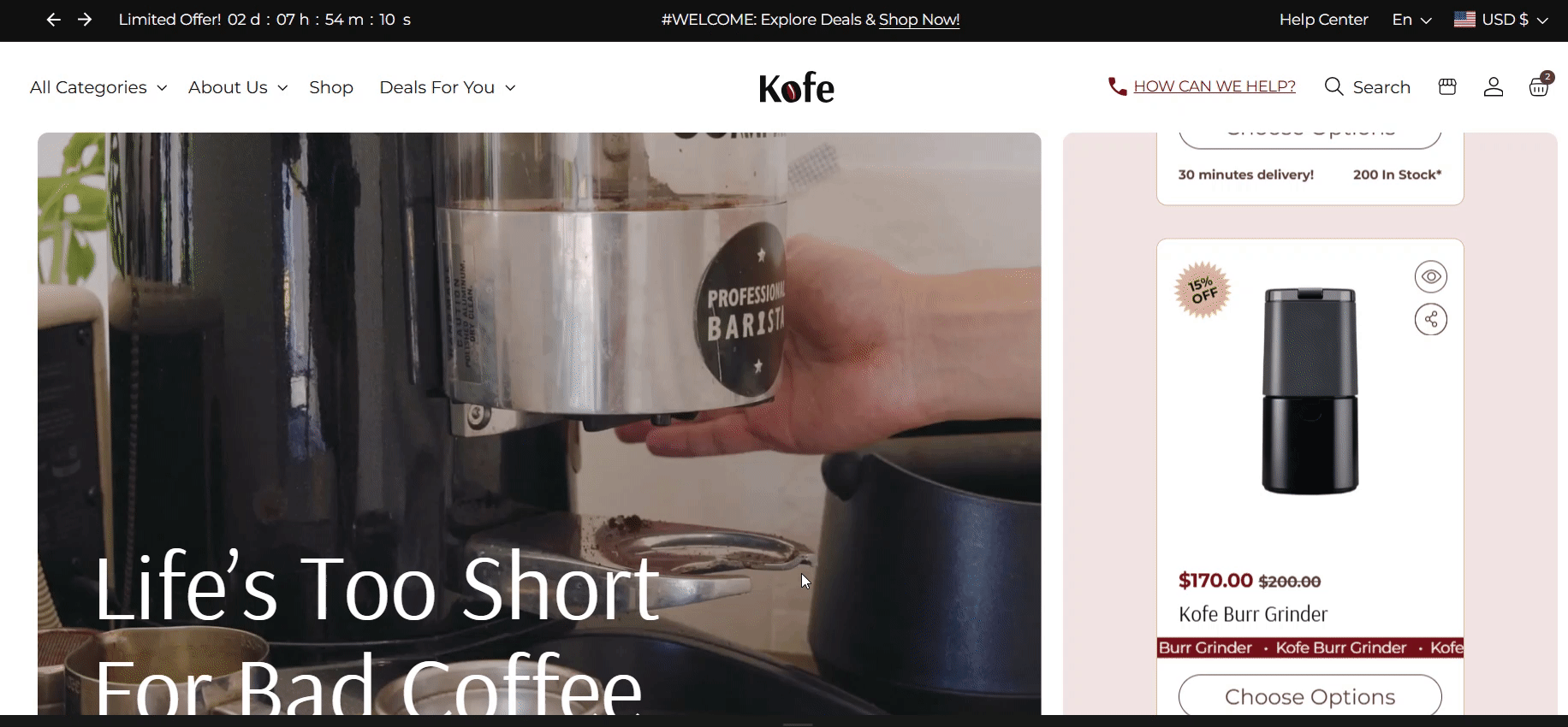
| Products |
Choose which products to display on the right side of the section. These products will appear in a scrolling slider. A minimum of 8 and a maximum of 12 products can be added. |
| Image ratio |
The “Image ratio” setting allows you to control how images are displayed on your website based on their width-to-height ratio. You have several options to choose from:
|
| Show second image on hover | Check this option to display a second image on hover. This will only apply if the product page includes more than one image. |
| Show vendor | Show the vendor of the product after product title. |
| Show product rating | Displays the average product rating in stars with the number of reviews in parenthesis, for example: ★★★★★ (8). Also requires a product review app such as Shopify Product Reviews, and Metafield definitions for reviews.rating_count and reviews.rating. |
| Product icons |
Create a metafield of type "File -> List of files" to customize info. Paste name here (e.g.,"Product icons") * Learn more (from Shopify help center); *Check our article above. |
| Product info |
Create a metafield of type "Single line text" to customize info. Paste name here (e.g.,"Product info") Learn more. Product Info: You can add product information in two ways:
|
| Show products stock |
Swipe the button to the right to display stock information at the bottom of the product card. The stock status will vary based on the product type:
|
| Quick add |
If you activate the Quick add option, then your customers can add an item to their cart from the product card. Choose from the following options:
|
Dynamic text replacement in the heading

