Highlight text with image
This guide describes the Highlight text with image section.
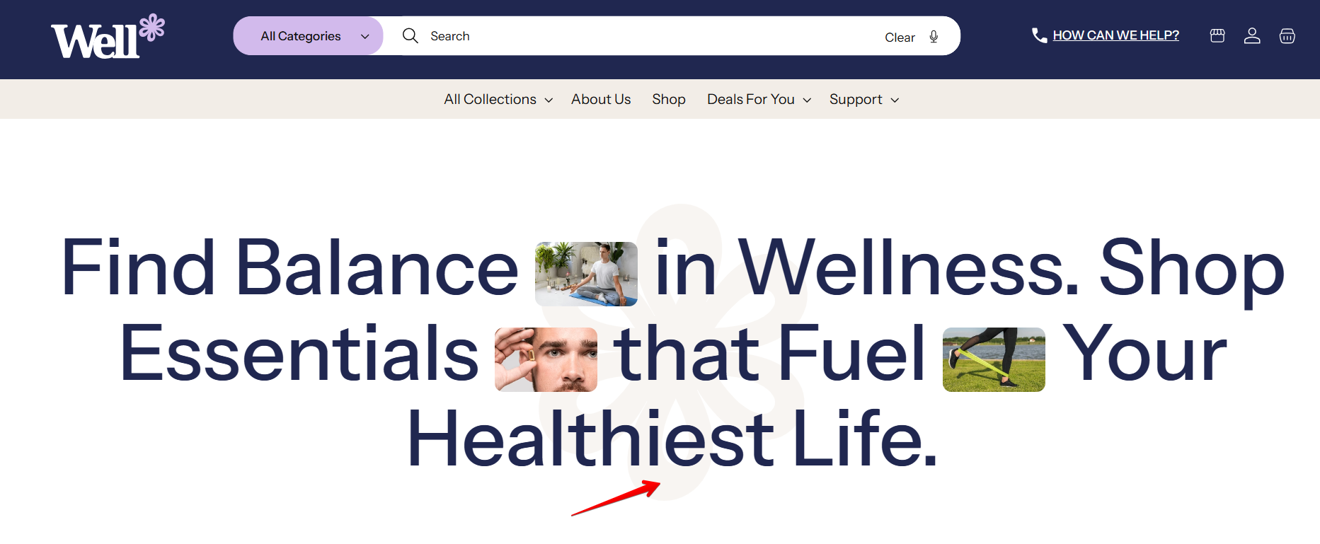
This section allows you to display icons alongside text to create a visual impact. It’s ideal for highlighting key features, services, or value propositions.
Features include: (Settings are available in Image block)
- Adjustable icon position (after a certain word)
- Customizable icon width for layout flexibility
- Icons can rotate or scale continuously using animation options, adding dynamic visual effects
Examples how this section can be set:


How to access the Highlight text with image section
From any page, click on “Add Section” and choose “Highlight text with image” from the list.
To insert a new section between existing ones, follow the steps in the article Add a section

How to configure the Highlight text with image section
Basic Components
The “Highlight text with image” section consists of two primary components:
- General settings – These control the overall settings of the section.
- Block – Each block has its own individual settings.
Available block types include:
- Image. To learn about all available block settings, see the related article "Image"
To insert a new block between existing ones or to add a block when none have been added yet, refer to the article "Add a block" and locate the section titled “How to Add a Block”.
General settings

Select a setting described in the following table:
| Setting | Description |
| Heading |
This field is for adding a heading to the section. You can click the dynamic source button to insert a dynamic source as the title of the section. |
| Heading size |
The heading size setting offers three options to control the size of your section heading:
|
| Heading weight |
Choose a font weight for heading:
|
| Button label |
Decide whether the section includes a button:
|
| Button link | Add a URL or page link for the button, directing customers to a specific destination. |
| Button style |
Choose the button’s appearance:
|
| Content alignment |
Align the heading, heading with images, or heading and button according to your design preferences:
|
| Color scheme |
Apply Color Scheme:
|
| Background image | Add a background — transparent image for the section. |
| Make section full width | This option allows the selected section to expand and take up the entire width of the page or screen. |
Background image
Section padding
| Setting | Description |
| Top padding | The 'Top padding' setting allows you to adjust the amount of space at the top of the section using a slider. |
| Bottom padding | The 'Bottom padding' setting functions similarly to the “Section top padding” setting, but controls the space at the bottom of the section. |
| Top padding mobile | The 'Top padding mobile' setting allows you to adjust the amount of space at the top of the section specifically for mobile devices, using a slider. |
| Bottom padding mobile | The 'Bottom padding mobile' setting works similarly to the 'Top padding mobile' setting but controls the space at the bottom of the section for mobile devices. |